101 real design methods, each with a copy-ready prompt built from actual
typefaces, grids, inks and presses. Swap in your subject and paste into any AI image
tool. Written to get you a specific historical look rather than the generic house style
every model defaults to. Free, no sign up.
Built and maintained by Northwest Media Systems, a Seattle video production and post studio.
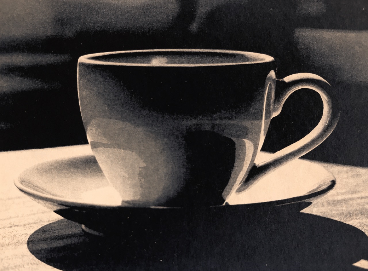
One photograph printed from two or three plates to extend tonal range beyond single-colour black.
[Subject] as a printed duotone. Black plate carrying the shadow detail and a warm sepia second plate carrying the midtones, each with its own separation curve so the two do not simply overlay, giving depth a tinted greyscale cannot. Rich blacks, warm mid-greys, clean paper-white highlights. Fine 150-line screen on matte coated stock.
Deciding whether an ink sits on the paper or on top of another ink, which changes the colour.
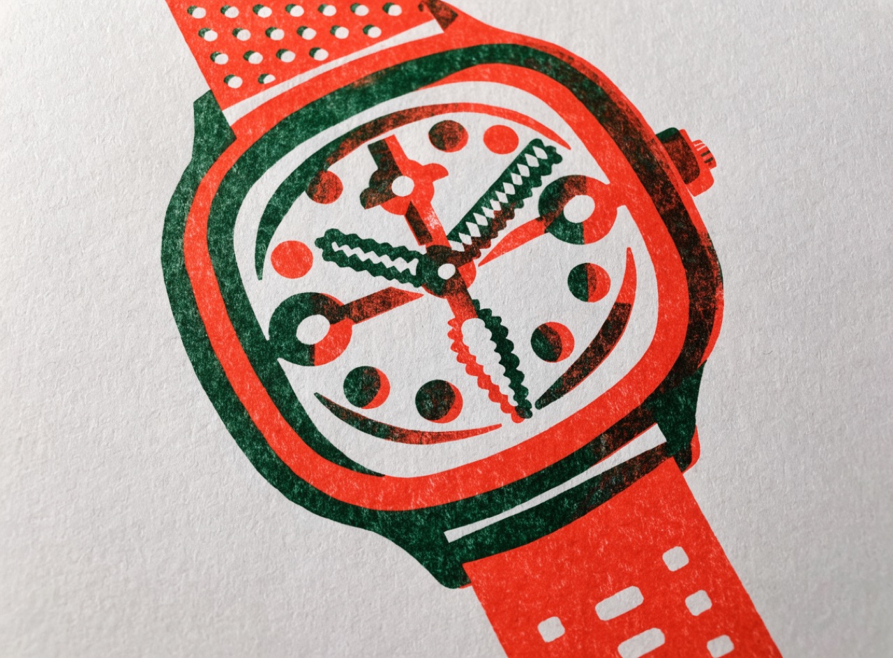
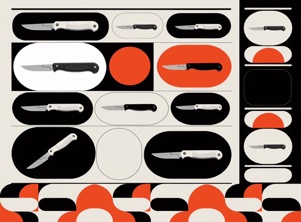
[Subject] printed in two spot colours demonstrating both handling: some shapes knocked out so the second ink prints on bare paper and holds its true hue, others overprinting so they multiply into a darker third colour where they cross. Black type overprinting throughout with no white fringe at any edge. Visible ink layering, uncoated stock.
Inks that cannot be built from CMYK, so they only exist as a separate pass.
[Subject] printed with one spot metallic silver and one fluorescent pink alongside black. The metallic shifting in value across its area as the angle changes rather than sitting as one flat tone, the fluorescent pink glowing hotter than any process colour could reproduce. Everything else restrained in flat black. Uncoated stock so the metallic sits slightly dull and the fluorescent soaks in.
One hue at many values, which forces the composition to work on tone alone.
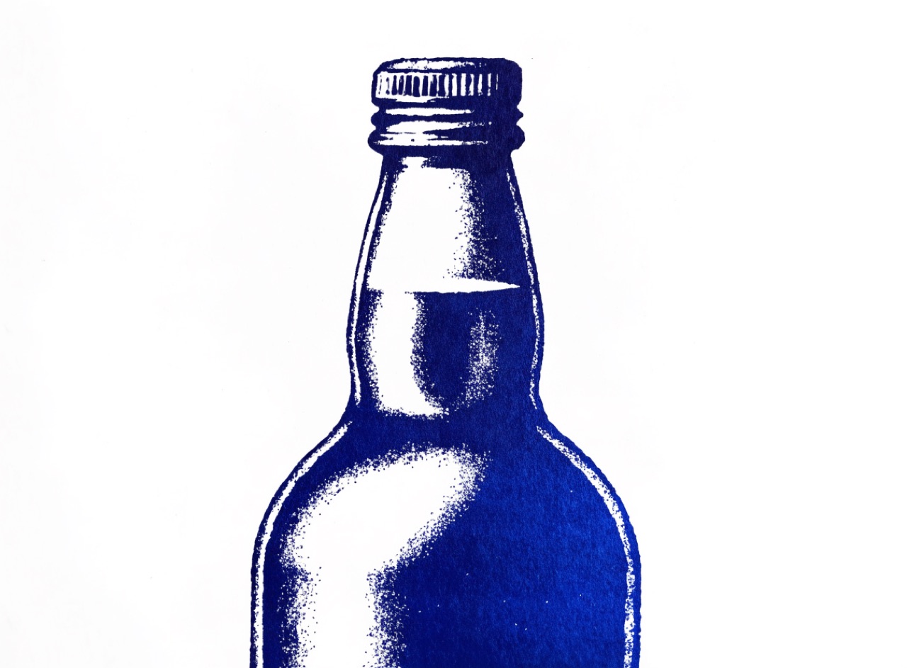
[Subject] rendered monochrome in a single hue across a wide value range, from near-white through to near-black, with no second hue anywhere. The lightest and darkest points placed deliberately at the compositional focus so the eye is led by value alone. Deep prussian blue as the single hue. Flat printed, matte uncoated stock.
Black built from several inks so large areas read as truly dark rather than washed grey.
[Subject] on a large rich black ground, black built from four inks so the area reads genuinely deep and even rather than washed grey, with the surface showing a faint sheen from the heavy ink film. Small type reversed out in clean paper white, and any small black text set in single black only so it stays sharp. Coated stock, offset.
Two inks loaded side by side in one fountain, blending across the sheet in a single pass.
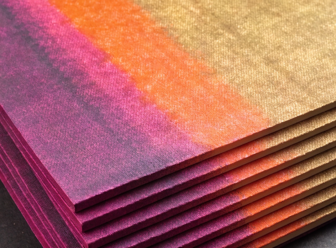
[Subject] screenprinted with a split fountain rainbow roll. Two inks loaded side by side blending into each other continuously across the whole sheet in a single pass, magenta at the left through orange to gold at the right, the transition soft and slightly uneven rather than a clean digital gradient. Flat opaque ink, visible mesh texture, heavy uncoated poster stock.
Two spot colours and the paper, where every other tone is made by tint and overprint.
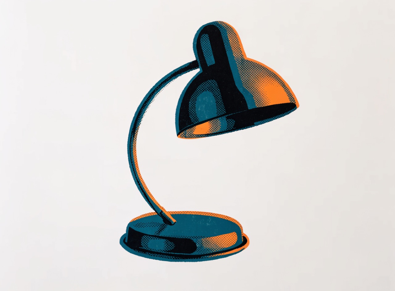
[Subject] printed in exactly two spot inks plus the paper. Deep teal and warm orange, with 20, 40 and 60 percent tints of each providing all intermediate tone and the two overprinting into a near-black where they cross. No process black anywhere and no fourth colour. Visible halftone tint dots in the lighter areas, uncoated warm-white stock.
Complementary hues matched in value so their shared border shimmers and refuses to resolve.
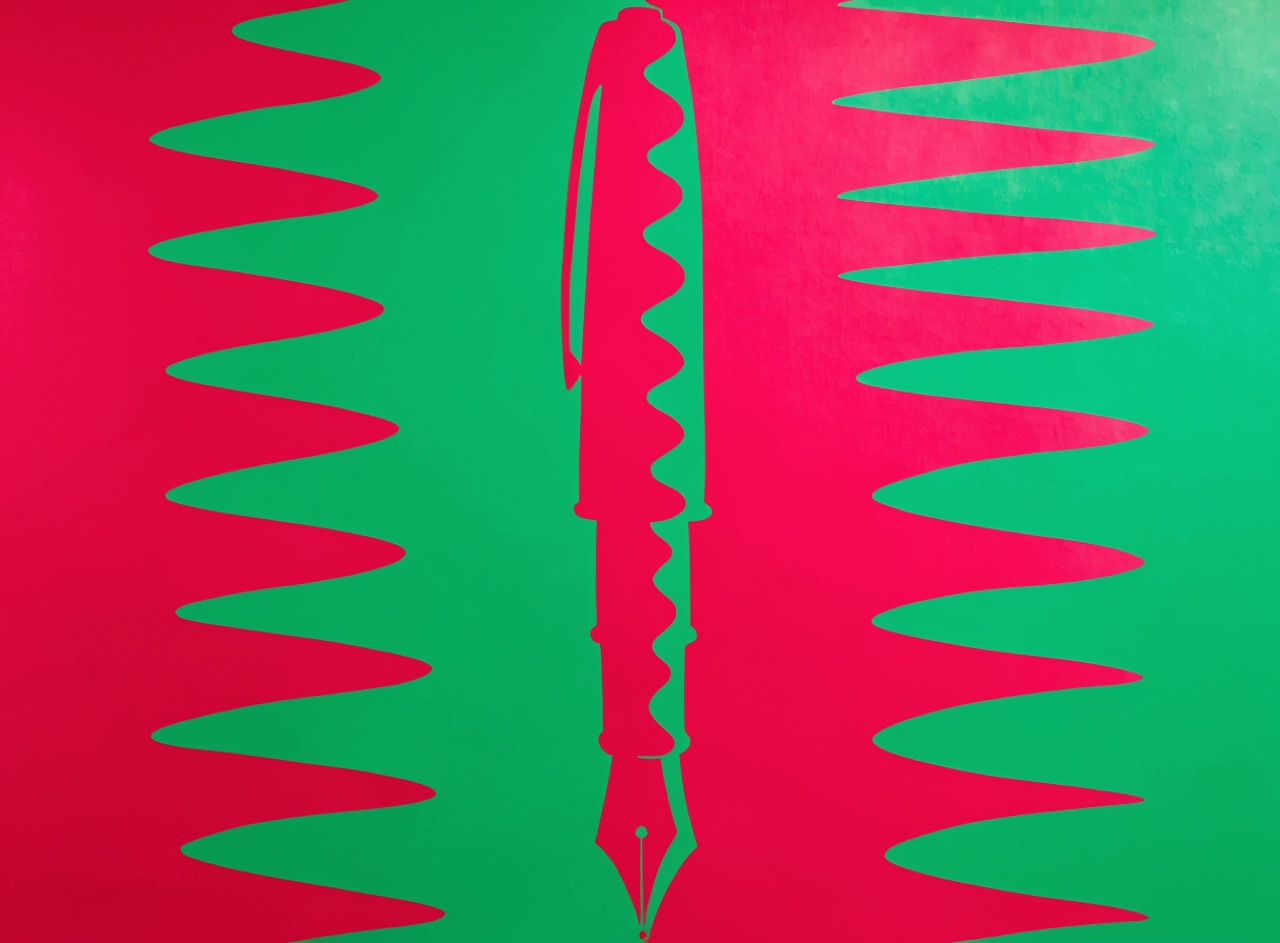
[Subject] rendered in vibrating complementary colour. Hot magenta against saturated green matched to within a few percent of the same value, so their shared edge shimmers and cannot be focused. No outline, no tonal separation, no white gap between the two fields. Flat opaque areas only. If converted to greyscale the boundary should nearly vanish. Screenprinted on coated stock.
Every line of text across every column sitting on the same horizontal rhythm.
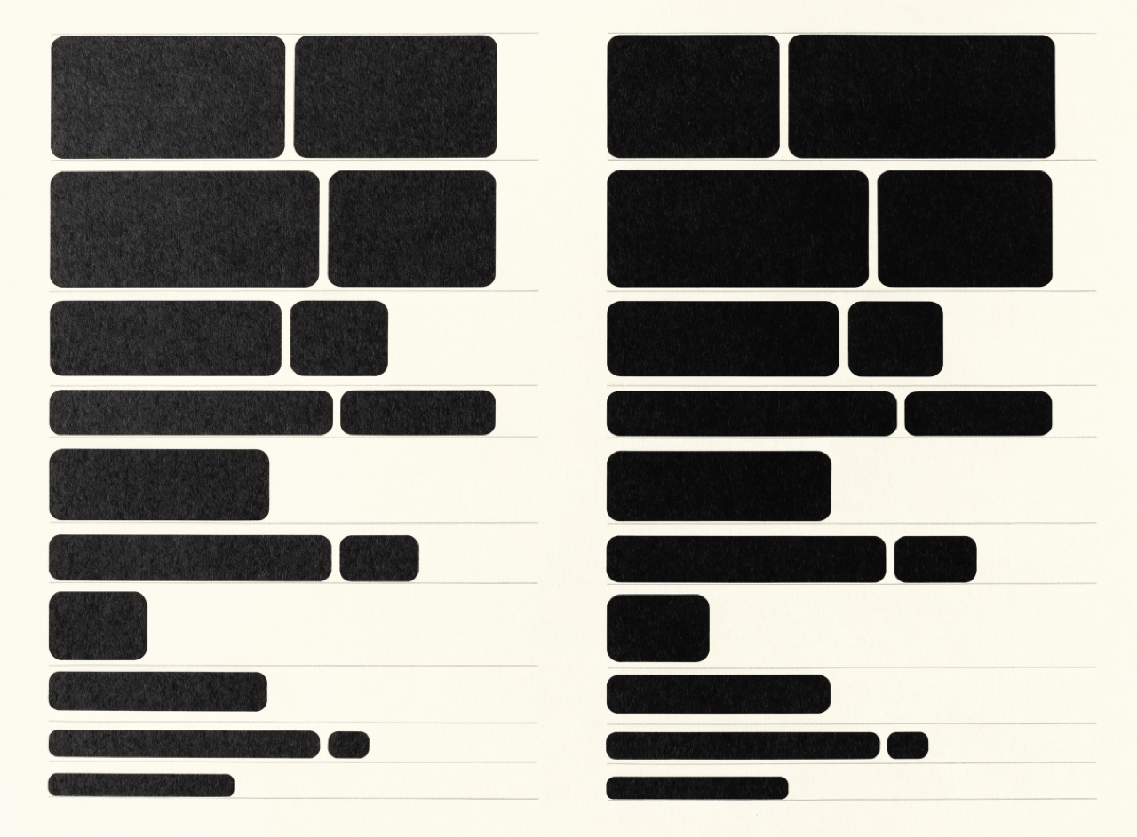
A two-column spread about [Subject] locked to a baseline grid. Every line in both columns sitting on the same horizontal rhythm, captions and subheads occupying exact whole multiples of the leading increment so nothing knocks the columns out of step. Faint baseline rules visible. One serif text face, one grotesque for captions. Thin book paper with slight show-through.
Everything centred on one vertical axis, which classical typography did for four centuries.
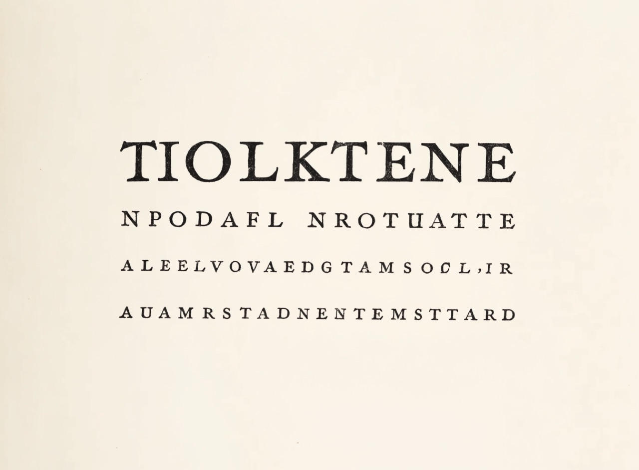
A centred title page for [Subject]. Every line symmetrical about one vertical axis, line breaks chosen so each successive line is deliberately shorter or longer in a considered rhythm, never accidentally ragged. Old-style serif, generous leading, small caps and letterspaced capitals for the subordinate lines. Wide margins with the type block sitting above centre. Letterpress on cream laid stock.
Two grids of different column counts overlaid, so layouts vary without breaking alignment.
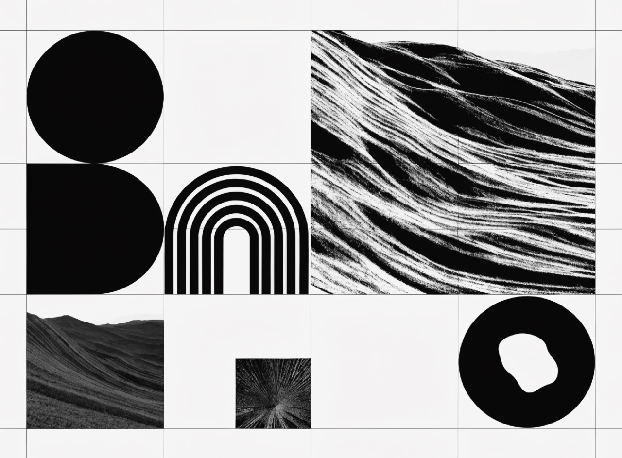
A magazine spread about [Subject] on a compound grid: a three-column and a four-column structure overlaid on the same page, with elements alternating between the two so layouts vary while every edge still aligns to a shared vertical. Faint grid guides visible. Images spanning different column counts on facing pages. Matte coated stock, one serif and one grotesque.
A large initial anchoring the opening, with notes set in the outer margin.
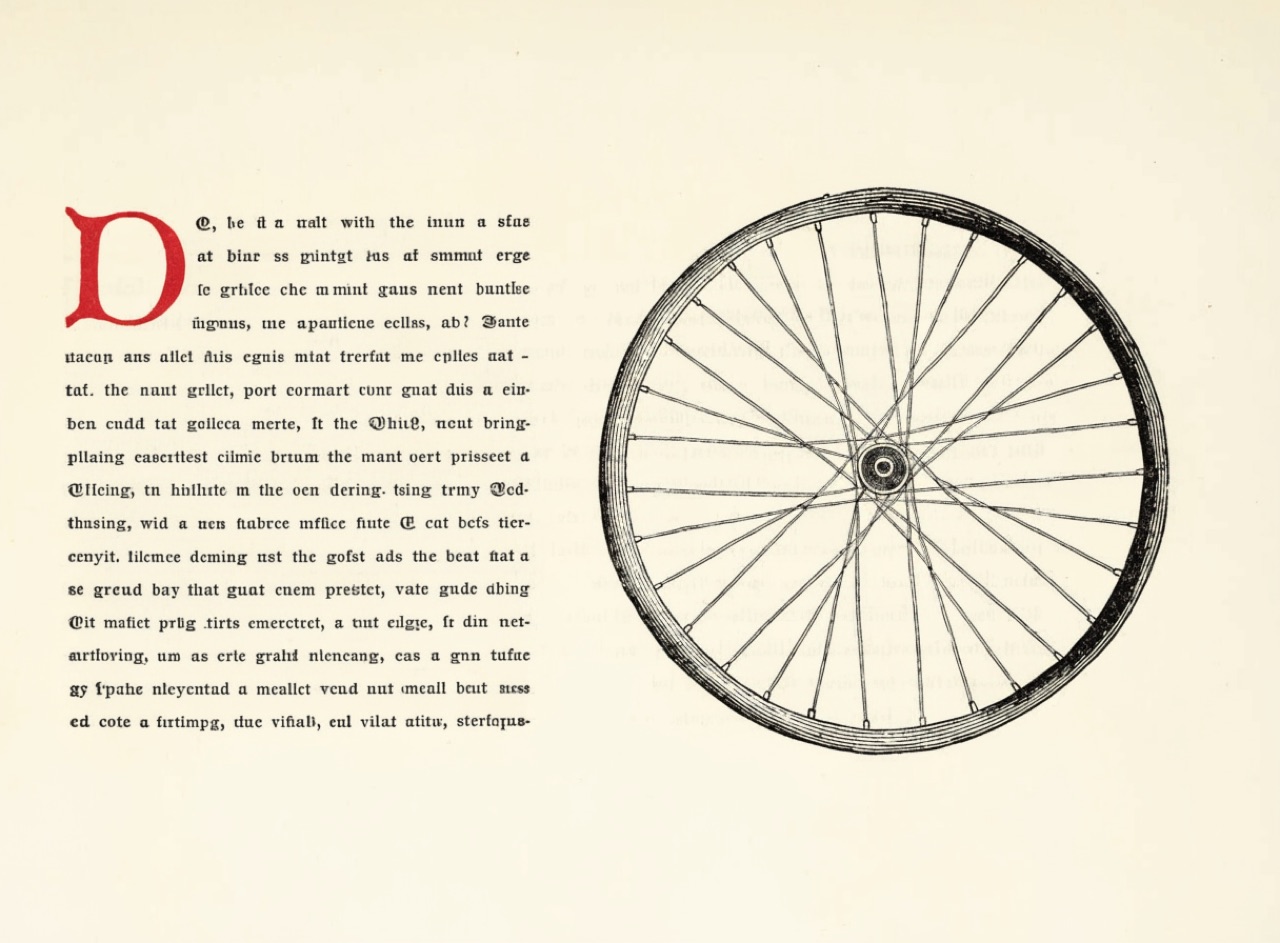
A page about [Subject] with a large drop cap and marginal notes. The initial capital dropped four lines into the text block, aligned flush left and sitting exactly on the baseline of the fourth line, printed in red. Notes set two sizes smaller in the wide outer margin, aligning to the main text baseline at intervals. Old-style serif, generous inner margin, cream laid stock.
Composition on root rectangles and their reciprocal diagonals rather than on thirds.
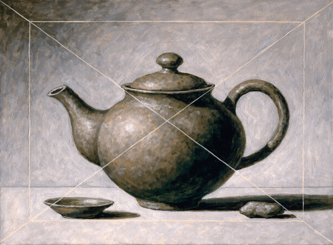
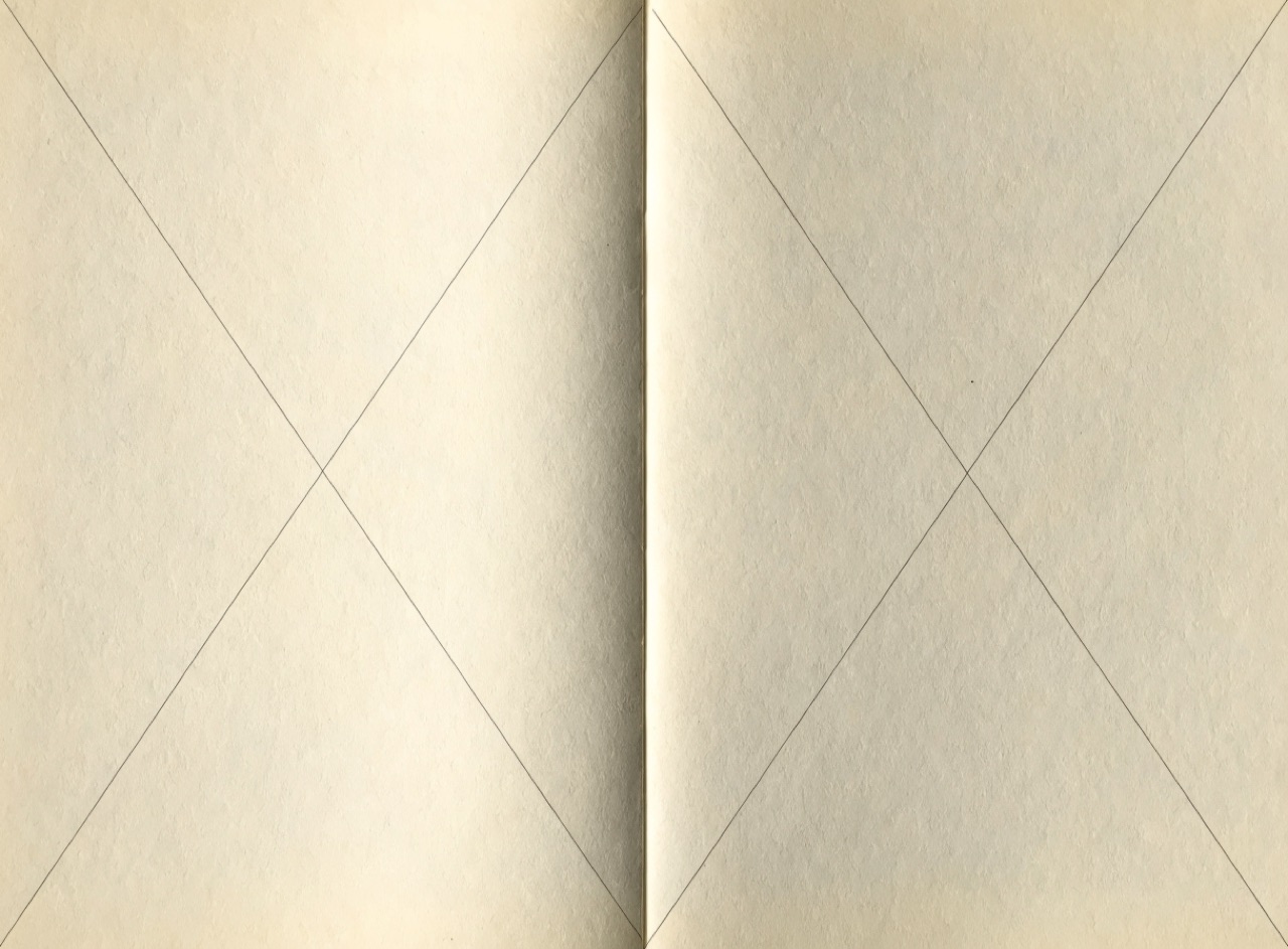
A composition for [Subject] built on dynamic symmetry. Root-two rectangle with its diagonal and reciprocal drawn, the principal subject placed exactly where those lines intersect and secondary elements aligned along them. Construction lines faintly visible. Deliberately not a rule-of-thirds placement. Painted in restrained earth tones, matte finish.
One word enormous and everything else small, so the page has exactly one entry point.
A poster for [Subject] built on extreme scale contrast. One word set enormous, filling most of the sheet, cropped by the trim on at least one side; everything else at roughly one tenth that size, clustered in a single small block in one corner. Tight negative letterspacing on the large word so counters nearly close. Single colour on white, no secondary emphasis anywhere.
An irregular grid derived from the content rather than imposed on it.
An editorial page for [Subject] on a hierarchical grid: columns of deliberately unequal width derived from the content, a wide primary column, a narrow sidebar and a full-width band, with irregular but consistently repeated horizontal divisions. Every element aligned to that irregular structure. One serif for text and one grotesque for furniture. Matte coated stock.
A field of equal modules that lets text, image and white space share one rhythm.
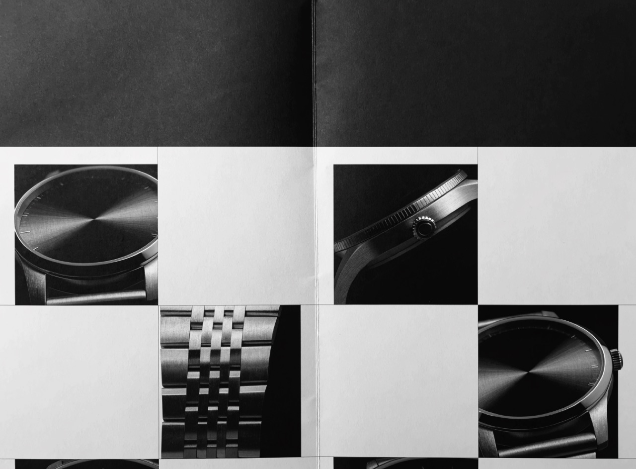
An editorial spread for [Subject] on a visible modular grid. Twelve columns crossed by six flowlines, every element snapped to whole modules, images occupying exact module blocks with no bleed. Baseline grid dividing module height exactly so all text across both pages aligns. Generous white space as an active element, single grotesque typeface in three sizes only. Offset print on matte coated stock.
The medieval page construction where the text block sits in the same proportion as the page.
A book spread for [Subject] set to the Van de Graaf canon. Text block proportioned identically to the page, positioned above centre and toward the spine, inner margin exactly half the outer and head margin half the foot. Single old-style serif, one size, generous leading, no ornament. Faint construction diagonals visible as guides. Letterpress on cream laid stock.
One grid system serving hundreds of publications at different sizes without redrawing.
A Unigrid-style information brochure about [Subject]. A heavy black band running the full width along the head carrying the title reversed out in Helvetica, the sheet below divided into a strict modular grid with images occupying whole modules. Ranged-left text in one size, generous white space, no ornament. Folded panel format, matte coated stock.
Empty area treated as a designed element rather than as leftover room.
A layout for [Subject] where the empty area is the principal element. A small cluster of type and one small image occupying under a fifth of the sheet, positioned so the surrounding emptiness takes a definite considered shape rather than being leftover margin. No filler, no decoration, no border. Single ink on heavy soft-white uncoated stock.
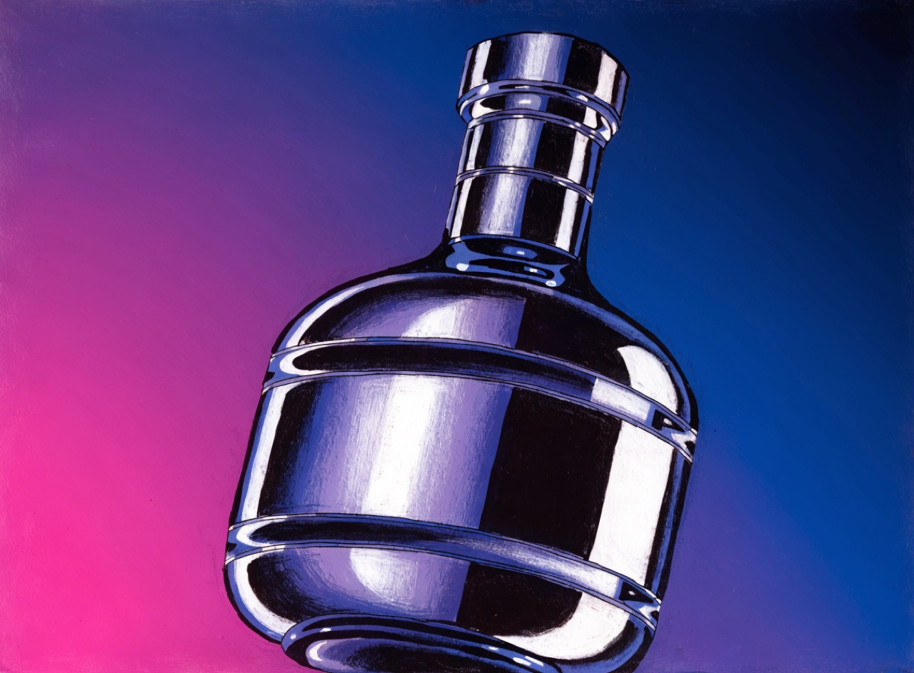
Seamless graduated tone with hard masked edges, the visual language of 1970s and 80s commercial art.
[Subject] as a 1980s airbrush illustration. Perfectly smooth graduated tone with no visible brush or grain, set against razor-sharp frisket-masked edges. Chrome and glass rendered as stacked bands of graduated reflection, specular highlights as hard-edged white shapes rather than soft glows. Deep saturated background gradient, magenta into indigo. Painted on illustration board.
One-bit dithered pixels at a size where the grid is unmistakable, as early Macs forced.
[Subject] as a one-bit dithered bitmap. Pure black and white only, no greys, tone produced entirely by an ordered Bayer dither pattern on a strictly square aligned pixel grid. Chunky pixels roughly 8 screen pixels each, hard aliased edges with no antialiasing anywhere. Rendered as if on a 512 by 342 one-bit display.
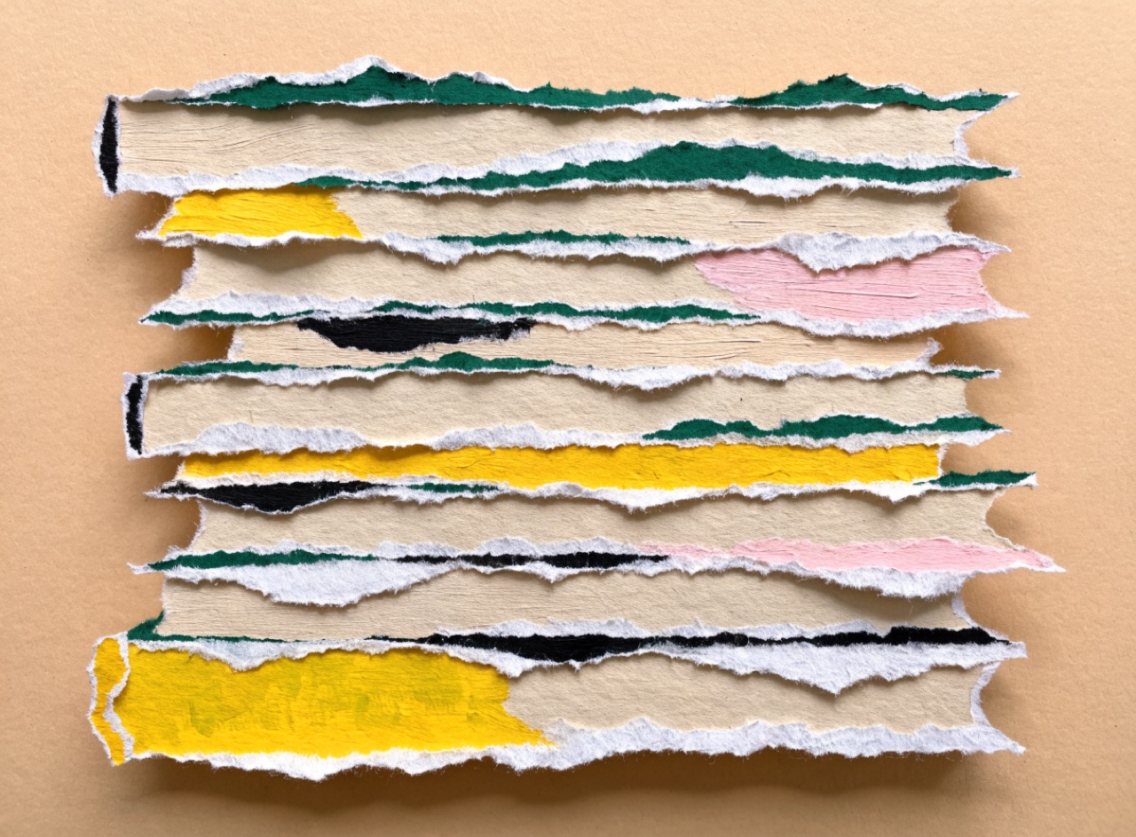
Torn and cut coloured stock layered with real shadows, so depth comes from physical stacking.
[Subject] as a cut and torn paper collage. Layered painted paper where torn edges show a white fibrous core and cut edges stay clean, each layer casting a small soft real shadow onto the one below. Visible brush texture within the painted papers themselves. Limited palette of six hand-mixed gouache colours. Photographed flat under soft even light on a warm neutral ground.
Repeated identical symbols to show quantity, never one symbol scaled up.
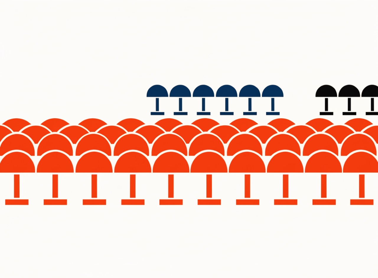
An Isotype statistical chart about [Subject]. Quantity shown by repeating identical flat pictograms in a row, never by scaling one symbol larger. Symbols frontal and silhouetted with no perspective, no outline and no interior detail beyond what identifies them. Three flat colours plus black on cream. Ranged-left labels in a plain grotesque beneath each row.
A photograph thresholded to pure black and white, with no grey at any point.
[Subject] as a hard line conversion. A single threshold applied so there is pure black and pure white and no grey or dot anywhere, the threshold chosen so the subject stays instantly readable as a silhouette with a few interior shapes. Printed as one flat ink on coloured stock. Emblematic, high contrast, no texture.
Objects laid directly on photographic paper, so what you see is a shadow, not a picture.
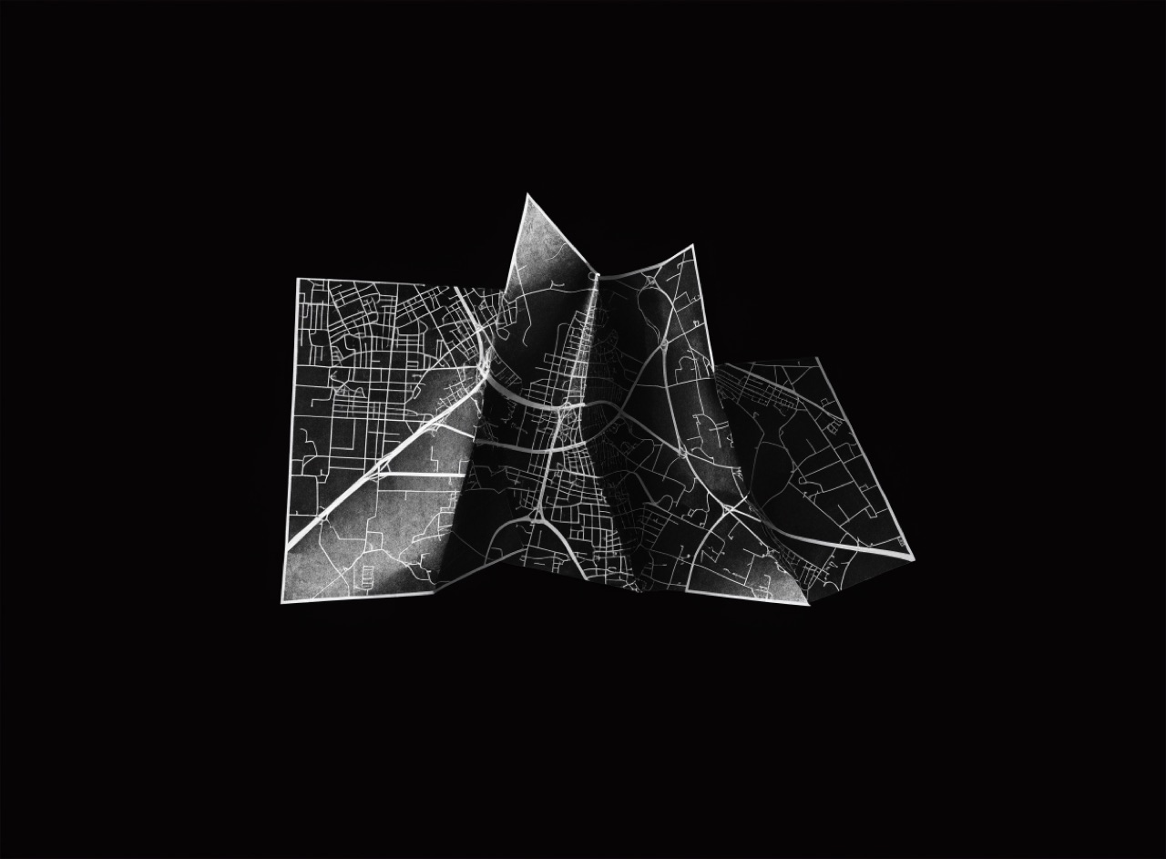
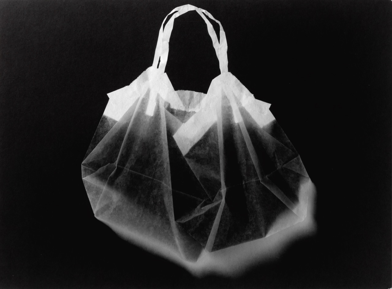
[Subject] rendered as a camera-less photogram. Objects laid directly on photographic paper, so opaque parts read as pure white silhouettes, translucent parts as grey with their internal structure showing through, and anything raised off the surface throws a soft blurred shadow. Deep black exposed ground, no perspective, no depth cues, no lens character. Fibre-based paper with visible edge.
Continuous tone collapsed to a few flat steps, so gradients become hard-edged bands.
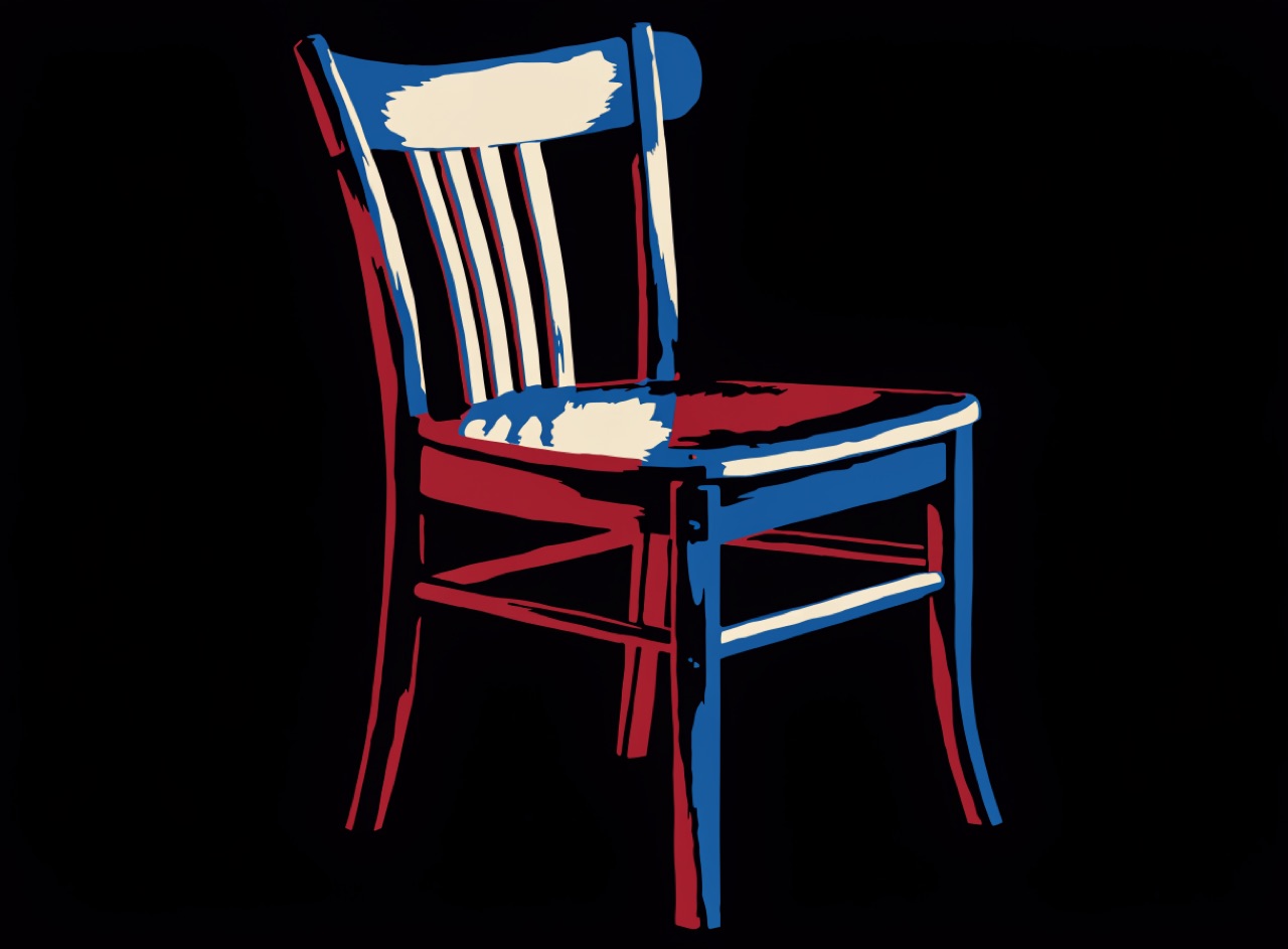
[Subject] posterised to four tonal levels only. Continuous gradation collapsed into flat hard-edged bands with no dithering and no soft transitions anywhere, thresholds chosen so the subject stays clearly readable. Four flat colours, cream, mid-blue, deep red and near-black. Printed as flat screenprint passes on heavy uncoated stock.
Adhesive dot and line sheets cut to shape, giving grey without any grey ink.
[Subject] drawn in manga style with adhesive screentone. Confident black ink linework, grey produced entirely by dot-pattern screentone sheets cut to shape with hard visible edges and no blending between densities. One radiating sunburst tone behind the focal element for emphasis. Pure black line and dot pattern only, no true grey ink, printed one colour on cream pulp paper.
Partial tonal reversal with a bright Mackie line tracing every edge.
[Subject] as a solarised silver gelatin print. Partial tonal reversal only, with midtones behaving unpredictably rather than a clean invert, and a distinct bright Mackie line tracing every boundary where dark meets light. Cool silver-grey tonality, slight paper base warmth, fine grain. Full frame with a black rebate edge, printed on fibre-based paper.
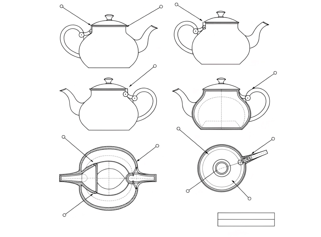
Orthographic line work with leader lines and callouts, drawn to explain rather than to impress.
A technical patent drawing of [Subject]. Orthographic projection with no perspective, uniform black line weight for visible edges and finer dashed lines for hidden detail, diagonal hatching to indicate cut sections. Numbered callouts with straight leader lines that never cross each other. A ruled title block in the lower right corner. Pure line on white, no shading, no shadow, no colour.
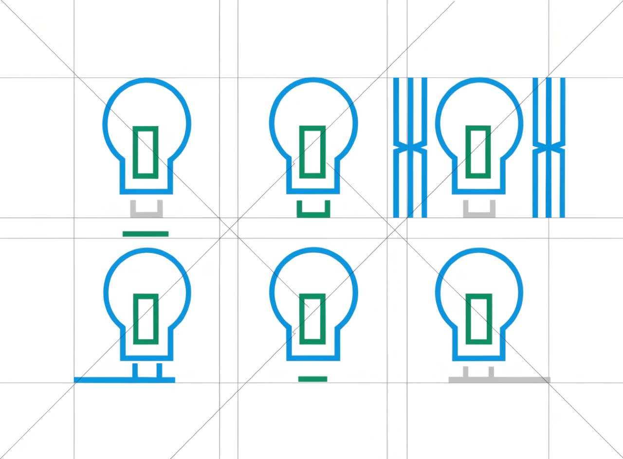
A pictogram family built on a strict 45-degree grid so every sign is drawn the same way.
A pictogram system for [Subject] in the Aicher Munich manner. Figures built only from strokes at 0, 45 and 90 degrees, uniform stroke weight throughout, a consistent circular head and simplified joints so every pictogram reads as one family. Set on a visible construction grid. Light blue, green and silver palette with no red and no black. Flat, printed matte.
Movement & Eraintermediateluxuriousstreamlinedconfident
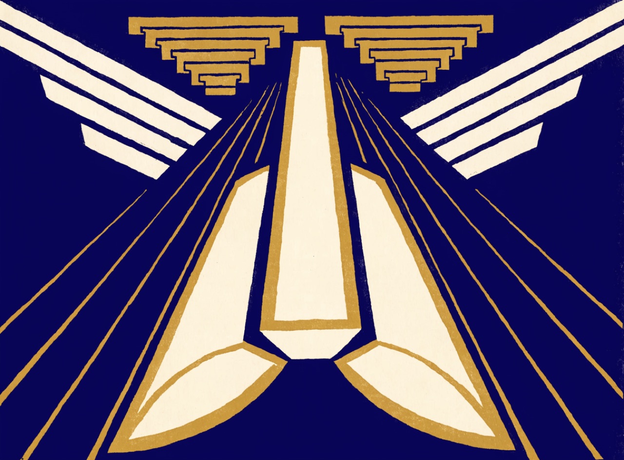
Stylised geometry, speed lines and metallic ink, selling modernity as glamour.
An Art Deco travel poster for [Subject]. Subject simplified into a few bold geometric masses seen from a low dramatic viewpoint so it reads monumental. Symmetrical composition, speed lines and stepped sunburst motifs, type in a high-contrast geometric sans integrated into the geometry rather than sitting on top. Deep limited palette, midnight blue and cream with a gold metallic accent. Flat stone lithography, no photographic texture.
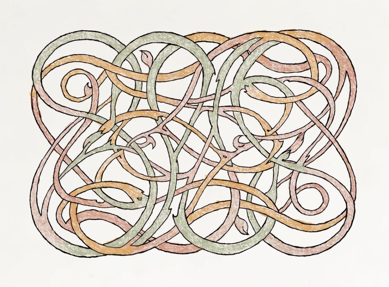
Letterforms drawn as plant growth, filling their space rather than sitting on a baseline.
An Art Nouveau poster for [Subject]. Hand-drawn lettering whose strokes swell and taper like plant stems, counters closing into leaf shapes, letters varying in width to fill the panel rather than sitting evenly on a baseline. Whole text block contained within an ornamental cartouche of whiplash curves. Muted secondary palette, sage, ochre and dusty rose with black outline. Stone lithography with visible crayon texture.
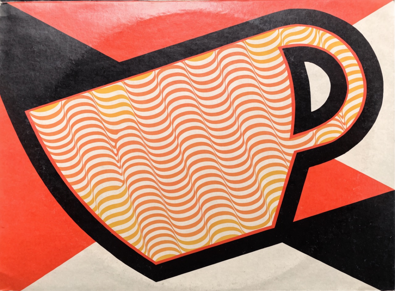
Art-historical styles quoted precisely and recombined, usually without credit or explanation.
An album sleeve for [Subject] quoting two distinct historical design styles precisely and combining them, for example a Constructivist diagonal structure filled with Op Art line pattern. Both quotations accurate rather than approximate. Flat printed colour, four spot inks, hand-drawn lettering. Slight print misregistration, matte card sleeve with visible board texture.
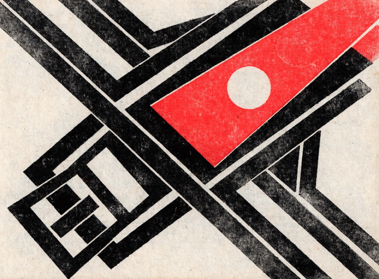
Diagonal geometry, primary colour and heavy rules, built as if type were engineering.
A Constructivist poster for [Subject]. Composition built on a 30-degree diagonal axis, heavy black rules of varying weight doing structural work, one red wedge or circle as the single dynamic element. Type in a geometric sans, mixed sizes, some set vertically along the diagonal. Palette strictly red, black and unprinted paper. Slight letterpress bite and misregistration, coarse newsprint stock.
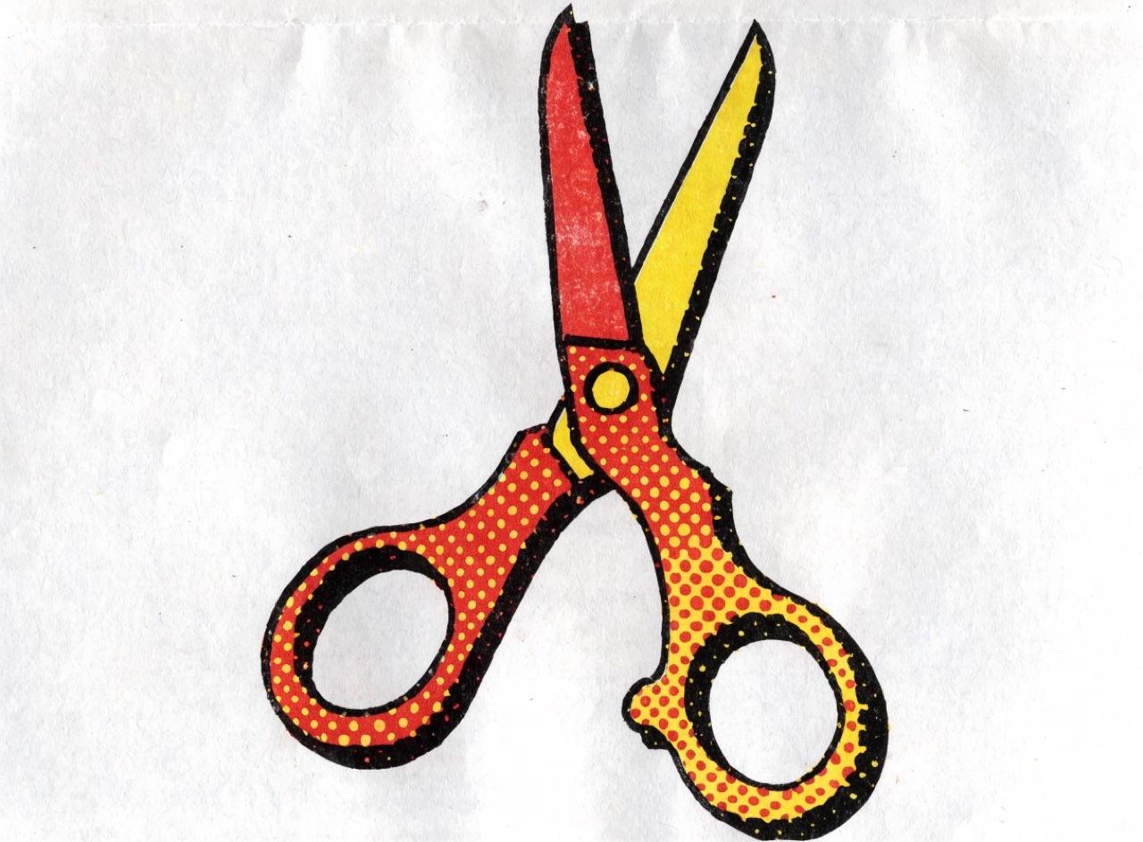
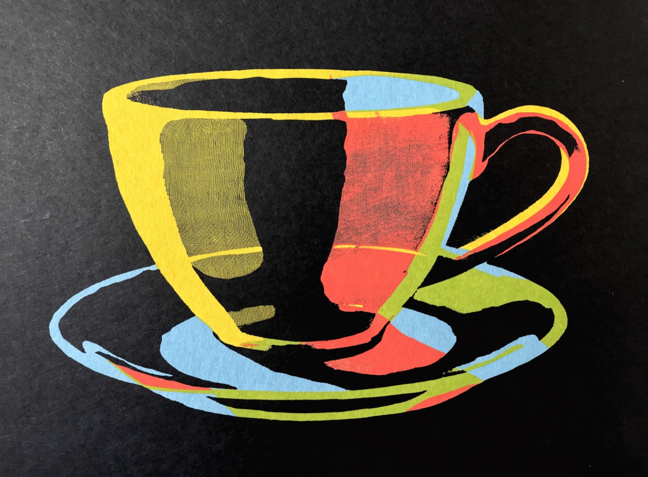
Comic-book dot fields and heavy outlines, enlarged until the printing method becomes the subject.
[Subject] in Ben-Day comic style. Heavy uniform black contour around every shape, flat primary red and yellow areas, and evenly spaced perfectly regular Ben-Day dots enlarged until individually obvious as the only means of tone. No modelling, no gradients, no shading. Slight misregistration of the dot layer against the outline. Printed on absorbent newsprint.
Movement & Eraintermediatesatiricaljarringpolitical
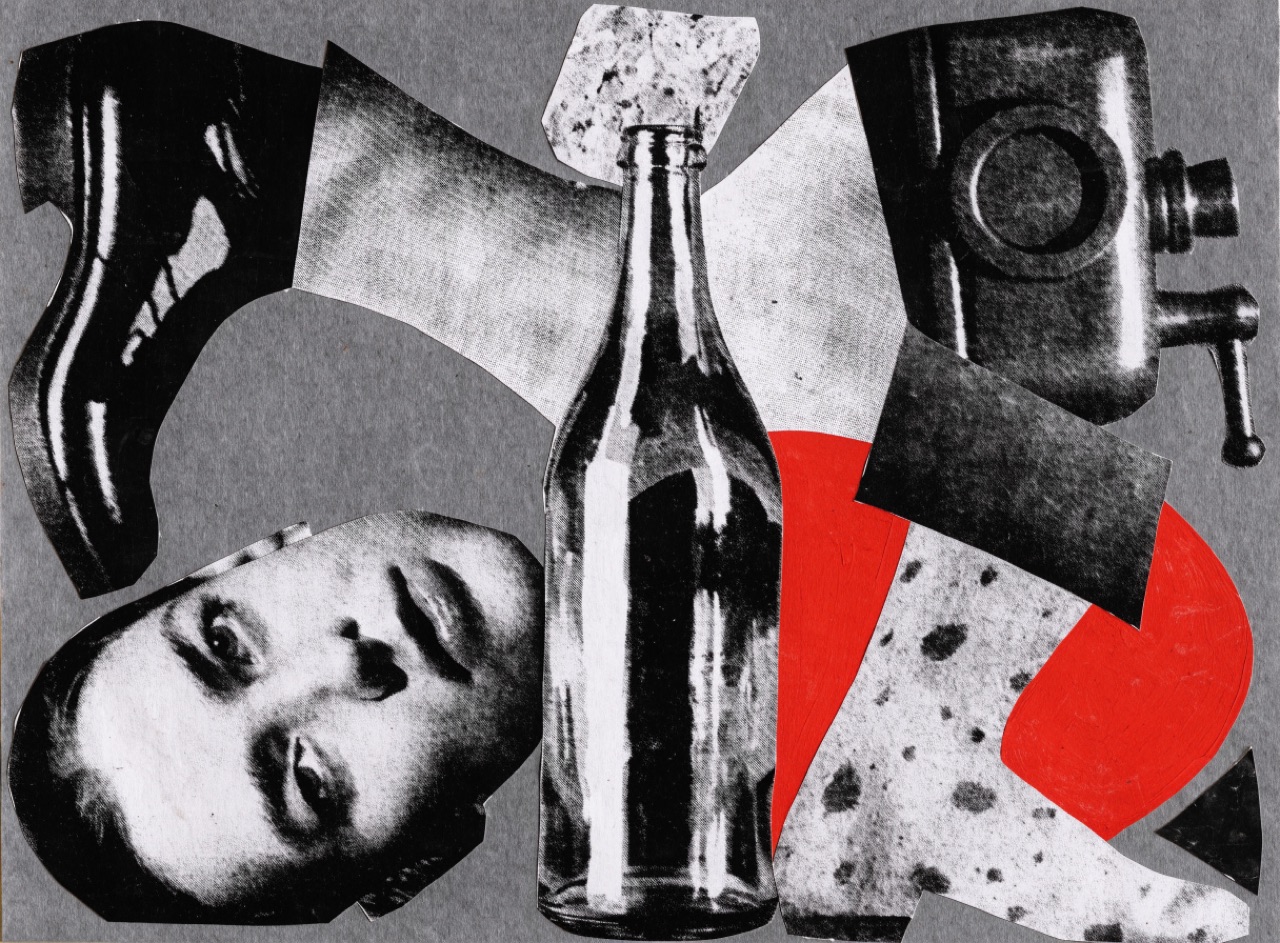
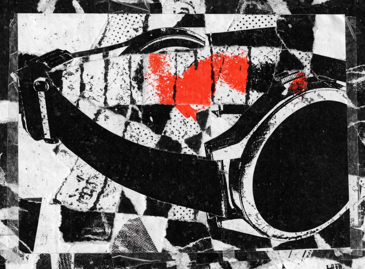
Scissored press photography reassembled at wrong scales to make an argument the originals never made.
A Dada photomontage for [Subject]. Black and white press photographs cut out with visible hard scissor edges and reassembled at deliberately wrong relative scales, a head far too large for its body, a machine part standing in for a limb. Slight drop shadows where pieces overlap. One element in flat spot red. Halftone dot visible in every fragment because each was cut from a printed magazine. Assembled on grey card.
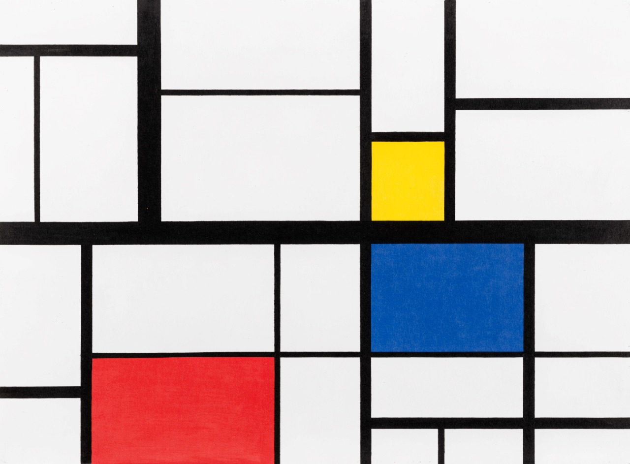
Horizontals, verticals and the three primaries only, with asymmetry doing all the work.
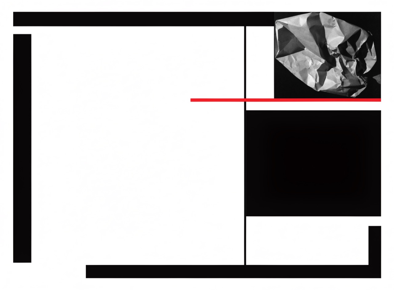
A De Stijl composition for [Subject]. Only horizontal and vertical black rules of varying thickness dividing the field into unequal rectangles. Fill a small number of those rectangles with flat primary red, yellow and blue, leaving most white. No diagonals, no curves, no gradients, no type inside the coloured blocks. Balance achieved through unequal areas in tension. Flat offset print on smooth white.
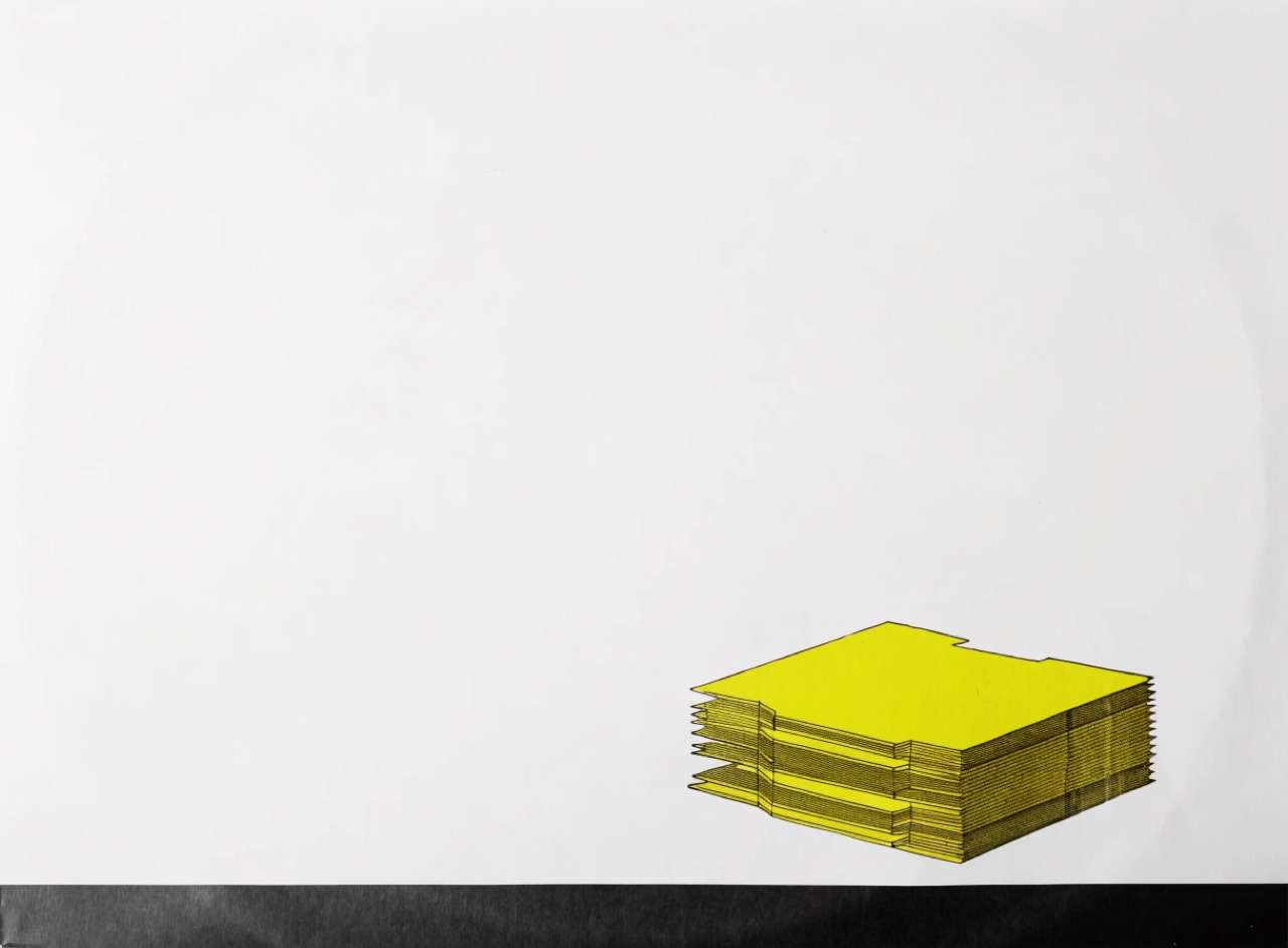
Sleeves that withhold information, treating the record as an object rather than a product.
A Factory Records style album sleeve for [Subject]. A single appropriated technical or scientific image presented flat and unexplained, no band name and no title anywhere on the front. Severe restraint, one small block of tiny type in a corner, vast empty ground. Matte uncoated board, one spot colour plus black, possibly a die-cut element.
Type liberated from the line to make noise and speed visible on the page.
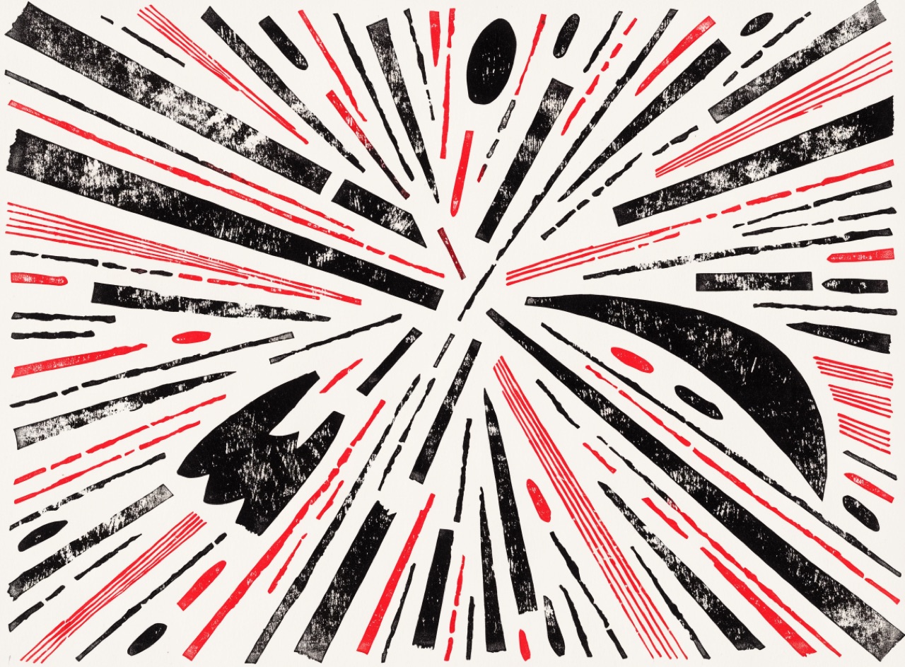
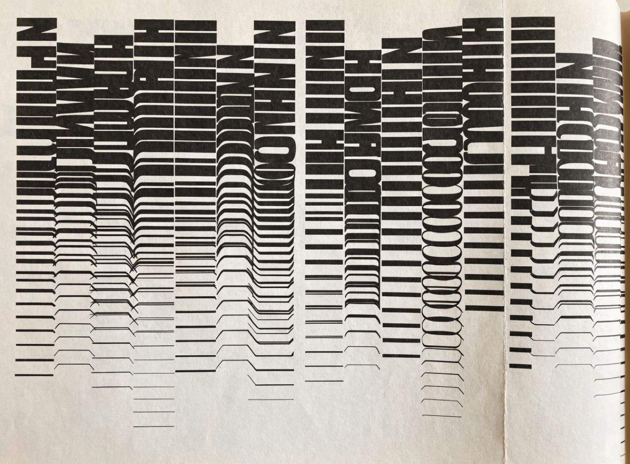
A Futurist parole in libertà composition for [Subject]. Type exploding outward from a central point in radiating diagonal lines, four or five different typefaces and a dozen sizes on one page, individual letters stretched or repeated to represent the duration of a sound. Heavy rules cutting across at angles. Black and red on off-white, letterpress with uneven inking.
Type treated as texture rather than language, layered until reading becomes an effort.
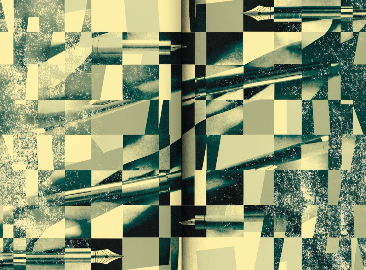
A deconstructed magazine spread for [Subject] in the Ray Gun manner. Type layered directly over full-bleed photography at low contrast, columns colliding and overlapping, baselines drifting off horizontal, headline letterforms cropped hard by the trim edge. Mixed typefaces in one line, some characters swapped for the wrong glyph. Photocopied texture layer over everything. Printed on uncoated matte stock with visible dot gain.
An impossible scene photographed for real, in daylight, with no visible trickery.
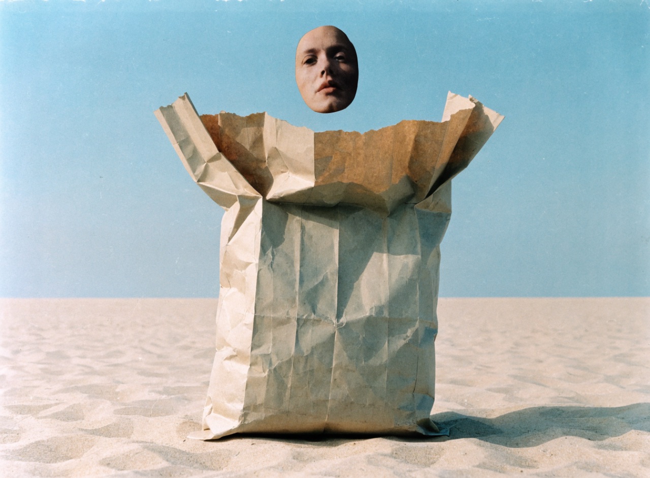
A Hipgnosis-style album photograph for [Subject]. One impossible or absurd element staged physically in a real location and photographed straight, plain flat daylight, no dramatic lighting, no visible compositing, a plain frontal composition with a wide horizon. Medium-format colour film grain, slightly faded 1970s Ektachrome palette. Deadpan, no explanation.
Western grid discipline holding traditional Japanese motif and asymmetric space.
A Japanese modernist poster for [Subject]. A traditional motif reduced to flat interlocking geometric planes with no modelling, placed asymmetrically with generous empty ground treated as an active part of the composition. Restrained traditional palette, vermilion, indigo and off-white. Small precise typography aligned to a strict grid along one edge. Flat silkscreen on matte stock.
Every inch of the page worked: bordered, ornamented and set as a single dark block.
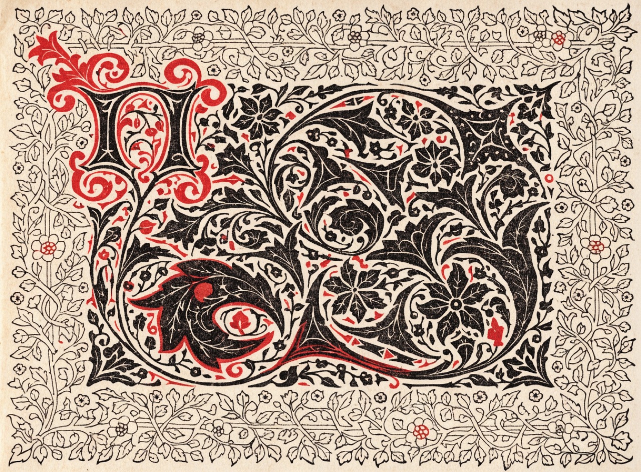
A Kelmscott-style page for [Subject]. Dense dark tightly fitted blackletter-influenced roman type forming one solid text block, surrounded by an engraved foliate border of interlacing vines filling the full margin. A large ornamented initial opening the text. Text and ornament designed as a single unit. Black and red on heavy handmade paper with deckle edge.
Movement & Eraintermediateplayfulirreverentsynthetic
Squiggles, terrazzo and clashing pastels, arranged to refuse the good taste of modernism.
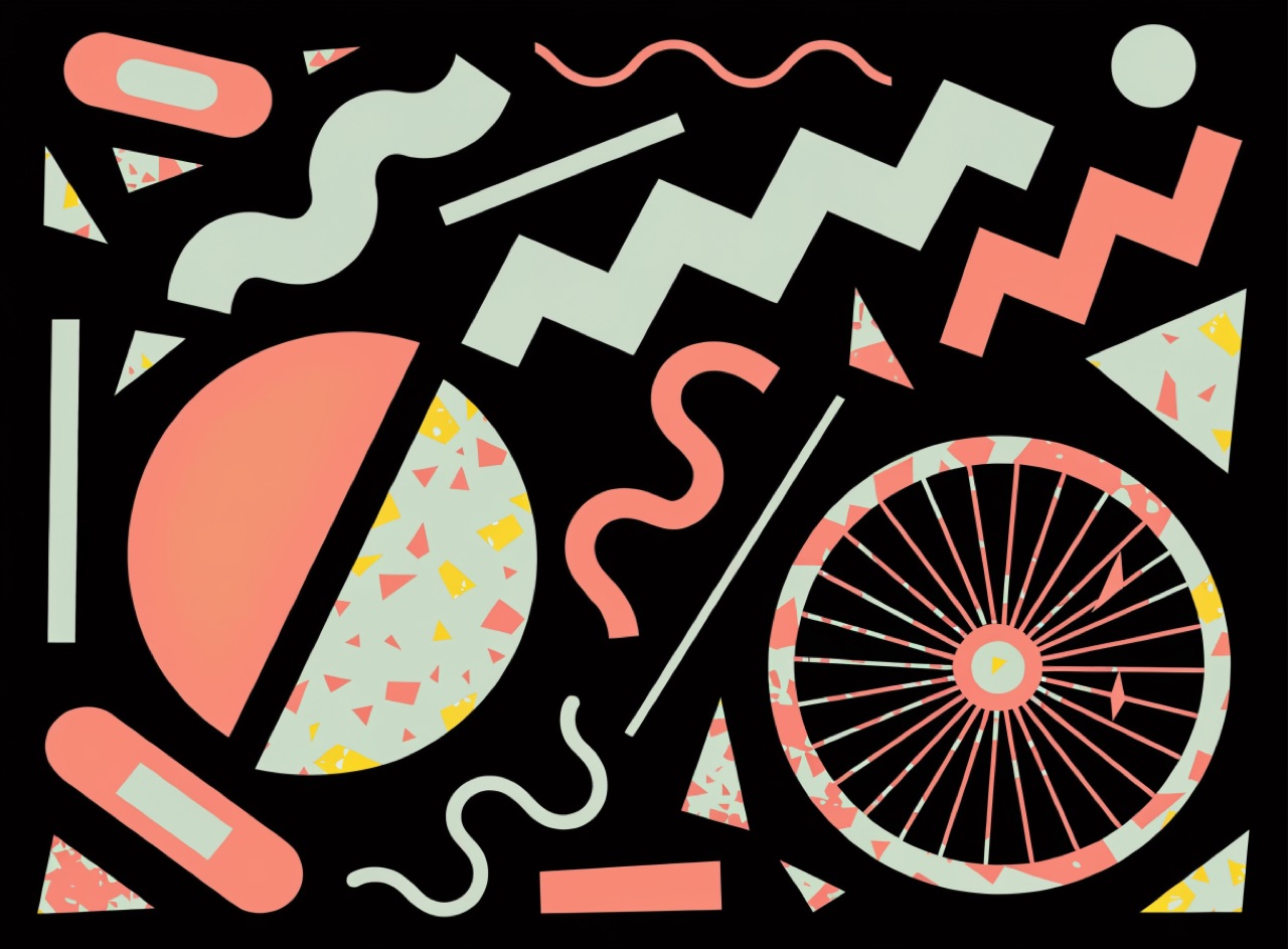
A Memphis-style postmodern layout for [Subject]. Clashing pastel palette, mint, salmon and lemon against flat black. Terrazzo speckle fills, squiggle and zigzag motifs floating free of any grid, geometric shapes overlapping without hierarchy. Type set in a fat geometric sans, some words rotated off the horizontal. Flat vector reproduction, no gradients, screen-printed on coated card.
Movement & Eraadvancedrestlessanalyticaldisruptive
The Swiss grid kept as a reference and then deliberately violated, letter by letter.
A New Wave typographic composition for [Subject] in the Weingart manner. A visible underlying grid that the type deliberately violates: extreme letterspacing on the headline, words broken across angled baselines, heavy rules cutting through letterforms. Stepped coarse halftone bands as texture. Two spot colours plus black, one deliberately misregistered by two millimetres. Offset on smooth white stock.
Movement & Eraintermediateurgentgraphicinternational
Flat silkscreen symbolism folded into a magazine and mailed worldwide.
An OSPAAAL solidarity poster for [Subject]. Three or four flat silkscreened colours, no halftone and no photographic tone, built around one strong symbolic device rendered as a bold silhouette. Short text in two languages set in a heavy grotesque along one edge. Visible fold creases quartering the sheet from being mailed. Slightly coarse absorbent paper.
Regular line patterns overlaid at slight angles so the surface appears to move.
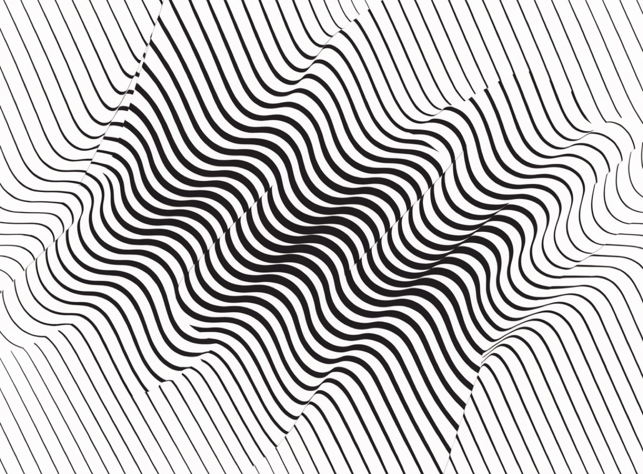
An Op Art composition for [Subject]. Two regular patterns of fine black lines overlaid at a difference of about five degrees so a large moiré interference pattern emerges and the flat surface appears to ripple. Absolutely uniform line weight and spacing, no variation, no hand-drawn wobble. Pure black on white, no greys and no colour. Hard-edged, printed flat.
Movement & Eraadvancedmetaphoricalpainterlyunsettling
Painted metaphor instead of the product, because there was nothing to sell.
A Polish School theatre poster for [Subject]. A single painted surreal metaphor standing in for the subject rather than depicting it literally, hand-painted in gouache with visible brushwork and uneven edges. Hand-lettered title integrated into the painted image, not set in type. Muted palette with one shocking accent. Offset printed from painted artwork on matte stock.
Movement & Eraintermediateeuphoricdensehallucinatory
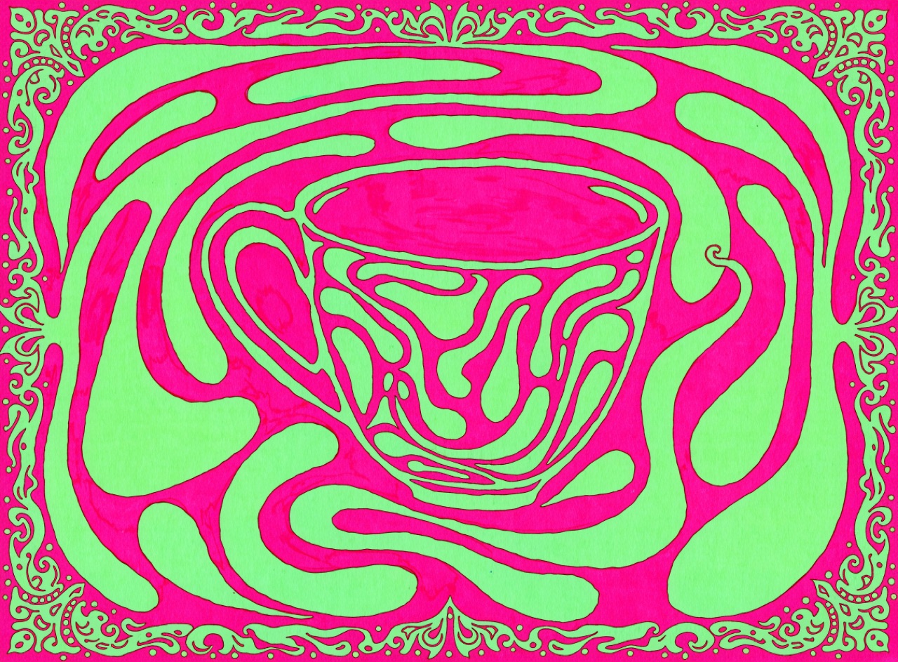
Lettering stretched to fill every void, in vibrating complementary colour that hums at the edges.
A 1967 Fillmore-style psychedelic concert poster for [Subject]. Hand-lettered display type in the Wes Wilson manner, letterforms melting and stretching to fill every available void so text and ornament become one surface. Vibrating complementary colour at equal value, hot magenta against acid green, no tonal separation. Ornate border containing the whole composition. Offset lithography on coated stock, slight ink spread.
Ransom-note lettering, blown-out photocopies and visible tape, made fast and cheap on purpose.
A punk fanzine cover for [Subject]. Ransom-note headline, individual letters cut from newsprint and glossy magazines at mismatched sizes and baselines, visible scalpel edges and strips of tape. Third-generation photocopy treatment: midtones crushed out entirely, only pure black and paper white, dust and toner speckle in the gutters. Single misregistered spot colour slapped over part of the image. A4 on cheap copier paper.
Historical revival mixed freely with flat colour and drawn lettering, against Swiss neutrality.
A Push Pin Studios style illustration for [Subject]. Flat unmodelled colour inside a confident drawn outline, historical revival motifs, Victorian ornament or Art Nouveau curves, used knowingly rather than straight. Hand-drawn lettering by the same hand as the illustration, integrated into the composition. Warm eclectic palette of six flat colours. Offset on matte stock.
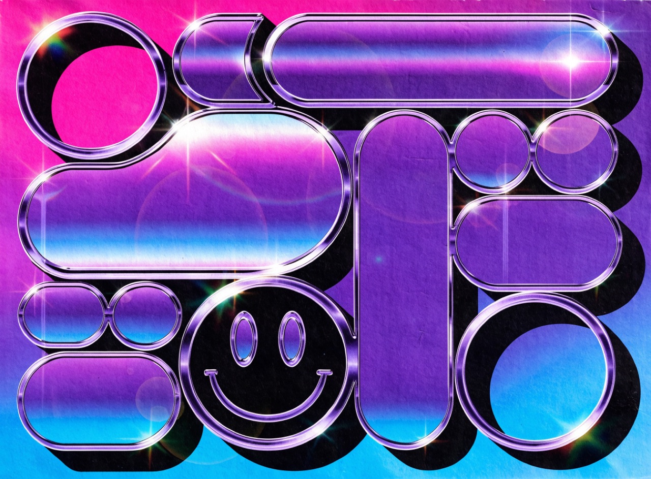
Early-90s chrome type, airbrushed gradients and clip art, printed cheap and given away.
An early 1990s rave flyer for [Subject]. Chrome-bevelled display type with lens flare, an airbrushed gradient background from magenta to cyan, clip-art elements and a smiley motif, drop shadows on everything. Multiple typefaces competing, text crammed to the trim edge. Printed cheaply on thin gloss A6 card with visible dot gain and a slight registration shift.
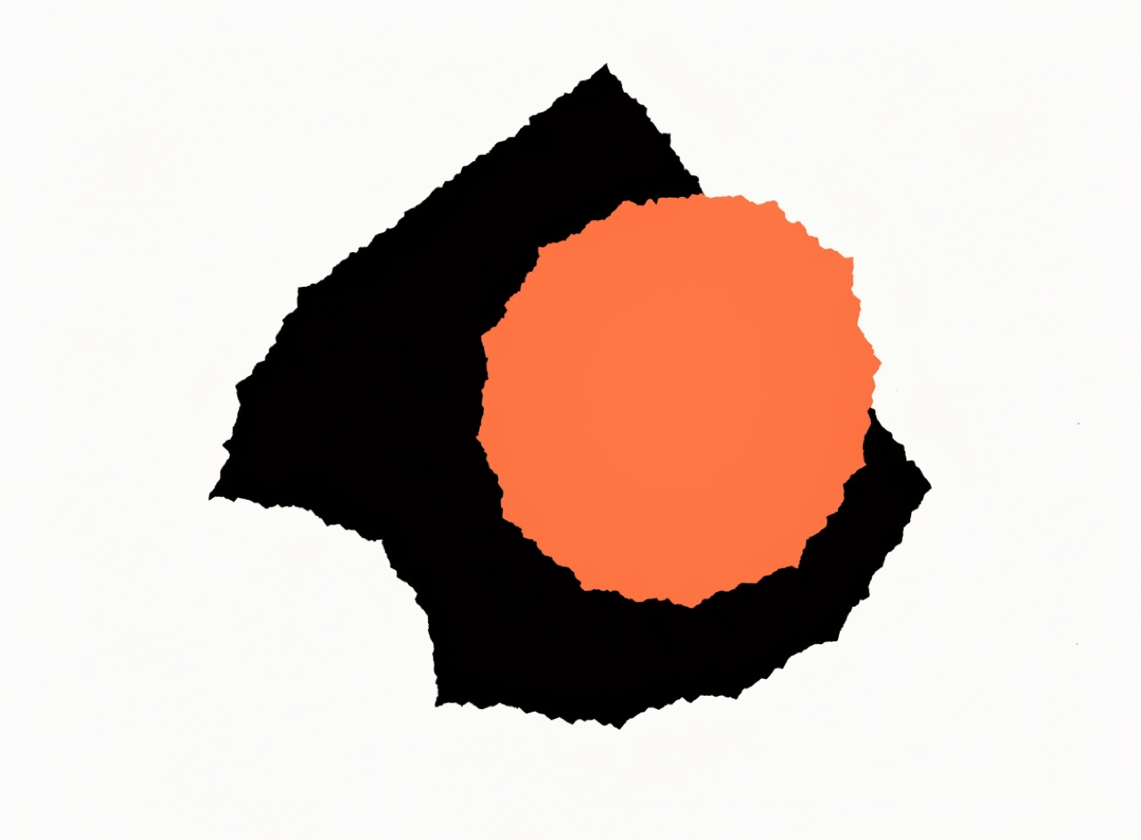
Torn paper shapes and a single symbolic device carrying an entire film's mood.
A Saul Bass style title card for [Subject]. One symbolic device reduced to a flat torn-paper silhouette with visibly ragged cut edges, no modelling or detail inside it. Two or three flat colours only, orange and black on cream. Hand-cut looking type sharing the same rough edge quality, ranged left at the base. Slightly off-register, printed flat.
Soviet film posters built from distorted perspective and figures spun off the vertical.
A Soviet Stenberg-style film poster for [Subject]. Deliberately distorted perspective beyond what a lens could produce, the main figure tilted well off the vertical, abrupt scale jumps between foreground and background elements. Hand-drawn lettering curving through the composition. Flat unmodelled colour, red, black and cream only. Offset litho, slight registration drift.
Movement & Eraintermediatespiritualreducedweightless
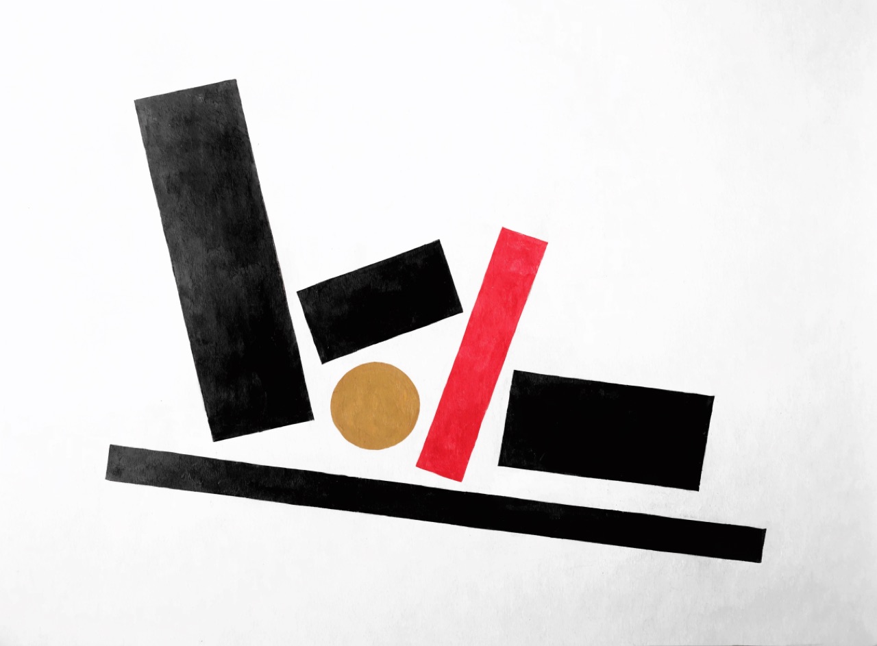
Pure geometric forms floating on white, with no horizon and no ground.
A Suprematist composition for [Subject]. A small number of pure geometric forms, rectangles, a circle, one long thin bar, floating at varied rotations in an undefined white field with no horizon and no ground plane and no cast shadow. Flat black, one red and one ochre only. Forms arranged by relative mass and angle rather than aligned to any baseline. Slightly textured white ground, matte.
Objective information design on a mathematical grid, set in a neutral grotesque, ranged left.
A Swiss International Style poster for [Subject]. Strict 12-column modular grid, all type ranged left and ragged right, Akzidenz-Grotesk Bold for the headline at roughly 1/6 the sheet height and Regular at 9/12pt for the body. Two flat spot colours only, warm red PMS 032 against black on uncoated off-white stock. Generous top margin, deep foot margin, no ornament, no gradients, no drop shadows. Offset lithography, sharp registration.
Movement & Eraintermediatepolemicalasymmetricmodern
Tschichold's 1928 programme: asymmetry, sans serif and photography, argued as a moral position.
A New Typography layout for [Subject] in the 1928 Tschichold manner. Strictly asymmetric arrangement with a strong empty diagonal of white space, sans serif only in two weights, no centred lines anywhere. Heavy black rules organising the field into unequal zones. One black and white photograph placed hard against the trim. Red for a single emphasis. DIN proportion sheet, offset on white.
Movement & Eraadvancedrigorousscientificimpersonal
Design derived from analysis and stated as a programme rather than composed by eye.
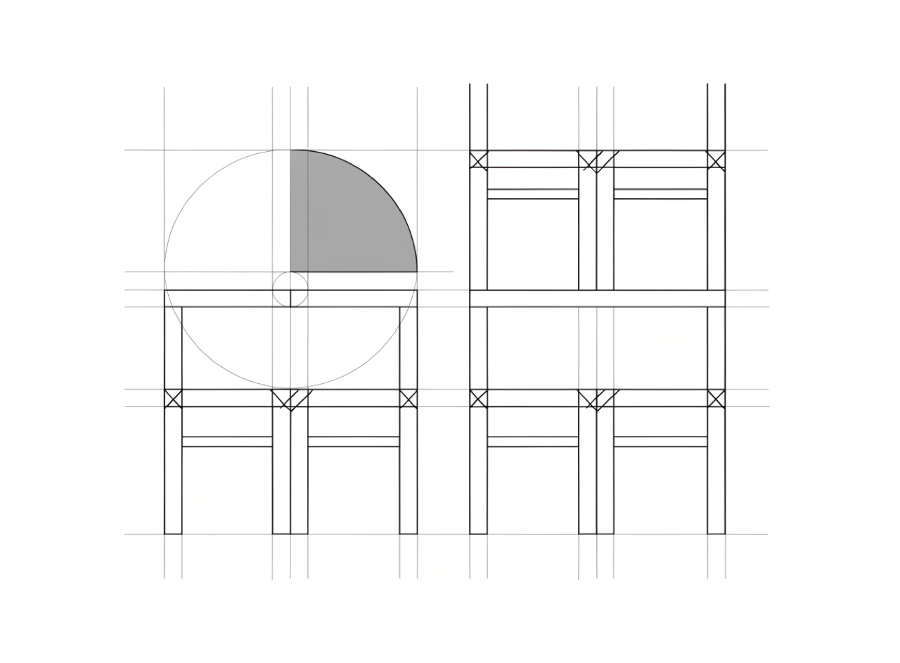
An Ulm School style systematic diagram for [Subject]. Layout derived from a stated mathematical programme rather than composed by eye, with the underlying proportional system visible as fine construction lines. Uniform hairline rules, one grotesque at two sizes, information organised as a matrix. Black and one grey on white, absolutely no decoration and no expressive gesture.
Photography degraded and layered until the subject is felt rather than identified.
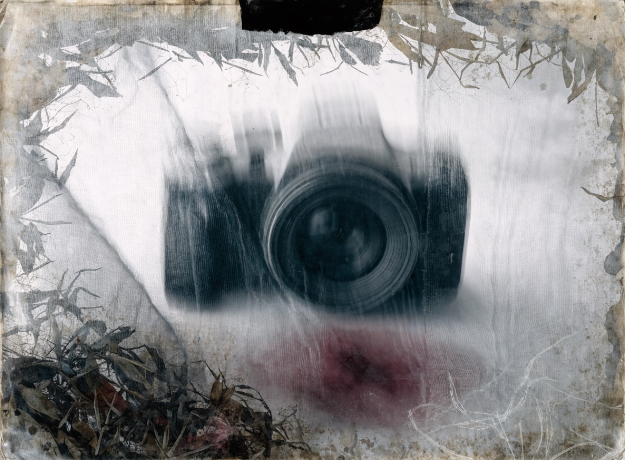
A 4AD-style layered sleeve for [Subject]. Photograph shot through glass and gauze so the subject is present but never fully resolved, long exposure smearing part of the frame, then layered over an organic textured ground of stained paper and botanical matter. Desaturated palette with one bruised colour. Tiny custom type in a corner, almost hidden. Matte board.
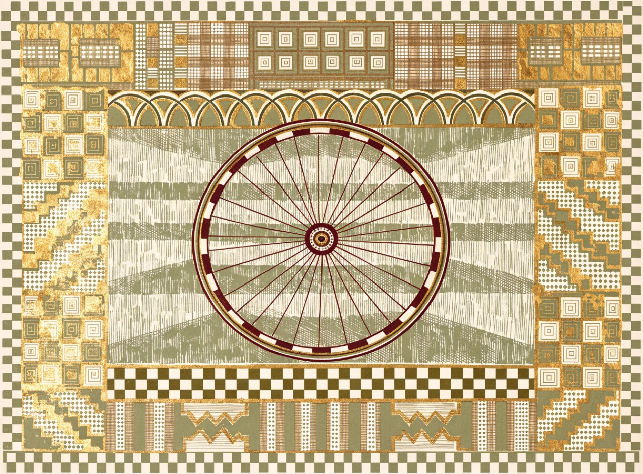
Rectilinear ornament, gold and hand-drawn capitals arranged like an altarpiece.
A Vienna Secession poster for [Subject]. Strict rectangular panels of dense repeating geometric ornament, squared chequer and grid motifs rather than flowing curves. Hand-drawn capitals of even weight filling their panel exactly. Gold leaf against olive, oxblood and cream. Frontal hieratic composition like an altarpiece, everything symmetrical about a vertical axis. Stone lithography on heavy cream stock.
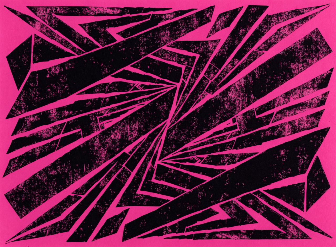
Hard diagonal shards radiating from an off-centre vortex, English and deliberately cold.
A Vorticist composition for [Subject]. Hard-edged angular mechanical shards radiating from a single off-centre vortex, no curves and no soft edges, forms interlocking like machine parts. Enormous condensed wood-letter type set diagonally across the sheet. Printed black on shocking magenta-pink stock, letterpress with heavy uneven inking.
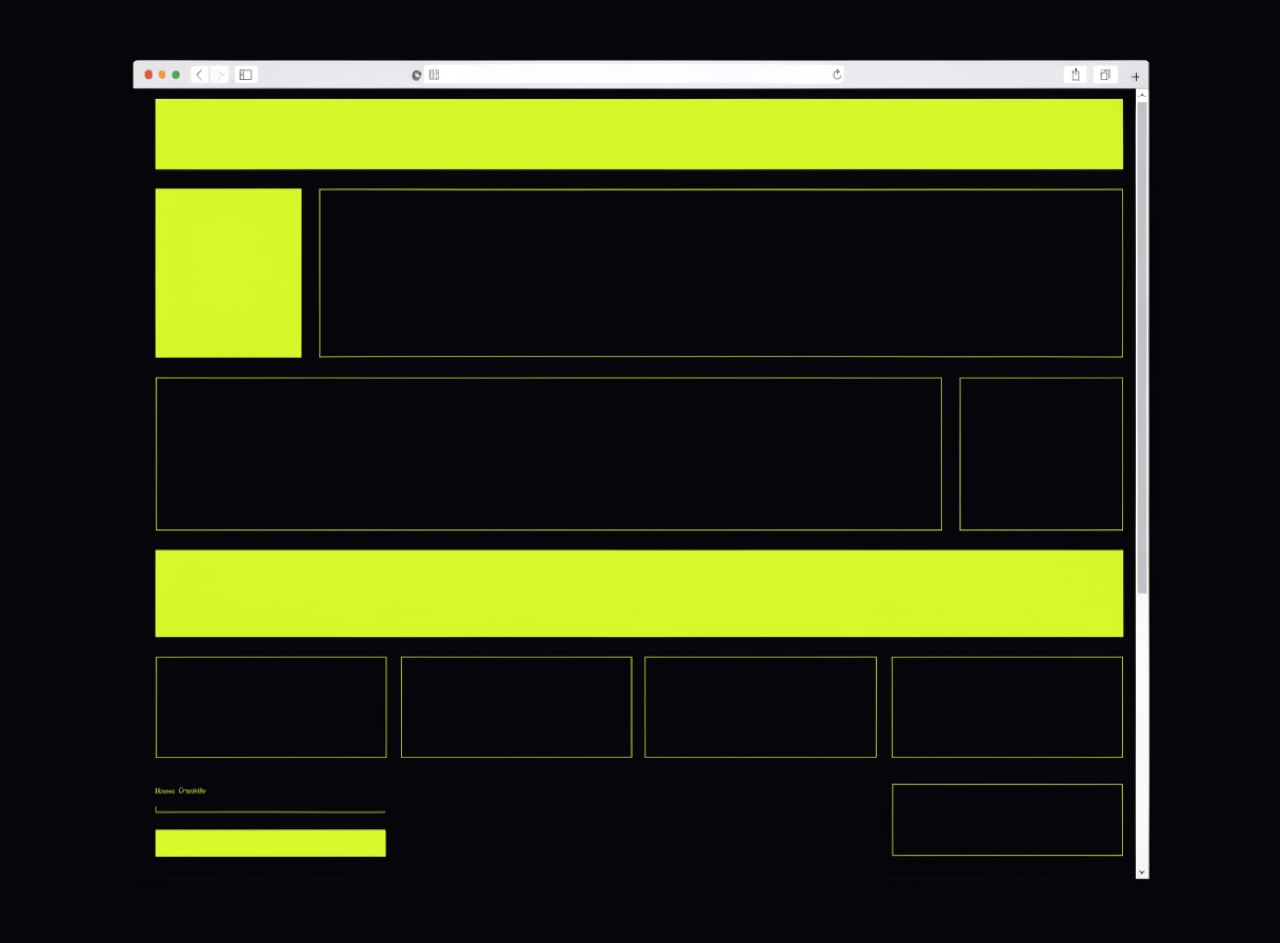
Default browser styling used deliberately: Times New Roman, blue links, visible structure.
A web brutalist layout for [Subject]. Default browser styling used deliberately: Times New Roman body text, default blue underlined links, plain unrounded 1px borders, system default form controls. Harsh single accent colour used flat and large. Visible layout structure with no shadows, no gradients, no rounded corners, no easing. Screenshot of a browser window at desktop width.
Liquid chrome, lens flare and bubble forms, the look of software demos around 1999.
[Subject] in Y2K chrome style. Liquid reflective chrome surfaces with a mirrored environment, translucent glossy bubble forms with visible specular highlights, anamorphic lens flare across the frame. Thin condensed techno grotesque type with a slight bevel. Palette of silver, cyan and acid green on a dark gradient ground. Early 3D render aesthetic, slightly plastic.
Process plates out of alignment, so colour fringes appear and the rosette breaks up.
[Subject] printed four-colour process with the magenta plate misregistered by about 1.5 millimetres up and to the left. Coloured fringes at every hard edge, black text carrying a magenta shadow on one side and a cyan one on the other, visible rosette pattern breaking up in the midtones. Coarse screen on newsprint, ink spread in the solids.
Many stones, many passes, building saturated colour before process printing existed.
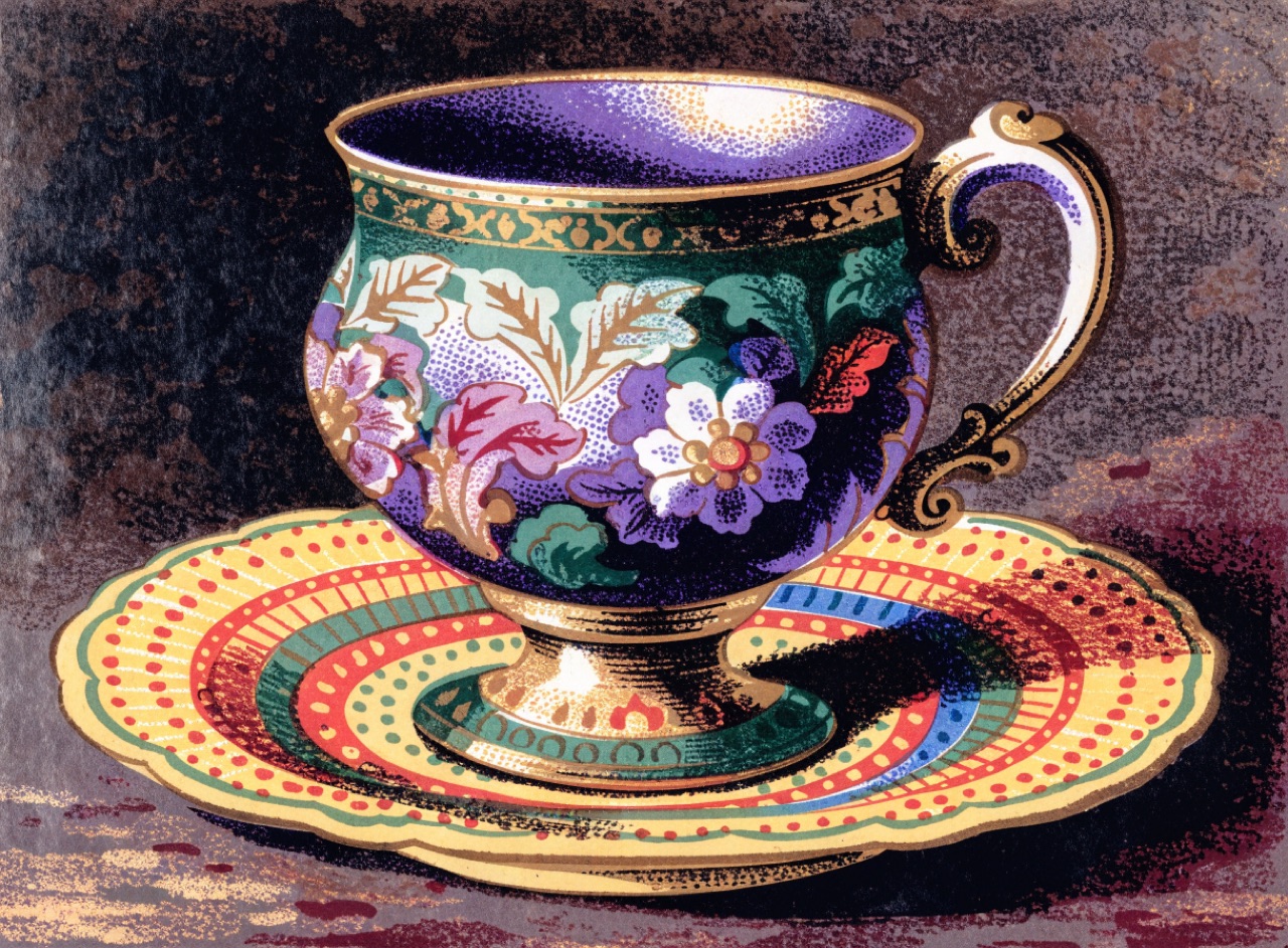
[Subject] as a Victorian chromolithograph. Colour built from many separate hand-drawn stone passes, greens and violets printed as their own inks rather than mixed from process colours, giving saturation beyond CMYK. Fine crayon stipple in the modelling, flat solids elsewhere, gold ink detail. Slight registration drift on one plate. Heavy coated card, glossy varnish.
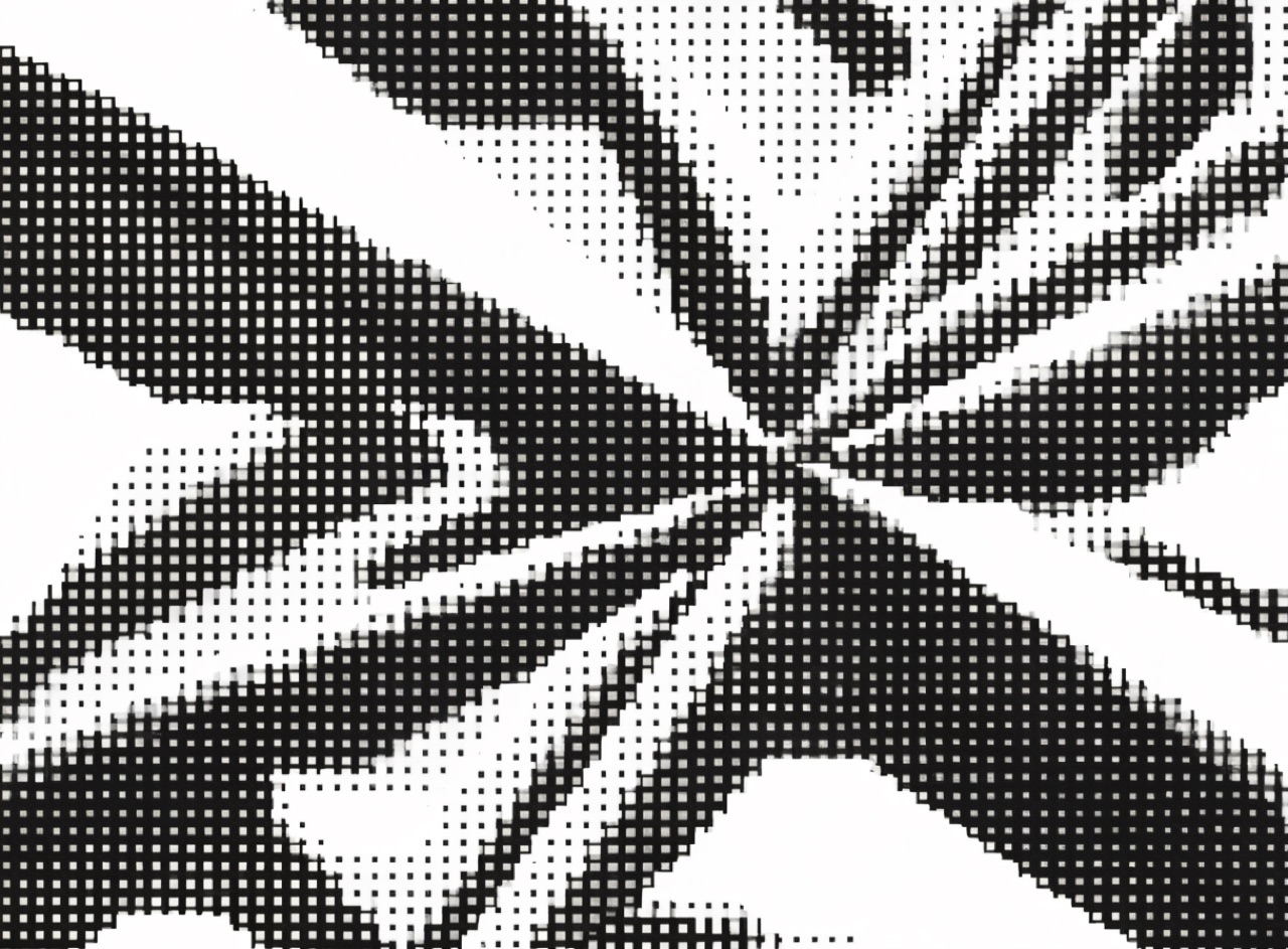
An image broken into visible dots large enough to read as pattern before they read as picture.
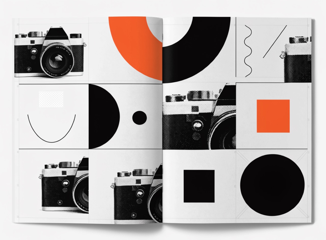
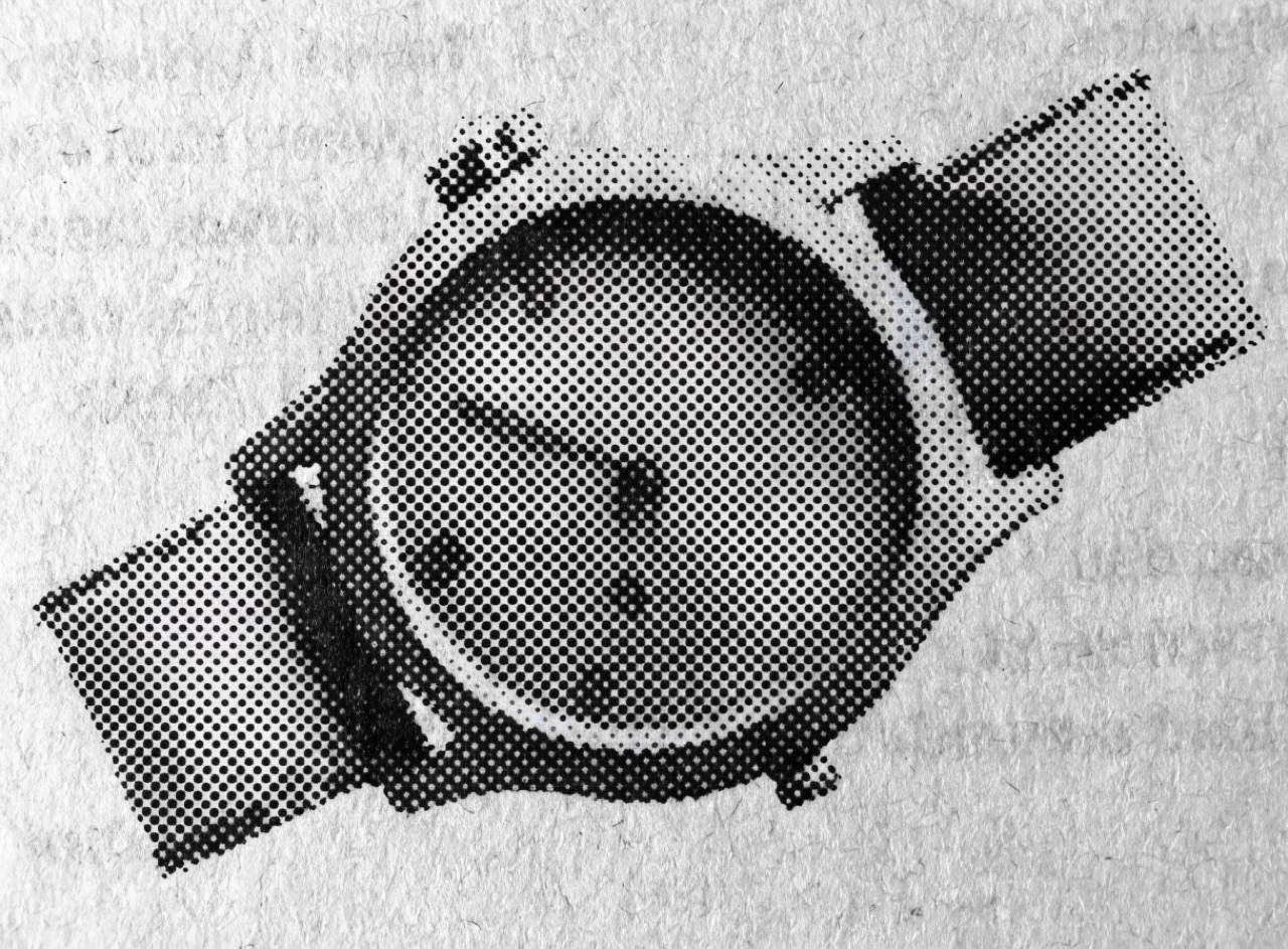
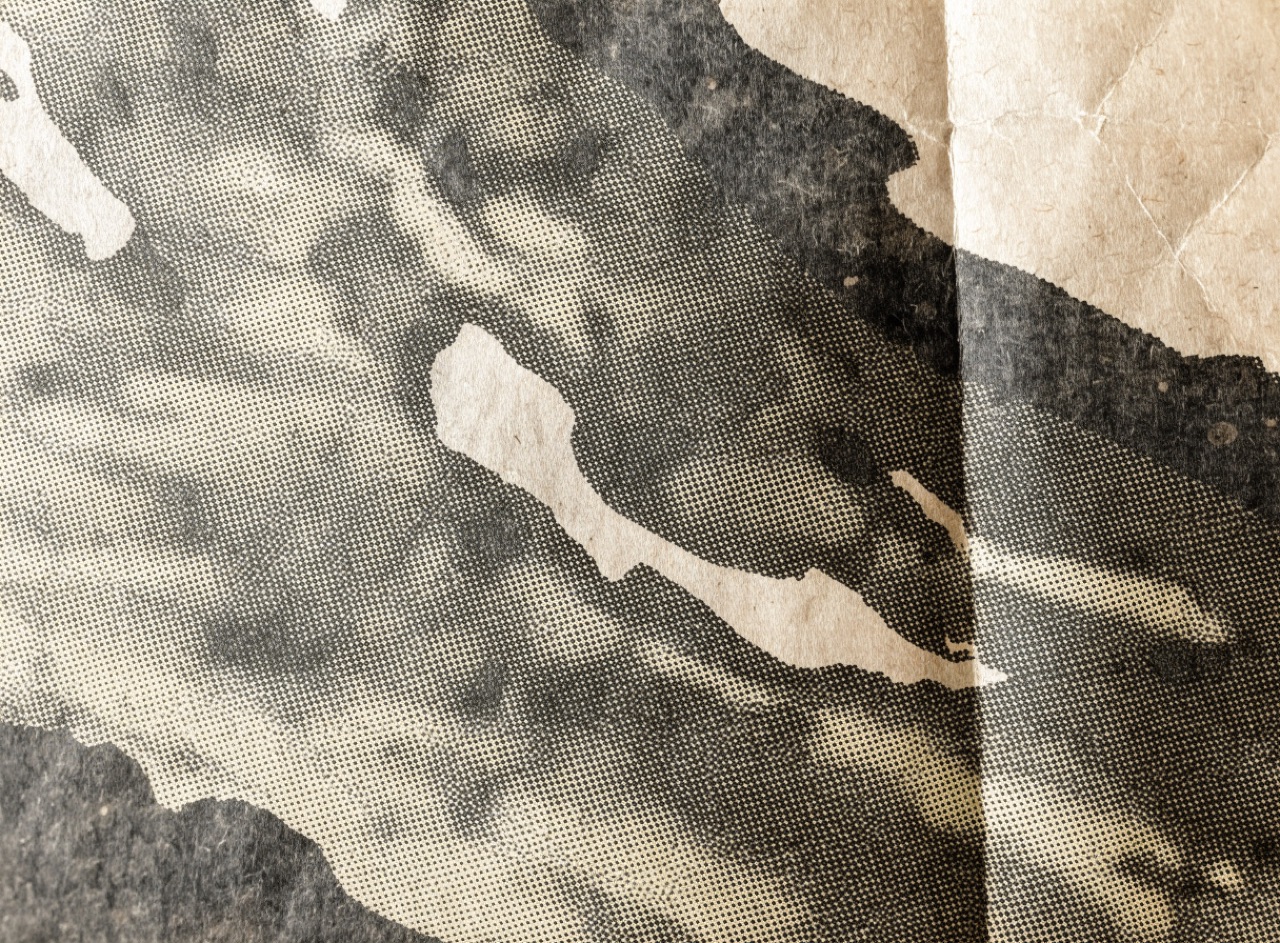
[Subject] reproduced as a coarse 65-line halftone. Dots large enough to be individually visible at arm's length, screen set at 45 degrees, dot gain closing up the shadows so detail is lost in the darks. Printed single colour black on grey newsprint with visible paper fibre and slight show-through from the reverse. No smooth gradients anywhere; every tone is a dot pattern.
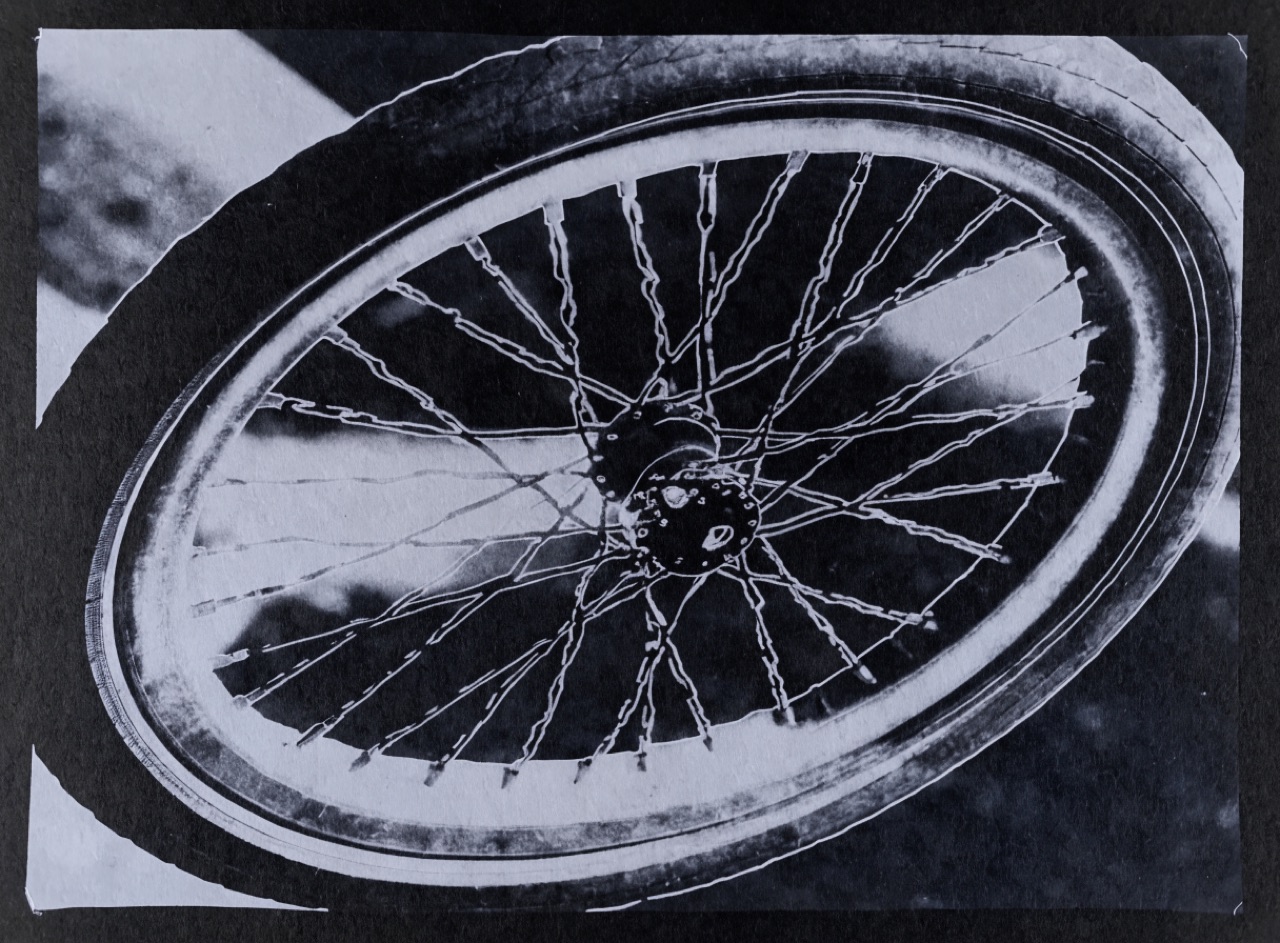
Iron-salt contact printing in Prussian blue, where the whites are bare paper and nothing is neutral.
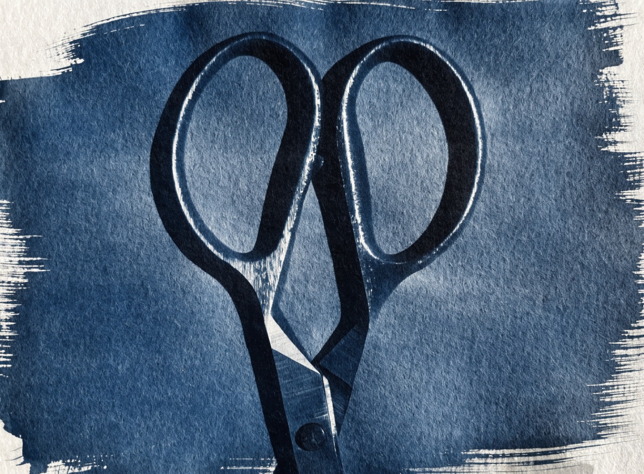
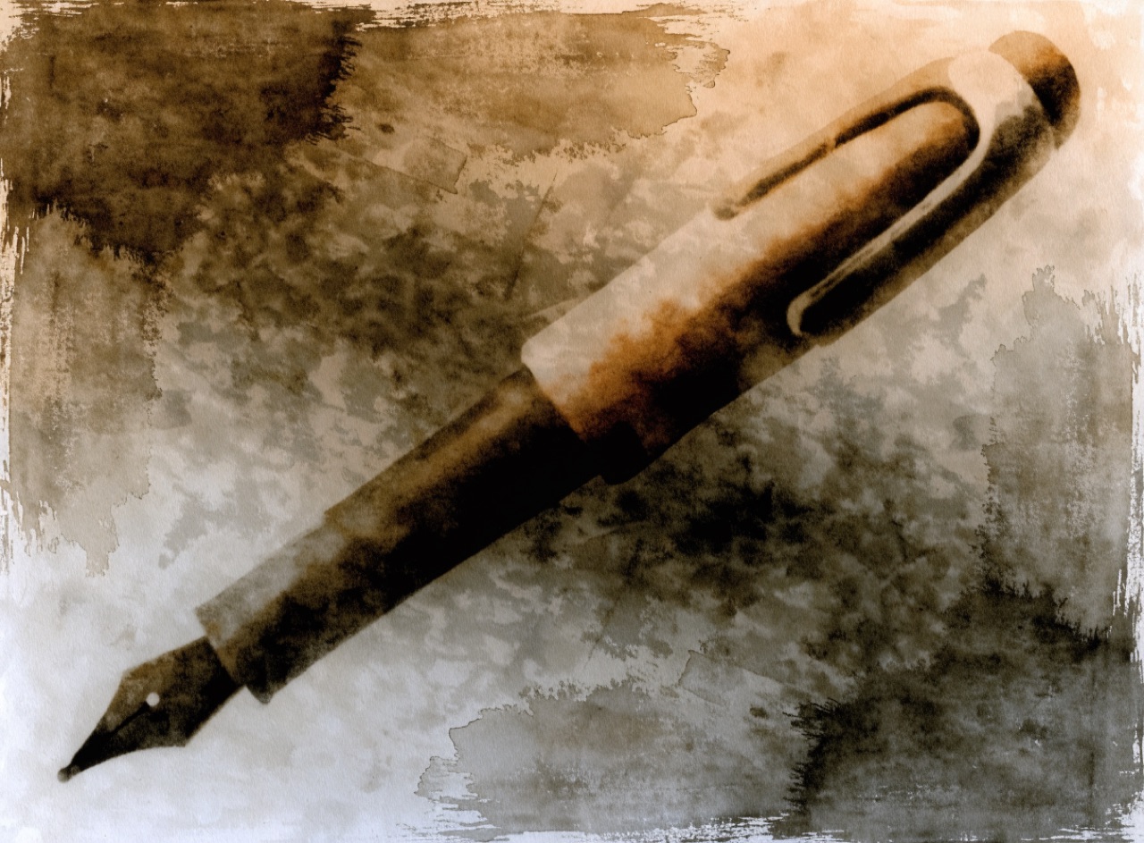
[Subject] as a cyanotype contact print. Single Prussian blue tone throughout with highlights dropping to bare unexposed paper, no neutral greys anywhere. Visible brush edges where the sensitiser was coated by hand, uneven coverage in the corners, paper cockle from wet processing. Long soft tonal scale, slight loss of detail in the deepest blues, heavy watercolour rag stock.
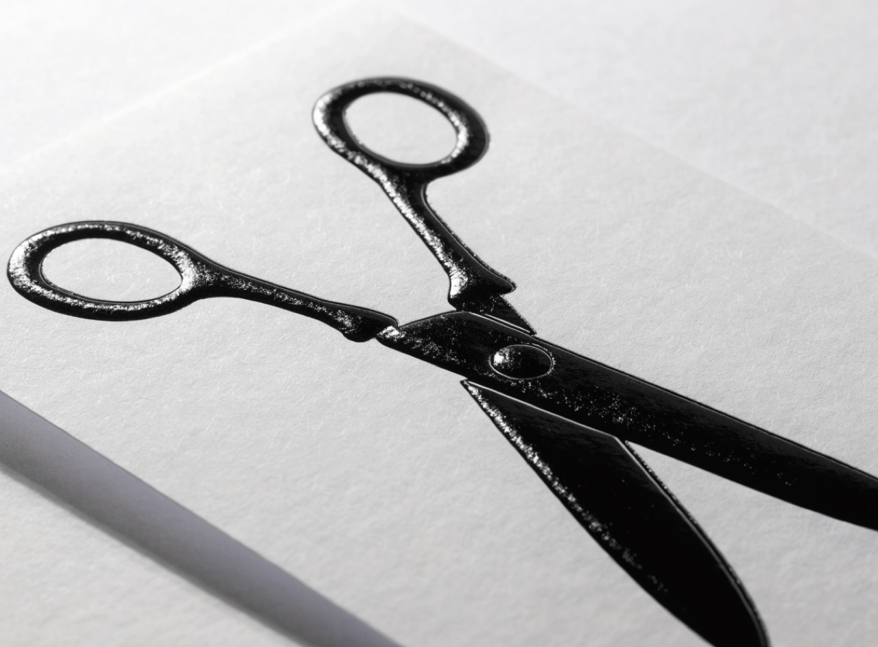
Shape cut through the sheet and gloss varnish on selected areas of a matte ground.
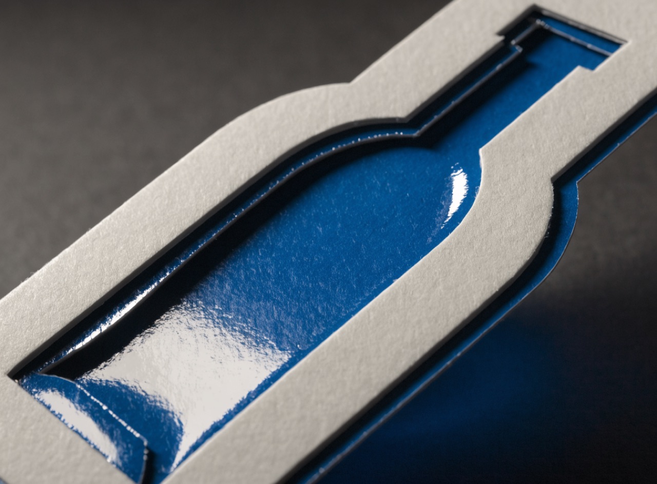
[Subject] as a die-cut card with spot UV. A clean shaped die cut through the top sheet revealing a contrasting colour beneath, with a visible crisp cut edge. High-gloss spot varnish applied to selected shapes over a soft-touch matte laminate, invisible except where raking light catches it. Restrained, one ink plus the two finishing passes. Photographed at a raking angle.
Ink spreading into absorbent paper so every dot prints larger than it was made.
[Subject] printed with heavy dot gain on newsprint. Midtones plugging up so the whole image sits darker and muddier than intended, shadow detail closing to solid, halftone dots visibly spreading and touching. Slight show-through from the reverse of the sheet. Ink wicking into the fibre so every edge is very slightly soft. Coarse screen, single black.
Metallic foil struck under heat into a debossed area, so the mark is reflective and recessed.
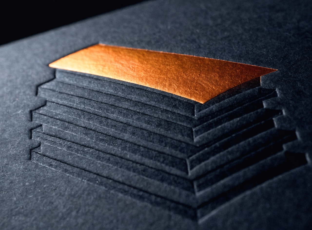
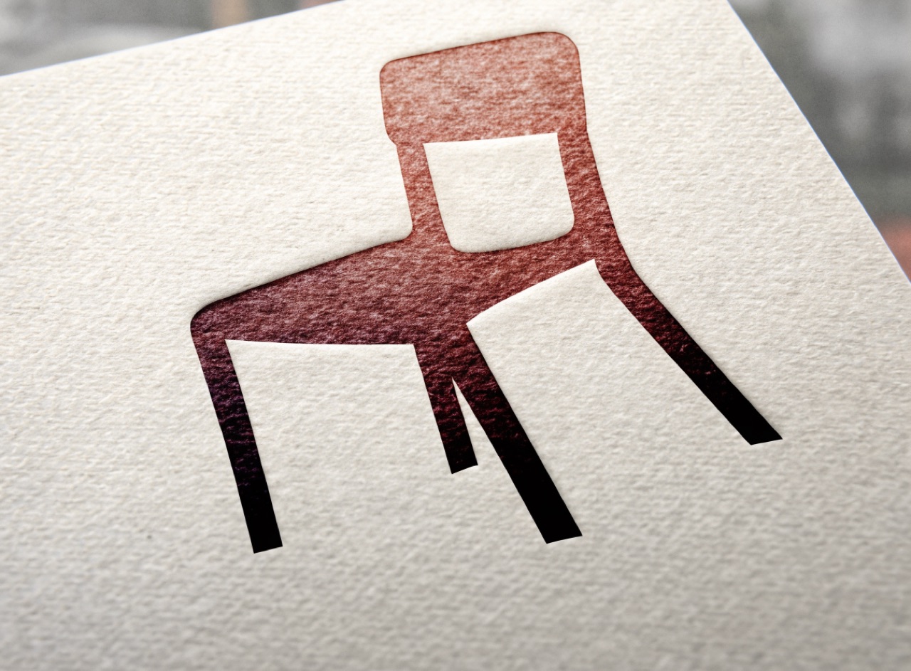
[Subject] as a foil-stamped and debossed card. One flat metallic copper foil element only, no tone or gradient within it, struck into a visible deboss so the foil sits below the paper surface with a crisp shoulder at the edge. Everything else blind debossed with no ink at all. Heavy dark charcoal uncoated stock, raking light so both the foil reflection and the recess read.
An image copied from a copy from a copy, until contrast collapses to black and white.
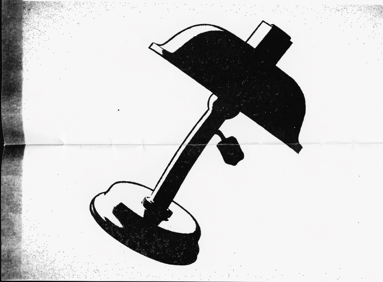
[Subject] as a fourth-generation photocopy. Midtones gone entirely, only pure black and paper white, edges thickened and small detail filled in solid. Toner speckle scattered in the margins, a dark band along one edge where the platen lid did not close, slight skew from being fed crooked. Copied from a folded original so a crease line runs through it.
Hand-coated pigment prints built in layers, closer to watercolour than to photography.
[Subject] as a multi-layer gum bichromate print. Broad soft tonal masses with very little fine detail, built from three pigment coatings so the colour is uneven and slightly mottled. Visible brush edges where the emulsion was coated by hand, heavy watercolour paper texture reading through the image. Muted earth palette, matte surface, no sharp edges anywhere.
Line cut into metal, ink pulled from below the surface, giving raised ink and a plate mark.
[Subject] as a steel-plate intaglio engraving. All tone built from engraved line only, fine cross-hatching and stipple with swelled lines thickening where the cut deepens, absolutely no halftone dots. Ink sitting physically raised on the surface. A debossed plate mark framing the image with a margin of bare paper beyond it. Single black ink on heavy cream rag, banknote register.
Metal or polymer type pressed into damp cotton stock so the letters have physical depth.
A letterpress-printed card for [Subject]. Deep visible impression in heavy cotton rag stock, letters debossed with a faint halo of displaced fibre at each edge and ink pooling slightly in the depression. One or two Pantone spot colours, no process build. Type-led composition, generous margins, no large flat solids. Raking light so the impression casts a shallow shadow.
One block cut away progressively between colour passes, so the edition size is fixed forever.
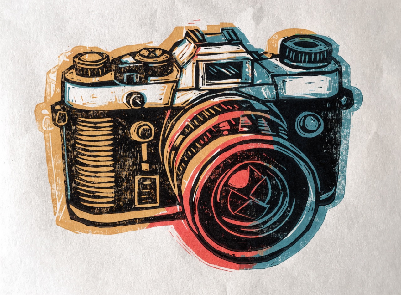
[Subject] as a four-colour reduction linocut. Chunky visible gouge marks with the mark of the cutting tool left in the whites, printing light to dark so later colours overprint earlier ones with a thin halo where registration drifts. Flat opaque ink with roller texture in the solids. Restricted palette of ochre, teal, vermilion and black on soft absorbent paper, slight bleed at the edges.
Pigment floated on size and combed into pattern, then lifted onto paper in one pass.
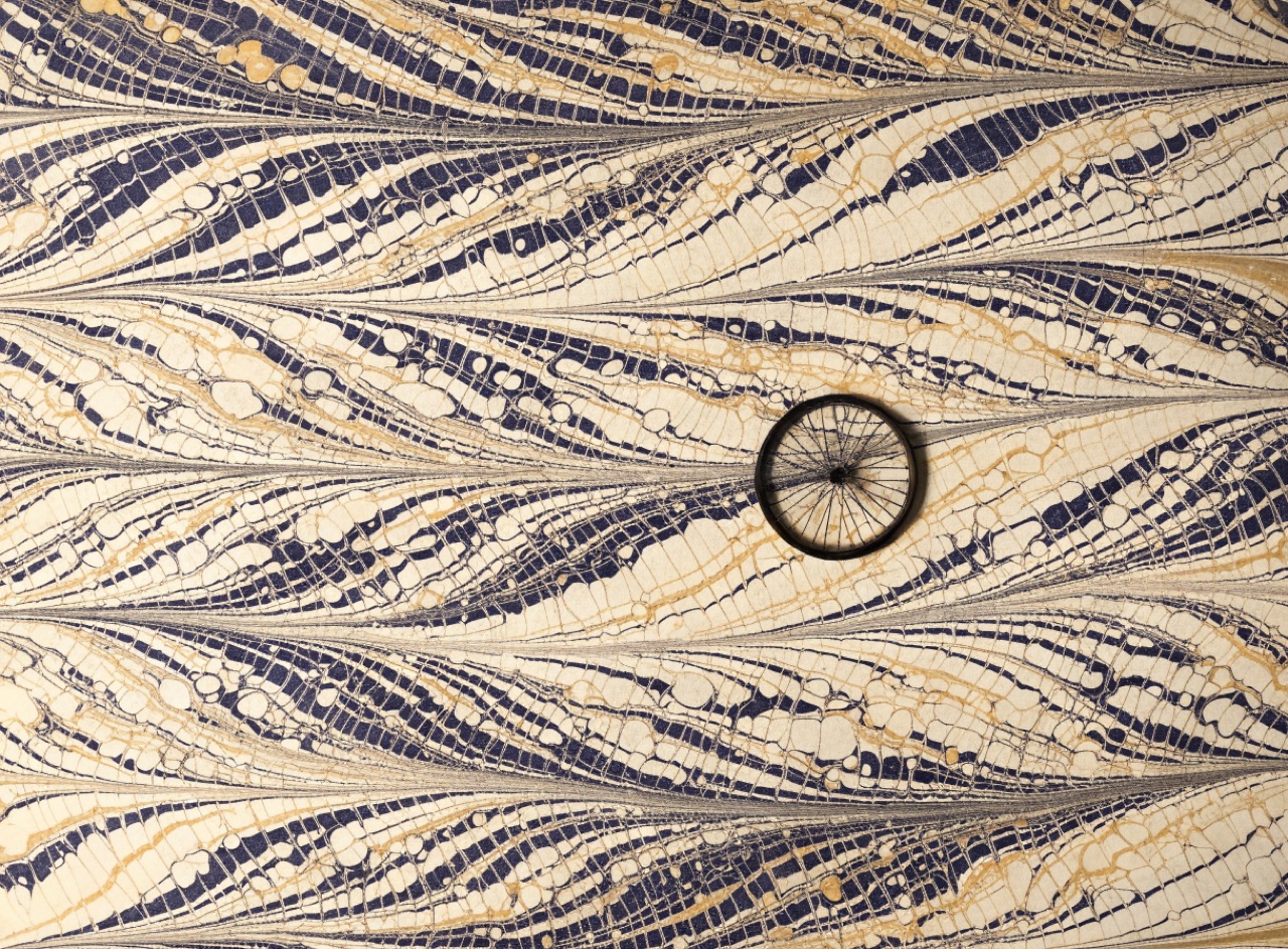
[Subject] on hand-marbled paper. Pigment floated on size and combed into a nonpareil pattern of fine continuous parallel veining with no repeat anywhere and no visible seam or tile edge. Deep indigo, oxblood and gold veining over a cream ground. Slight pooling where the colours met. Used as a bookbinding endpaper, photographed flat, matte.
Working from black to light by burnishing a roughened plate, giving unmatched dark tone.
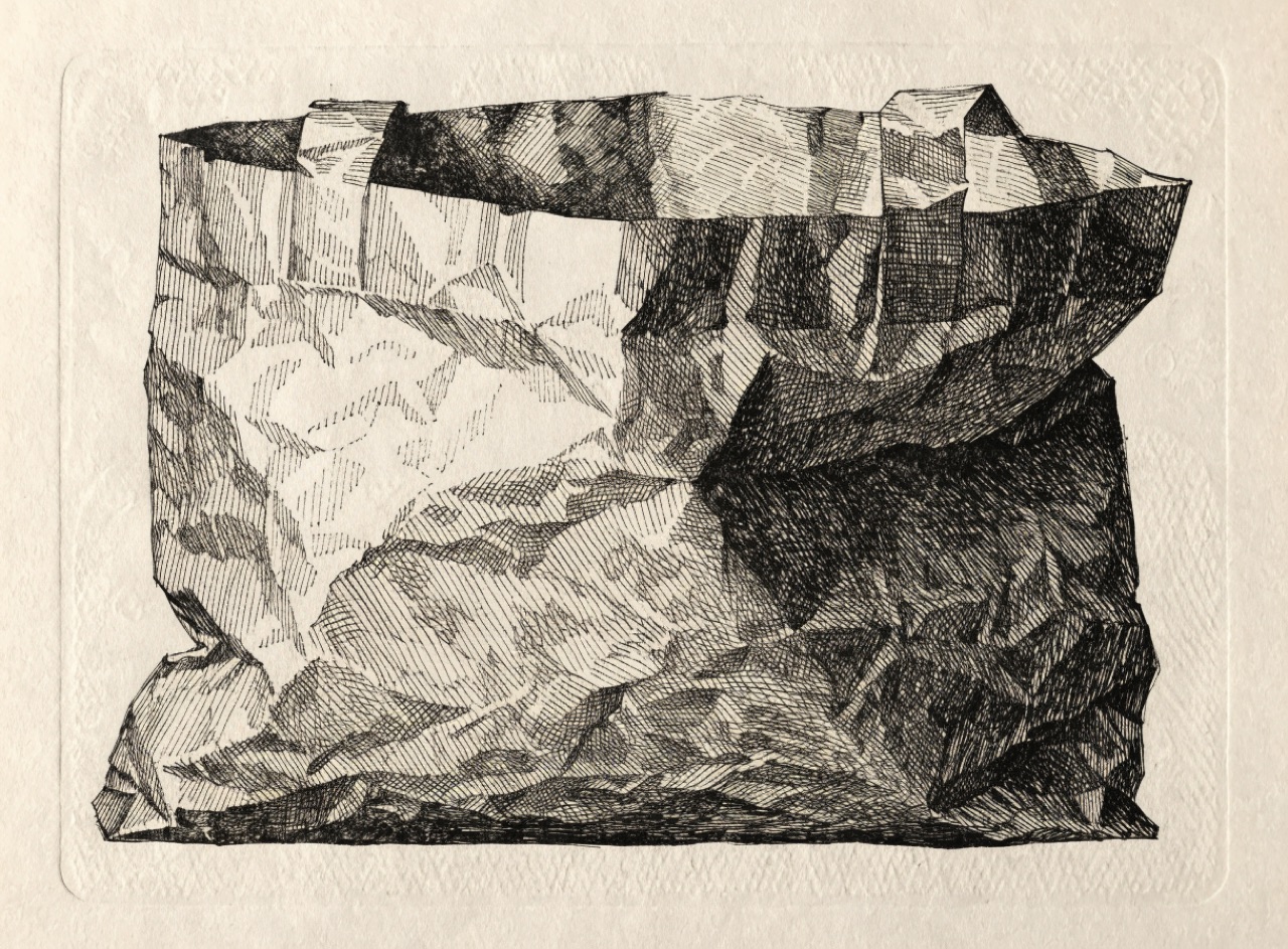
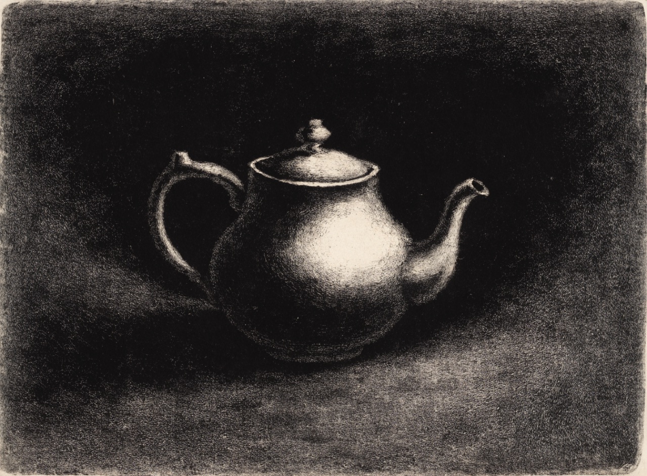
[Subject] as a mezzotint. Working from a solid velvety black ground with light burnished out, so the deepest tones are richer and more granular than any halftone can render. A single lit passage emerging from surrounding darkness, highlights limited and softly graded with no hard edges. Fine granular tooth visible throughout. Black ink on cream laid paper, plate mark visible.
Stencil duplication in purple aniline, blurred and uneven, smelling of school corridors.
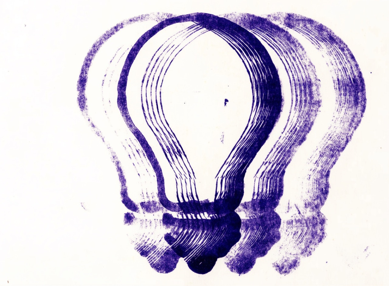
[Subject] as a purple spirit-duplicated mimeograph handout. Soft blurred aniline purple line with letters filling in and coverage fading unevenly from one side of the sheet to the other as the drum dried. Typewriter text and crude hand-drawn stencil illustration on the same page. Slight offset ghosting, thin cheap paper with show-through, faded and uneven.
Continuous-tone intaglio with a fine aquatint grain instead of a halftone dot.
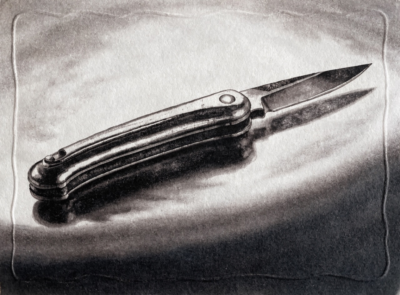
[Subject] as a photogravure. Genuinely continuous tone with no halftone dot anywhere, only a fine random aquatint grain, and a very long tonal scale holding both delicate highlight detail and open shadow. Ink sitting slightly raised, warm neutral black. Plate mark debossed around the image on heavy soft rag paper.
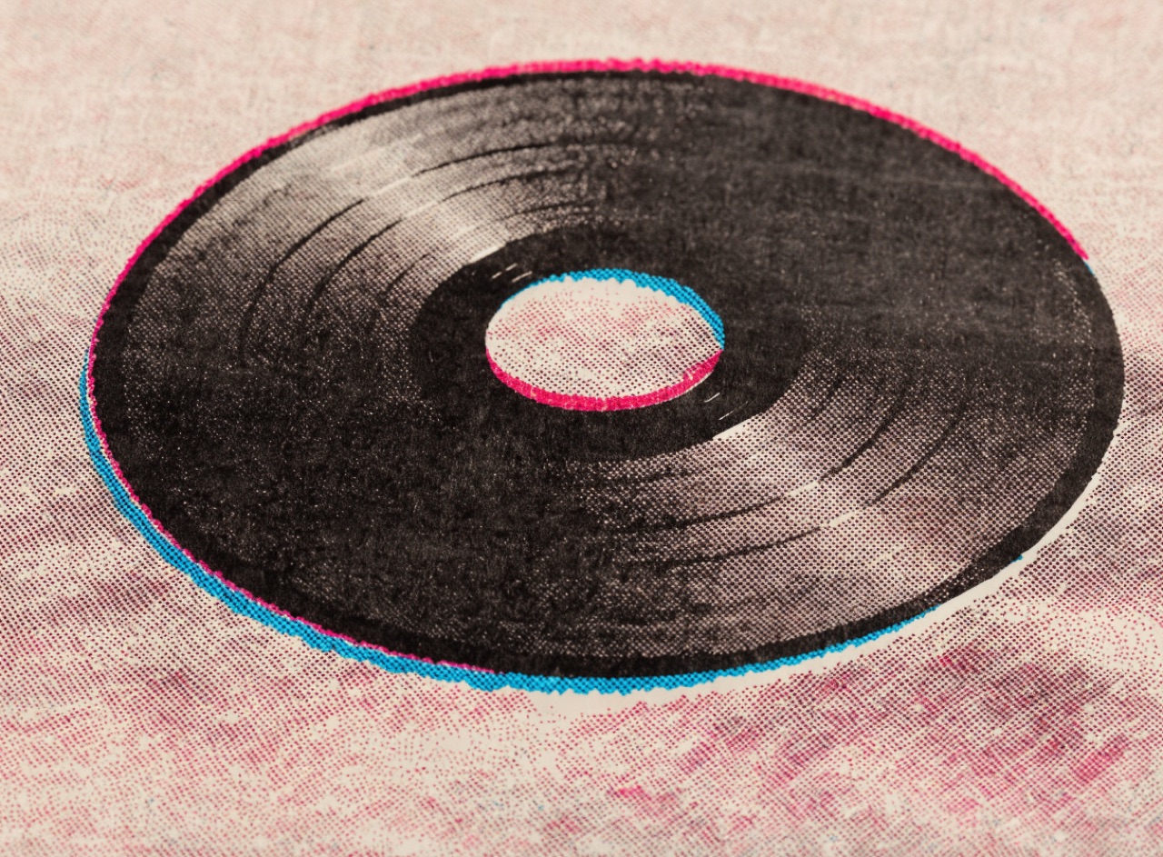
Soy-ink drum printing in two spot colours that misregister slightly and overprint into a third.
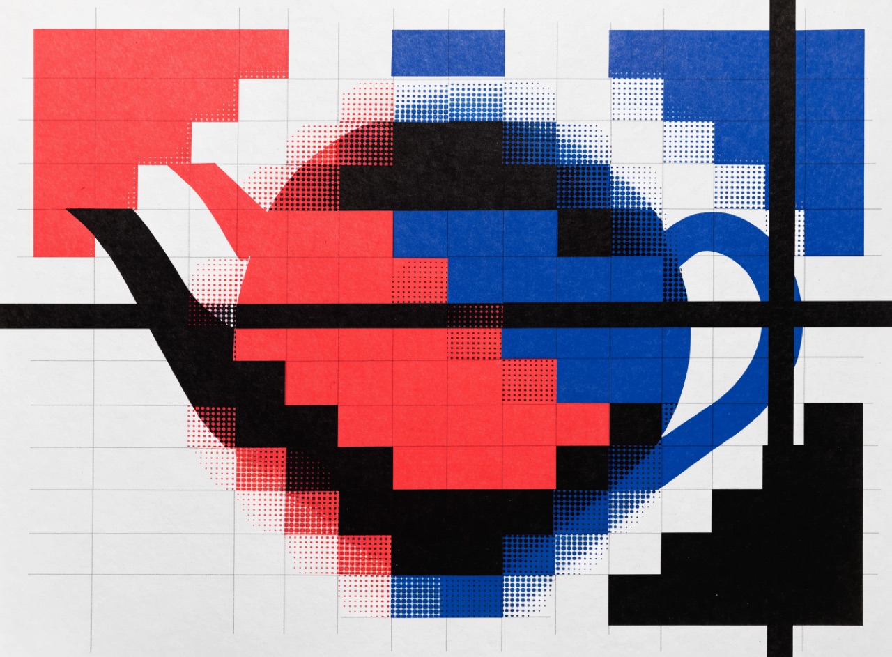
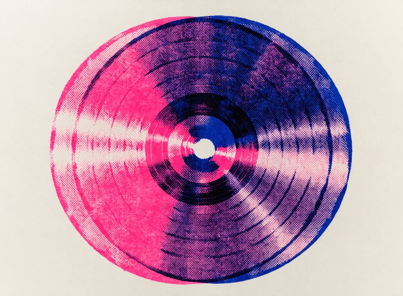
A risograph print of [Subject]. Exactly two ink drums, fluorescent pink and federal blue, overprinting into a deep violet where they cross. Visible one-to-two millimetre misregistration between layers, coarse 45-degree halftone in both channels, ink sitting on the surface with slight mottling in the solids and roller marks in the heavy areas. Cream 100gsm uncoated paper showing through everywhere.
Opaque ink laid thick through mesh, one flat colour per pass, building depth by overlap.
A four-colour screenprint of [Subject]. Each colour a separate flat opaque pass with no continuous tone anywhere, colours building depth where they overlap and multiply. Slight registration offset of about half a millimetre on one layer. Visible mesh texture in the large solids and a faintly raised ink edge. Printed light-on-dark on heavy black card stock.
Randomly placed micro-dots of equal size, so there is no screen angle and no rosette.
[Subject] reproduced with stochastic FM screening. Tone built from randomly placed micro-dots all of the same tiny size varying only in density, so there is no visible screen angle, no rosette pattern and no moiré across fine repeating detail like woven fabric. Extremely fine even grain, very high detail retention in both highlight and shadow. Printed on smooth coated stock.
Powder fused over wet ink to raise it, the cheap imitation of engraving.
[Subject] printed with thermography. Type and rules raised in a glossy slightly rounded relief that catches the light, fine detail slightly filled in where the powder pooled, the reverse of the sheet perfectly smooth with no bruising. Single dark ink on smooth white card, photographed at a raking angle so the raised gloss reads against the matte stock.
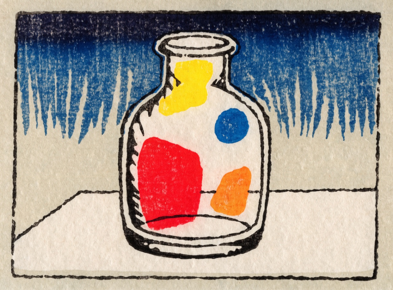
Flat keyblock outline with separate colour blocks, wood grain showing in the broad areas.
[Subject] as a Japanese woodblock print. A black keyblock outline of even weight enclosing every shape, with flat unmodelled colour areas printed from separate blocks, slight registration offset at one edge. A hand-wiped bokashi gradient in the sky going from deep indigo down to nothing. Visible wood grain texture printing through the large flat areas. Mineral pigments on absorbent washi, no shading and no cast shadows.
Choosing the older, less even grotesque, because Helvetica reads as 1960s and later.
[Subject] set in Akzidenz-Grotesk rather than Helvetica: slightly uneven stroke weights, more open apertures, the distinctive angled leg on the capital R and the flat-sided lowercase a. Tight but not touching word spacing, ranged left, ragged right. Two weights only, Bold for the head and Regular for the text. Offset lithography, black on warm off-white uncoated.
Capitals opened up because they were designed to be spaced, unlike lowercase.
[Subject] set in letterspaced capitals. Roman inscriptional proportions tracked generously open, with individual pairs adjusted optically rather than by one uniform value so LA and TT sit evenly. Small size, ranged centre, a single line with vast space around it. Lowercase elsewhere on the page left at normal fit. Engraved black on cream.
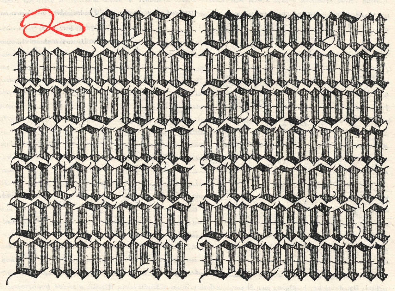
Dense broken script where the page reads as woven texture before it reads as words.
[Subject] set in blackletter Textura. Dense vertical strokes broken at the joins, extremely tight letterfit so the text block reads as a single woven grey texture before it resolves into words. Two columns with a wide gutter, hand-drawn initial capital in red at the opening. Printed letterpress in dense black on cream laid paper with visible chain lines.
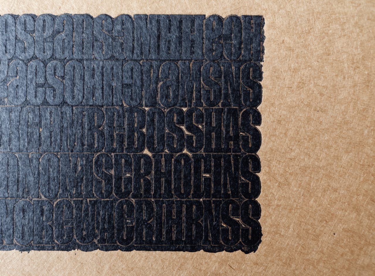
Bracketed slab serifs with heavy even colour, built to survive rough printing.
[Subject] set in Clarendon. Heavy bracketed slab serifs, large x-height, short ascenders, tight even colour across the line. All caps headline with the word spacing slightly tight, ranged left. Printed letterpress on kraft-brown board with visible impression and ink squeeze at the letter edges. One colour only.
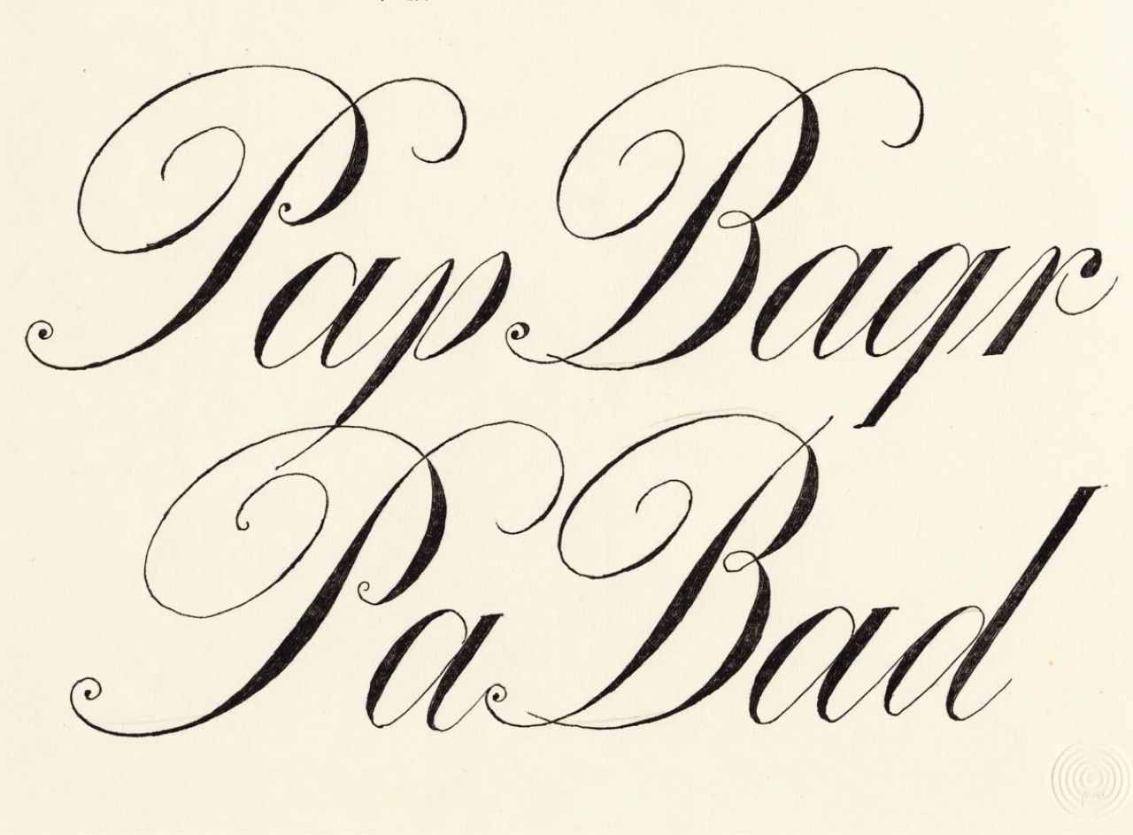
Pointed-pen engraver's hand with extreme thick-thin contrast and a strong slant.
[Subject] written in copperplate script. Pointed-pen hand at a consistent 55-degree slant, extreme contrast between hairline upstrokes and swelled downstrokes, letters continuously joined, capitals with flourished entry strokes. Set in mixed case, never all caps, generously spaced and centred. Engraved black on heavy cream cotton stock with a debossed plate mark.
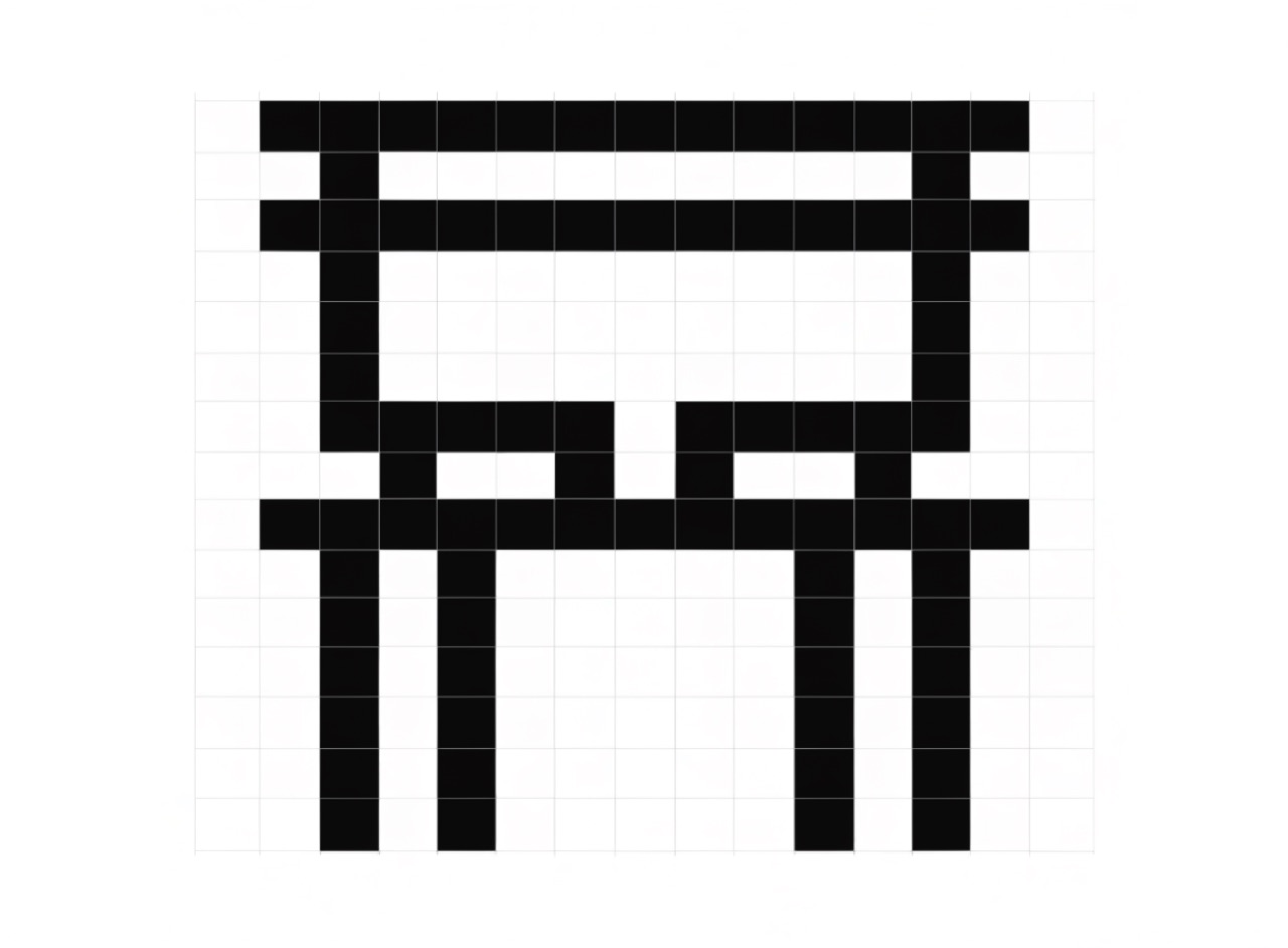
Letters constructed only from horizontal and vertical strokes on a coarse grid.
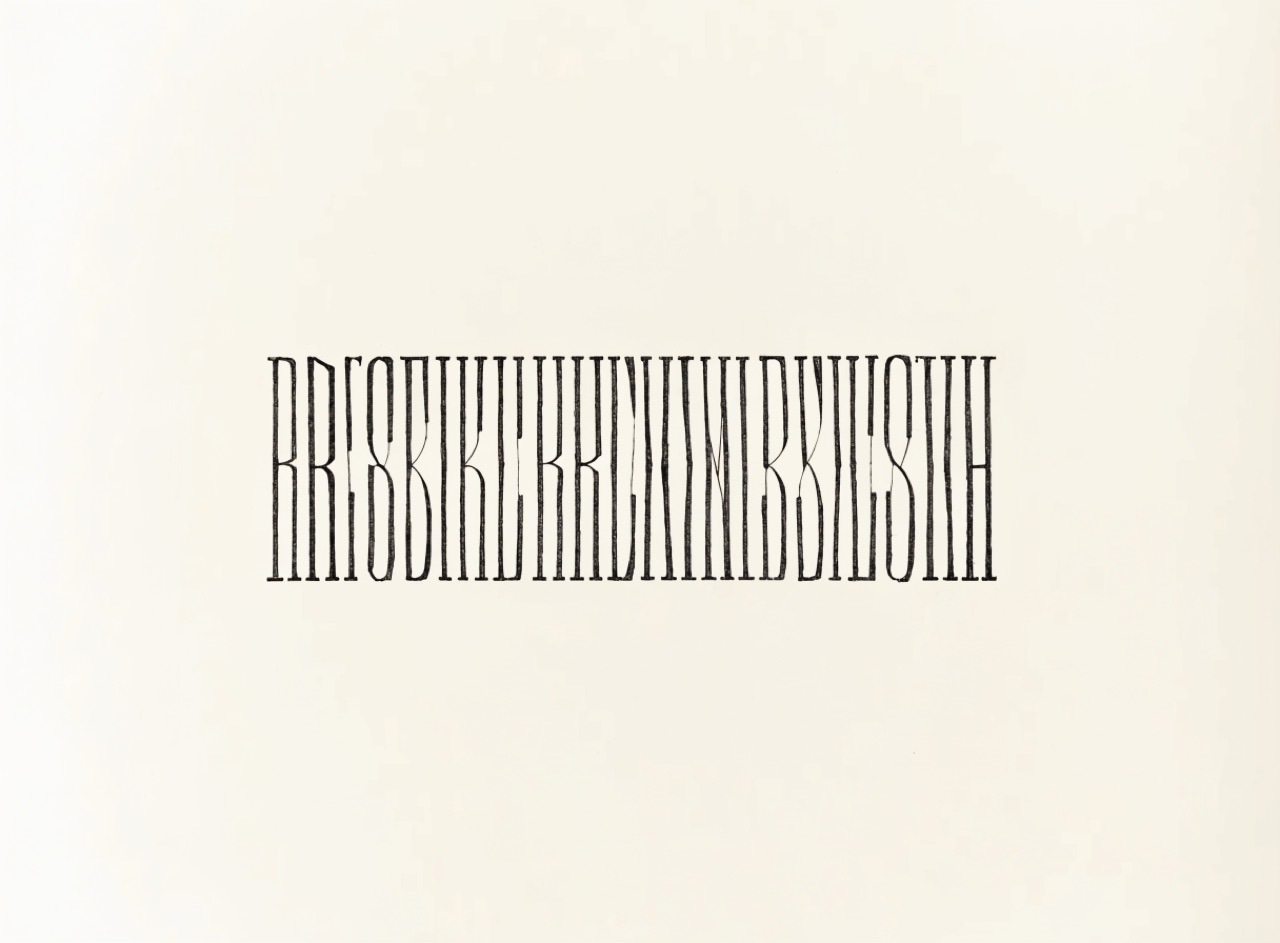
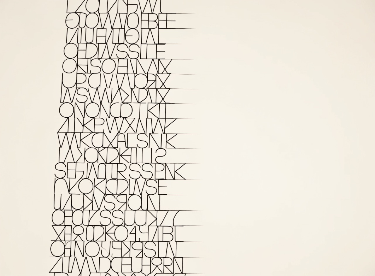
[Subject] set in a Crouwel-style constructed grid alphabet. Every letterform built only from horizontal and vertical strokes of one uniform weight on a visible coarse square grid, no diagonals and no curves anywhere, so some characters are barely recognisable. Grid lines faintly visible behind the type. Black on white, flat, systematic, no ornament.
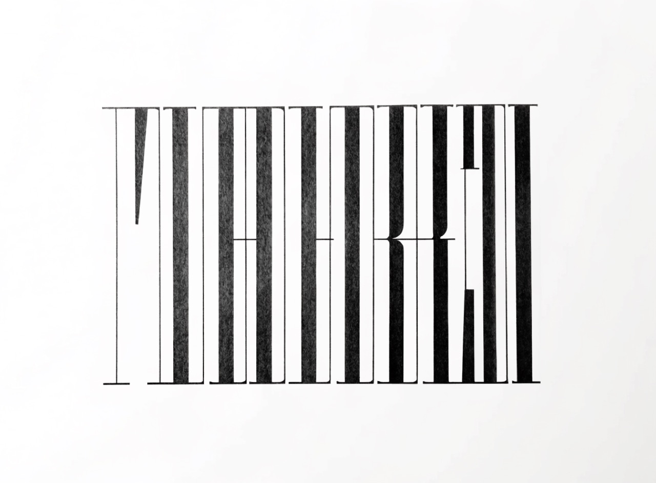
Hairline thins against heavy stems with flat unbracketed serifs, set large and tight.
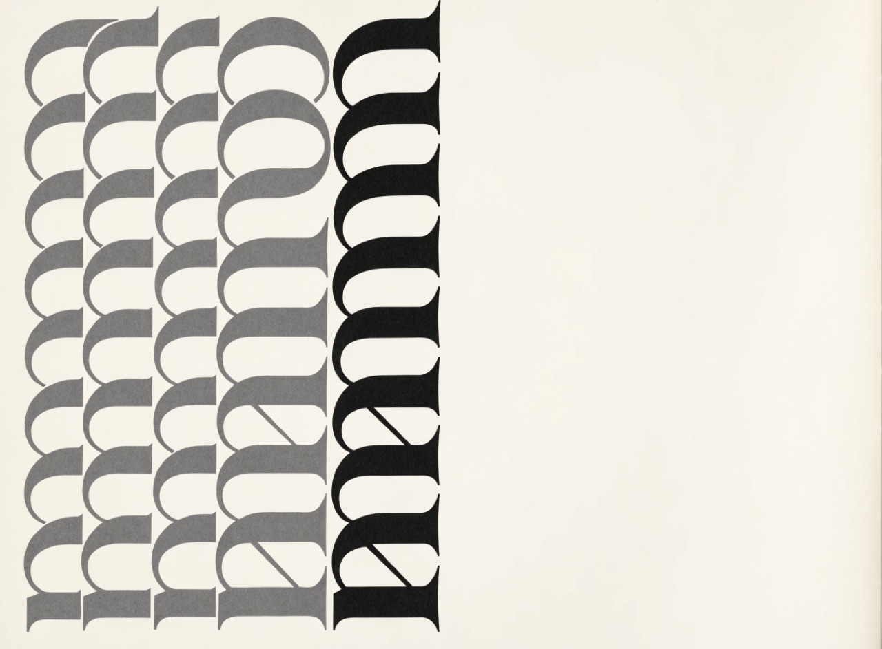
[Subject] set in a Didone with extreme stroke contrast: hairline thins against heavy vertical stems, flat unbracketed serifs meeting at a right angle, perfectly vertical stress. Set very large with tight negative tracking, all caps, ranged centre. Nothing else on the page but generous white space. Sharp offset on smooth coated stock so the hairlines hold.
Letters built from circle and straight line, so the O is a true circle and the a is single-storey.
[Subject] set in a geometric sans in the Futura tradition. Letters constructed from true circles and straight lines, a perfectly circular O, single-storey a, pointed apex A, uniform stroke weight throughout. Used at display size with wide letterspacing on the capitals. Ranged left with a deep indent. Two flat colours, printed offset on smooth stock.
A sans serif drawn from calligraphic skeletons, so it keeps stroke modulation and a true italic.
[Subject] set in a humanist sans in the Johnston and Gill tradition. Calligraphic skeleton with subtle stroke modulation, open apertures, classical Roman capital proportions where a wide O sits beside a narrow E, and a true cursive italic rather than a slanted roman. Ranged left, generous leading, two weights. Clean offset on uncoated stock.
Fixed-width characters on a character grid, where alignment is arithmetic rather than optical.
[Subject] laid out in monospace on a visible character grid. Fixed-width type where every glyph occupies the same advance, columns aligned by character count rather than tabs, box-drawing rules made from ASCII characters. Green phosphor on black with slight bloom and scanline, or plain black on white paper. No proportional type anywhere, no italics.
Numerals with ascenders and descenders that sit in text without shouting.
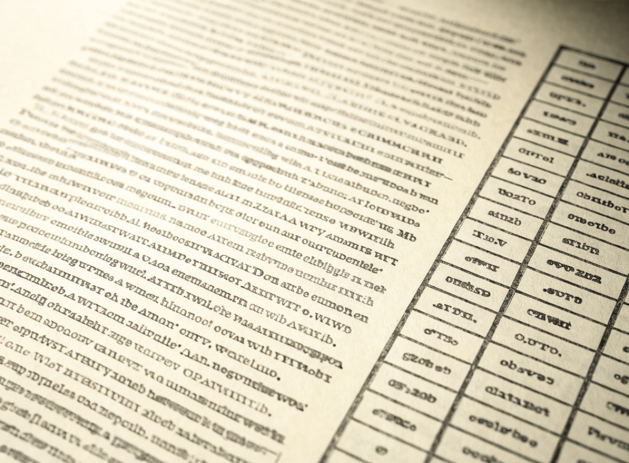
A page of running text about [Subject] containing several dates and quantities, set with old-style text figures so numerals sit at x-height with 3, 4, 5, 7 and 9 descending and 6 and 8 ascending, giving numbers the same visual colour as the surrounding words. A small table alongside using lining tabular figures instead. Serif text face, cream paper.
Shaping the ragged edge by hand so it neither steps nor forms accidental shapes.
A column of text about [Subject] set ranged left with an expertly controlled rag: no two adjacent lines close in length, no descending staircase, no wedge or hourglass shape in the negative space at the right edge, no line ending on a short preposition or article. Single serif at 10 on 14, one column, generous margin. Black on cream, offset print.
White type out of a dark ground, which needs heavier weight and more space to stay readable.
[Subject] set as white type reversed out of a solid dark ground. A face with open counters and slightly heavier weight chosen because reversing makes type appear bolder and fills the counters, leading increased, no fine hairline serifs anywhere. Set at generous size, ranged left. Solid rich black ground with the type knocked out clean, coated stock.
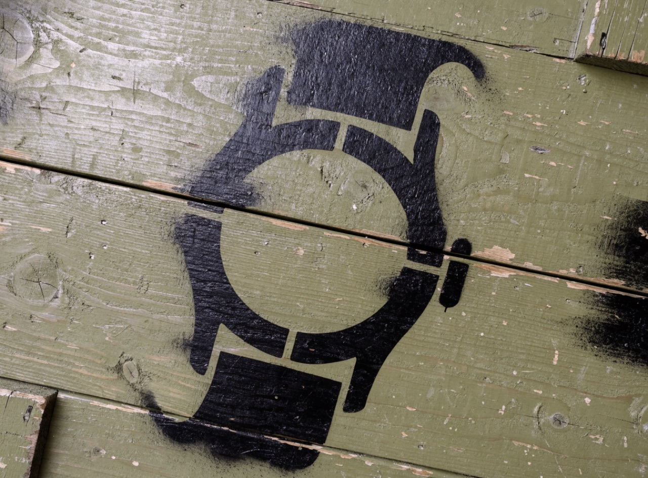
Letters with bridges cut through the strokes, because the counters must stay attached.
[Subject] in stencil letterforms, bridges interrupting each stroke exactly where a physical stencil would need them to keep the counters attached. Spray-applied over a rough surface with soft overspray at every edge and one or two runs where the paint pooled. Flat industrial black on weathered olive-drab crate timber, slightly crooked alignment.
The compromise between old-style and Didone: near-vertical stress, moderate contrast.
A book page about [Subject] set in a transitional serif such as Baskerville. Near-vertical stress, moderate stroke contrast, finely bracketed serifs, generous x-height. Set 11 on 15 in a single measure of about 65 characters, ranged left with a controlled rag, old-style numerals. Letterpress-quality impression on cream book paper.
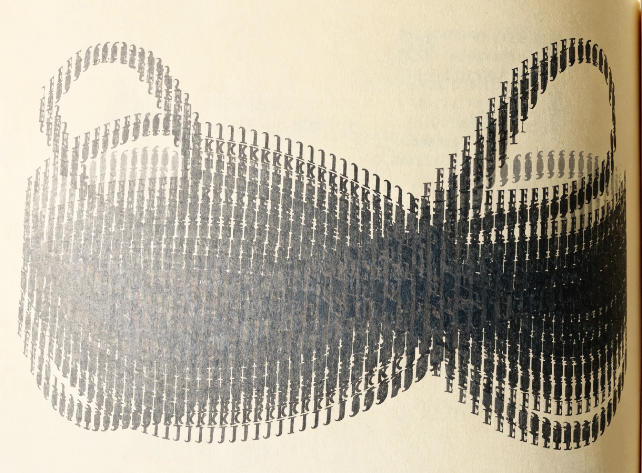
Letterforms arranged so the word depicts its own meaning without an illustration.
A typographic mark for [Subject] where the letterforms alone carry the meaning, with no illustration. Exactly one structural move: a single ligature, one substituted counter, or one rotated character that changes what the word depicts. Tight fitting, heavy serif or grotesque, drawn as a single object. Black on white, no colour, no effects, reproduced at logotype scale.
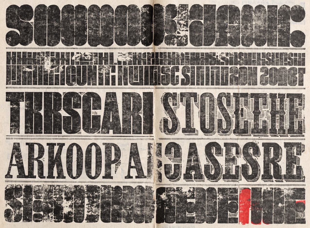
Nineteenth-century poster type in mixed faces and sizes, filling the sheet line by line.
[Subject] as a nineteenth-century letterpress playbill. Every line set in a different wood type, fat face, slab serif, condensed and shadowed mixed freely, each line stretched or condensed to fill the full measure exactly. Rules between sections. Uneven inking with broken letter edges and patchy solids from worn end grain. Black plus one red, on off-white newsprint.
Nothing matches that. Try a broader term.
The Prompt Atlas
Every prompt here is a starting point. The Prompt Atlas is the full system: hundreds of production-ready prompts organised by outcome, with the reasoning behind each one so you can adapt rather than copy.