
All-Caps Letterspacing
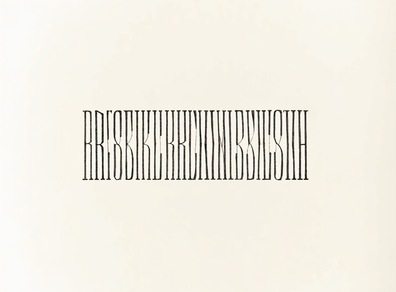
Capitals opened up because they were designed to be spaced, unlike lowercase.
What it does
Roman inscriptional capitals were cut with generous space between them, so digital defaults set them too tight. Frederic Goudy's remark about the man who would letterspace lowercase is the standard warning that the same treatment ruins minuscules, whose rhythm depends on close fitting. Correct practice is to track capitals open, adjust individual pairs optically rather than uniformly, and leave lowercase alone.
The prompt
Replace [Subject] with what you are shooting. Everything else is deliberate: the gear, stock and lighting are what push a generator towards this look.
Works well in
Ideogram, Midjourney, FLUX
Pairs with
Centred Axial SymmetryCopperplate Script
The Prompt Atlas
Every prompt here is a starting point. The Prompt Atlas is the full system: hundreds of production-ready prompts organised by outcome, with the reasoning behind each one so you can adapt rather than copy.