
Akzidenz over Helvetica
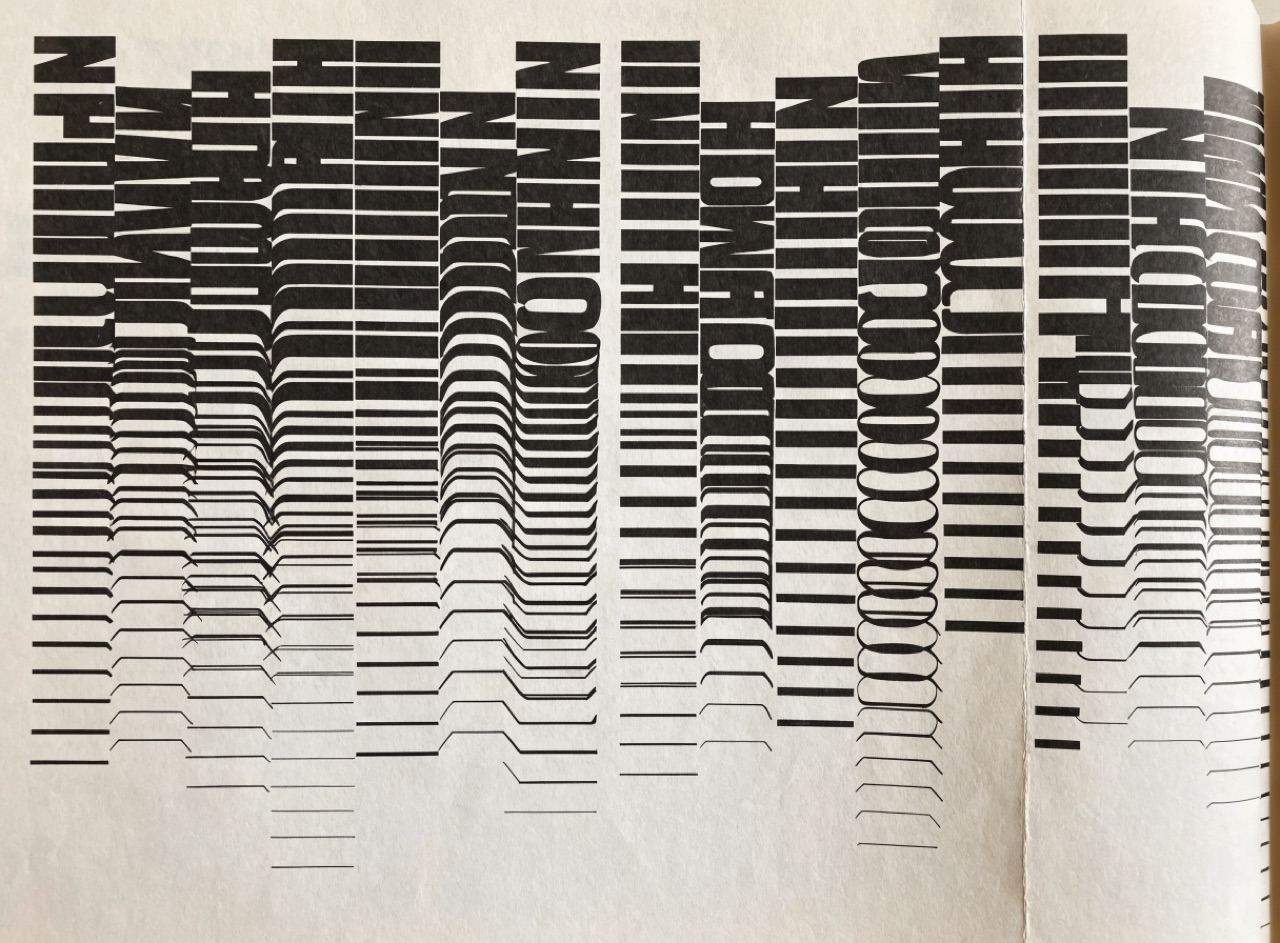
Choosing the older, less even grotesque, because Helvetica reads as 1960s and later.
What it does
Akzidenz-Grotesk was cut by Berthold in 1896 and is what the Basel and Zurich designers actually set before Helvetica existed. Helvetica arrived in 1957 from Haas and normalised the awkward corners: more even stroke weight, more closed apertures, a straighter leg on the R. Akzidenz keeps small irregularities that make text look slightly older and less corporate. Specifying the right one is the difference between a poster that looks like 1955 and one that looks like a 1990s corporate reprint of 1955.
The prompt
Replace [Subject] with what you are shooting. Everything else is deliberate: the gear, stock and lighting are what push a generator towards this look.
Works well in
Midjourney, Ideogram, FLUX
Pairs with
Swiss International StyleModular Grid
The Prompt Atlas
Every prompt here is a starting point. The Prompt Atlas is the full system: hundreds of production-ready prompts organised by outcome, with the reasoning behind each one so you can adapt rather than copy.