
Monochrome Value Study
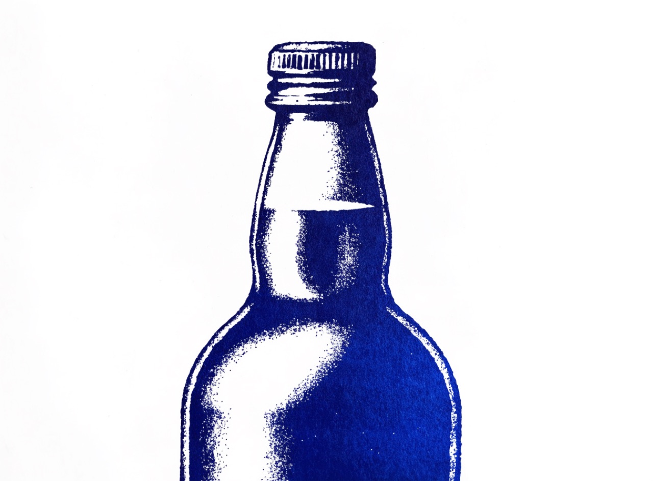
One hue at many values, which forces the composition to work on tone alone.
What it does
Removing hue variation exposes whether a composition actually reads, because contrast can no longer be faked with colour. Designers test work in greyscale for exactly this reason. A monochrome scheme uses a single hue across a wide value range, with the darkest and lightest points placed deliberately to lead the eye. If it fails in monochrome, adding colour will not fix it, it will only disguise it.
The prompt
Replace [Subject] with what you are shooting. Everything else is deliberate: the gear, stock and lighting are what push a generator towards this look.
Works well in
Midjourney, FLUX
Pairs with
The Prompt Atlas
Every prompt here is a starting point. The Prompt Atlas is the full system: hundreds of production-ready prompts organised by outcome, with the reasoning behind each one so you can adapt rather than copy.