
Clarendon Slab
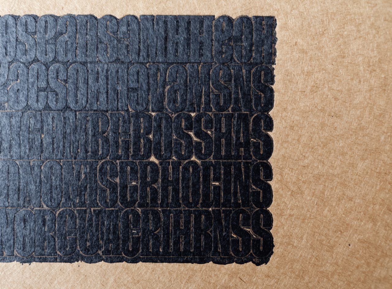
Bracketed slab serifs with heavy even colour, built to survive rough printing.
What it does
Cut by Robert Besley in 1845 as an emphasis face for dictionaries, Clarendon has thick bracketed slabs, short ascenders and a large x-height, so it holds up when printed badly on poor paper. It became the type of the wanted poster, the national park sign and the surf brand. Its authority comes from robustness rather than elegance, which is why it reads as honest where a Didone reads as expensive.
The prompt
Replace [Subject] with what you are shooting. Everything else is deliberate: the gear, stock and lighting are what push a generator towards this look.
Works well in
Ideogram, Midjourney, FLUX
Pairs with
Wood Type DisplayLetterpress Impression
The Prompt Atlas
Every prompt here is a starting point. The Prompt Atlas is the full system: hundreds of production-ready prompts organised by outcome, with the reasoning behind each one so you can adapt rather than copy.