
Letterpress Impression
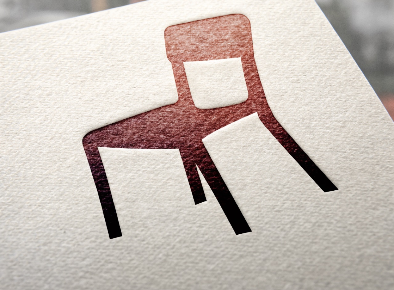
Metal or polymer type pressed into damp cotton stock so the letters have physical depth.
What it does
Historically a kiss impression was correct and a deep bite was a fault; the contemporary taste for visible debossing inverts that. The material facts matter: heavy cotton or Crane Lettra stock, dampened, takes a deep impression and shows a slight halo of displaced fibre at the letter edge. Ink is mixed to a Pantone and sits in the depression. Large solid areas print unevenly because the platen cannot deliver consistent pressure, which is why letterpress work is nearly always type-led rather than image-led.
The prompt
Replace [Subject] with what you are shooting. Everything else is deliberate: the gear, stock and lighting are what push a generator towards this look.
Works well in
Midjourney, FLUX
Pairs with
Bauhaus / ConstructivistModular Grid
The Prompt Atlas
Every prompt here is a starting point. The Prompt Atlas is the full system: hundreds of production-ready prompts organised by outcome, with the reasoning behind each one so you can adapt rather than copy.