
Knockout versus Overprint
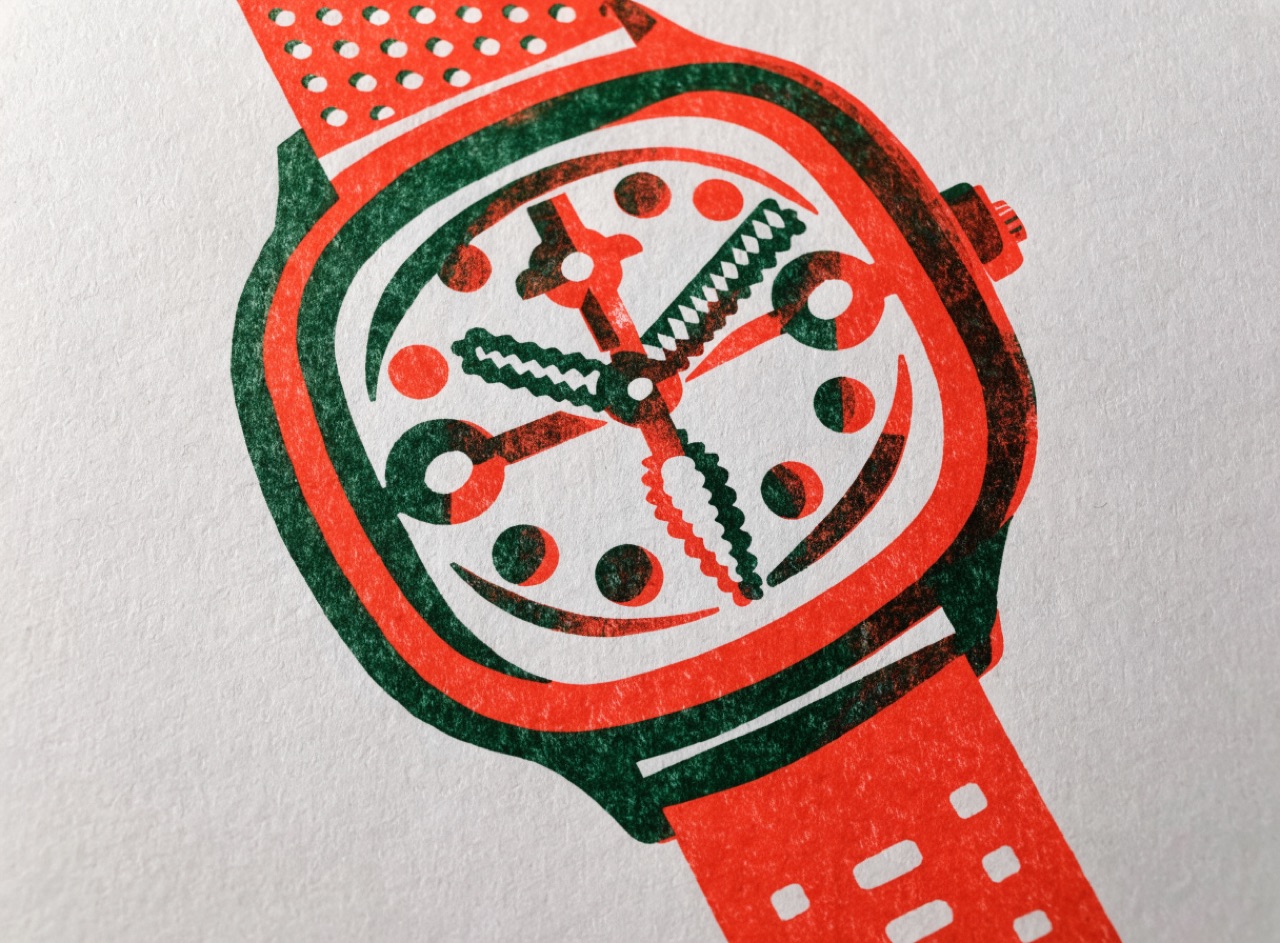
Deciding whether an ink sits on the paper or on top of another ink, which changes the colour.
What it does
Knocking out means the underlying colour is removed so the top ink prints on bare paper and keeps its own hue. Overprinting means it prints on top and multiplies with what is beneath, producing a third colour. Black text is almost always set to overprint so a registration shift does not show white fringes, whereas a light colour must knock out or it disappears. Choosing wrongly is one of the classic production errors.
The prompt
Replace [Subject] with what you are shooting. Everything else is deliberate: the gear, stock and lighting are what push a generator towards this look.
Works well in
Midjourney, FLUX
Pairs with
Two-Ink DisciplineScreenprint Overprint
The Prompt Atlas
Every prompt here is a starting point. The Prompt Atlas is the full system: hundreds of production-ready prompts organised by outcome, with the reasoning behind each one so you can adapt rather than copy.