
Two-Ink Discipline
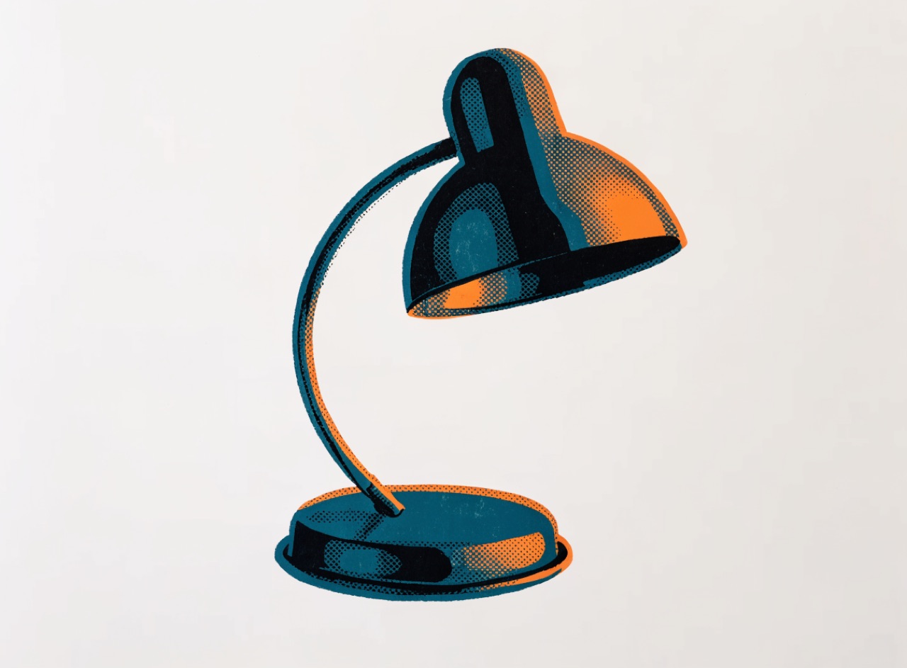
Two spot colours and the paper, where every other tone is made by tint and overprint.
What it does
A two-colour job forces the palette to be built rather than picked. Tints of each ink give a tonal range, overprinting gives a third hue, and the paper gives white. Because there is no black to fall back on, the darker ink has to carry structure. This constraint drove most mid-century book jackets and remains the fastest way to make generated imagery look printed rather than rendered, because a screen-native image almost never restricts itself this way.
The prompt
Replace [Subject] with what you are shooting. Everything else is deliberate: the gear, stock and lighting are what push a generator towards this look.
Works well in
Midjourney, FLUX, Ideogram
Pairs with
Risograph DuotoneScreenprint Overprint
The Prompt Atlas
Every prompt here is a starting point. The Prompt Atlas is the full system: hundreds of production-ready prompts organised by outcome, with the reasoning behind each one so you can adapt rather than copy.