
Chromolithograph
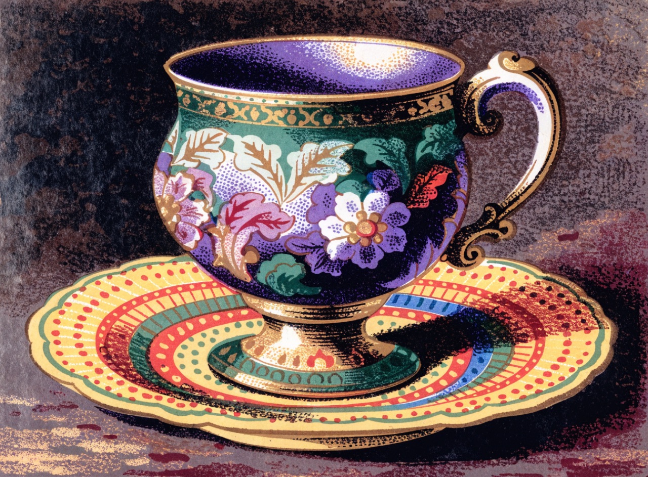
Many stones, many passes, building saturated colour before process printing existed.
What it does
Nineteenth-century colour lithography used a separate limestone for each colour, sometimes twenty or more, so the printer built colour by layering flat and stippled passes. Victorian advertising cards, seed catalogues and cigarette cards are the surviving examples. Because each stone was drawn by hand, the colour separations do not correspond to any process model: greens are printed green, not made from cyan and yellow, which gives a saturation four-colour cannot reach.
The prompt
Replace [Subject] with what you are shooting. Everything else is deliberate: the gear, stock and lighting are what push a generator towards this look.
Works well in
Midjourney, FLUX
Pairs with
Art Nouveau LetteringWoodblock (Ukiyo-e)
The Prompt Atlas
Every prompt here is a starting point. The Prompt Atlas is the full system: hundreds of production-ready prompts organised by outcome, with the reasoning behind each one so you can adapt rather than copy.