
Reversed Type
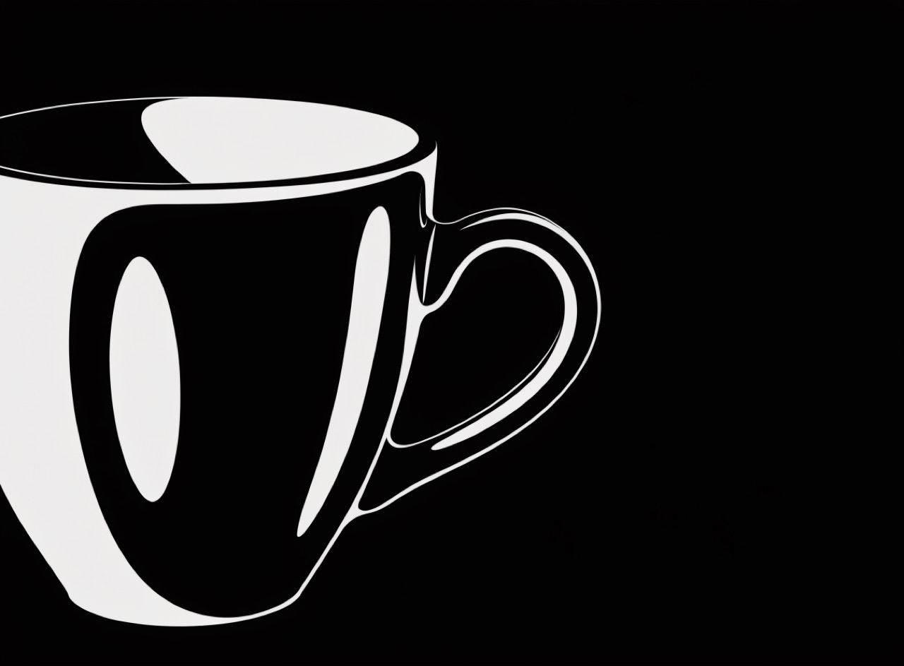
White type out of a dark ground, which needs heavier weight and more space to stay readable.
What it does
Light type on dark appears optically bolder because the ink spreads into the counters, so a face that reads well in black on white will fill in when reversed, especially at small size on absorbent stock. The correct compensation is to reverse only from a heavier optical size or a grade with slightly opened counters, increase leading, and avoid fine serifs and hairlines entirely. Ignoring this is why a lot of reversed captions turn to mud.
The prompt
Replace [Subject] with what you are shooting. Everything else is deliberate: the gear, stock and lighting are what push a generator towards this look.
Works well in
Ideogram, Midjourney, FLUX
Pairs with
Rich BlackKnockout versus Overprint
The Prompt Atlas
Every prompt here is a starting point. The Prompt Atlas is the full system: hundreds of production-ready prompts organised by outcome, with the reasoning behind each one so you can adapt rather than copy.