
Psychedelic Fillmore Poster
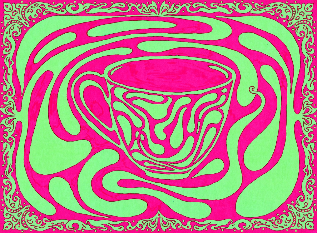
Lettering stretched to fill every void, in vibrating complementary colour that hums at the edges.
What it does
Wes Wilson, Victor Moscoso and Rick Griffin produced the San Francisco dance posters of 1966 to 1968 for the Fillmore and Avalon. Wilson's lettering derives from Alfred Roller's Vienna Secession type, stretched and squeezed to fill the shape rather than sit on a line. Moscoso, taught by Albers at Yale, deliberately broke the colour lessons by pairing saturated complements of equal value so the boundary vibrates and the eye cannot rest. Legibility was intentionally slowed: reading the poster was part of belonging to the audience.
The prompt
Replace [Subject] with what you are shooting. Everything else is deliberate: the gear, stock and lighting are what push a generator towards this look.
Works well in
Midjourney, FLUX
Pairs with
Vibrating Colour EdgeArt Nouveau Lettering
The Prompt Atlas
Every prompt here is a starting point. The Prompt Atlas is the full system: hundreds of production-ready prompts organised by outcome, with the reasoning behind each one so you can adapt rather than copy.