
Vibrating Colour Edge
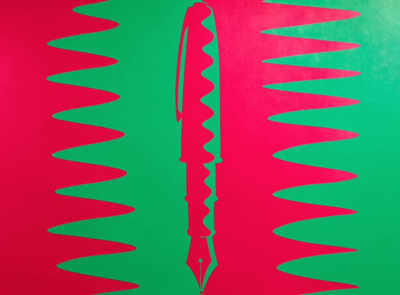
Complementary hues matched in value so their shared border shimmers and refuses to resolve.
What it does
Josef Albers demonstrated in Interaction of Color that a boundary between two colours of equal value and opposing hue cannot be focused: the eye keeps adjusting and the edge appears to move. Victor Moscoso applied it to concert posters deliberately. The condition is strict, because if the values differ even slightly the effect disappears and you simply have a bright poster. Converting the image to greyscale is the test: if you can still see the boundary clearly, the values are wrong.
The prompt
Replace [Subject] with what you are shooting. Everything else is deliberate: the gear, stock and lighting are what push a generator towards this look.
Works well in
Midjourney, FLUX
Pairs with
Psychedelic Fillmore PosterTwo-Ink Discipline
The Prompt Atlas
Every prompt here is a starting point. The Prompt Atlas is the full system: hundreds of production-ready prompts organised by outcome, with the reasoning behind each one so you can adapt rather than copy.