
Memphis / Postmodern
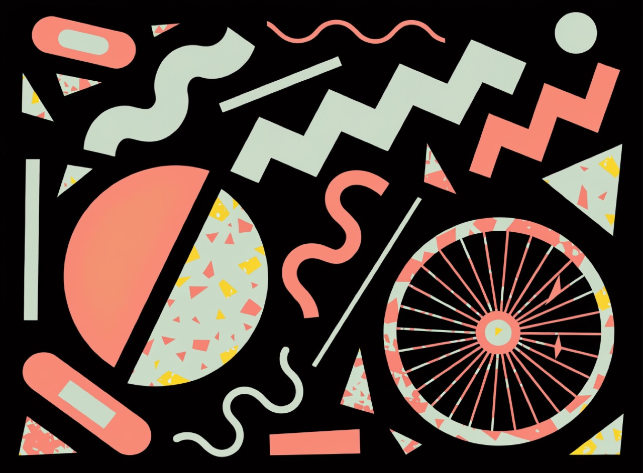
Squiggles, terrazzo and clashing pastels, arranged to refuse the good taste of modernism.
What it does
Ettore Sottsass founded Memphis in Milan in 1981 and April Greiman and Wolfgang Weingart pushed the parallel typographic argument. The move is deliberate bad taste as critique: laminate patterns, terrazzo speckle, squiggle and zigzag motifs, pastel mint and salmon against black, all refusing modernist restraint. Greiman's Design Quarterly 133 fold-out used early Macintosh bitmap coarseness as material rather than hiding it. It collapses into 1980s nostalgia unless the composition underneath is genuinely considered.
The prompt
Replace [Subject] with what you are shooting. Everything else is deliberate: the gear, stock and lighting are what push a generator towards this look.
Works well in
Midjourney, Ideogram, FLUX
Pairs with
New Wave (Weingart)Coarse Bitmap
The Prompt Atlas
Every prompt here is a starting point. The Prompt Atlas is the full system: hundreds of production-ready prompts organised by outcome, with the reasoning behind each one so you can adapt rather than copy.