
Humanist Sans
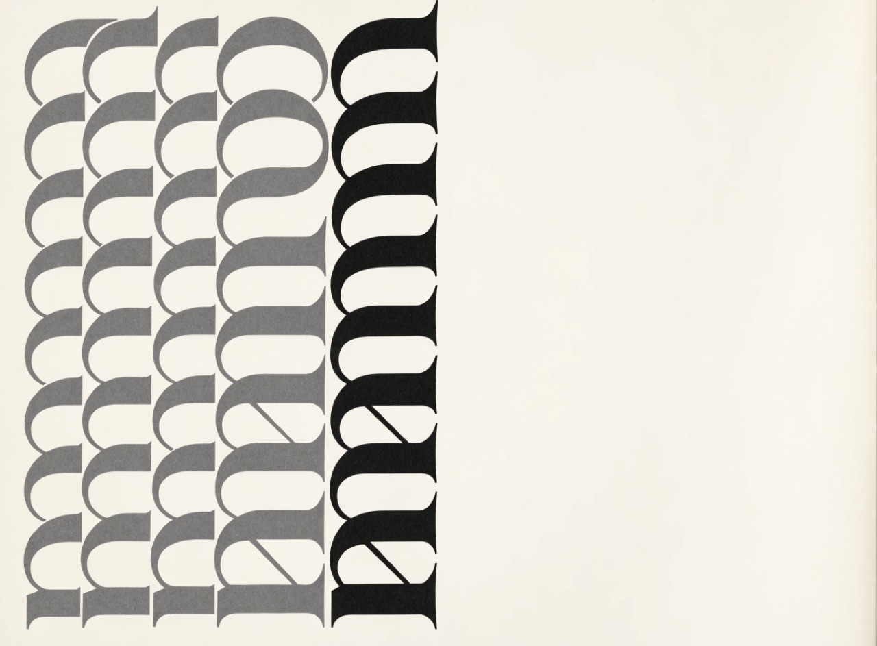
A sans serif drawn from calligraphic skeletons, so it keeps stroke modulation and a true italic.
What it does
Edward Johnston's 1916 Underground alphabet and Eric Gill's Gill Sans derive their proportions from Roman inscriptional capitals and humanist minuscules rather than from geometry. Strokes modulate slightly, apertures stay open, and the italic is a genuine cursive rather than a slanted roman. That inheritance makes it far more readable at length than a geometric sans, which is why transport and civic systems keep choosing it.
The prompt
Replace [Subject] with what you are shooting. Everything else is deliberate: the gear, stock and lighting are what push a generator towards this look.
Works well in
Ideogram, Midjourney, FLUX
Pairs with
Akzidenz over HelveticaModular Grid
The Prompt Atlas
Every prompt here is a starting point. The Prompt Atlas is the full system: hundreds of production-ready prompts organised by outcome, with the reasoning behind each one so you can adapt rather than copy.