
Transitional Serif
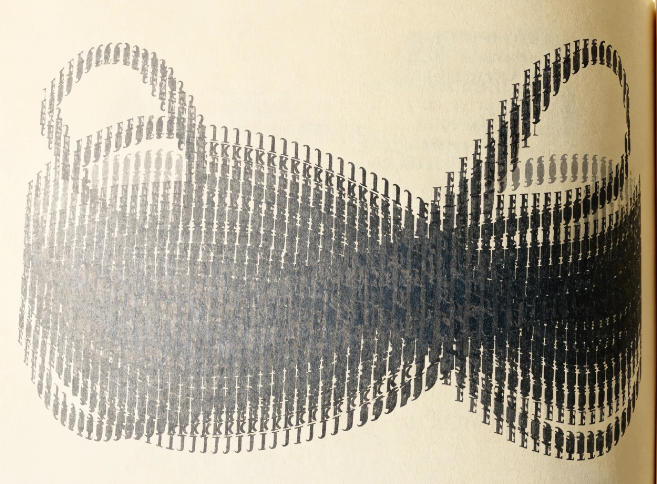
The compromise between old-style and Didone: near-vertical stress, moderate contrast.
What it does
Baskerville, cut in the 1750s, sits between Caslon's angled humanist stress and Bodoni's vertical extremes. Stress is nearly vertical, contrast moderate, serifs finely bracketed, and the whole is sharper than an old-style without being fragile. Baskerville was criticised in its day for being too bright and hard on the eyes, which tells you how far the change felt at the time. It remains the default for long-form book setting.
The prompt
Replace [Subject] with what you are shooting. Everything else is deliberate: the gear, stock and lighting are what push a generator towards this look.
Works well in
Ideogram, Midjourney, FLUX
Pairs with
The Prompt Atlas
Every prompt here is a starting point. The Prompt Atlas is the full system: hundreds of production-ready prompts organised by outcome, with the reasoning behind each one so you can adapt rather than copy.