
Geometric Sans
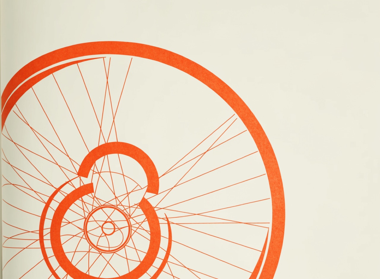
Letters built from circle and straight line, so the O is a true circle and the a is single-storey.
What it does
Paul Renner's Futura of 1927 and Herbert Bayer's universal alphabet construct letters from pure geometry: a circular O, a single-storey a, a pointed A. Renner drew alternates that were even more geometric and had to withdraw them because they were unreadable. Long text in a geometric sans is tiring because the repeated circular forms reduce word-shape distinction, so it belongs in display use.
The prompt
Replace [Subject] with what you are shooting. Everything else is deliberate: the gear, stock and lighting are what push a generator towards this look.
Works well in
Ideogram, Midjourney, FLUX
Pairs with
Bauhaus / ConstructivistDe Stijl
The Prompt Atlas
Every prompt here is a starting point. The Prompt Atlas is the full system: hundreds of production-ready prompts organised by outcome, with the reasoning behind each one so you can adapt rather than copy.