
Crouwel Grid Alphabet
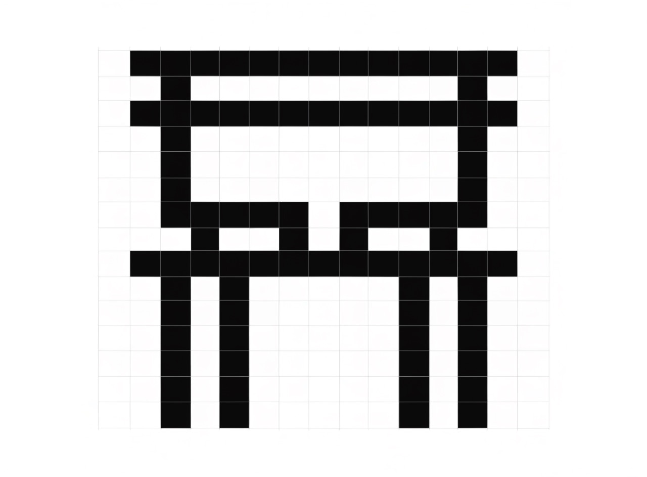
Letters constructed only from horizontal and vertical strokes on a coarse grid.
What it does
Wim Crouwel published New Alphabet in 1967 as a response to early cathode-ray typesetting, which could not render diagonals or curves. Every letter is built from horizontals and verticals on a visible grid, so several are barely recognisable and Crouwel presented it as a theoretical proposal rather than a working face. Brett Wickens revived it for Joy Division's Substance. It is legibility sacrificed to system on purpose.
The prompt
Replace [Subject] with what you are shooting. Everything else is deliberate: the gear, stock and lighting are what push a generator towards this look.
Works well in
Ideogram, Midjourney, FLUX
Pairs with
Coarse BitmapSwiss International Style
The Prompt Atlas
Every prompt here is a starting point. The Prompt Atlas is the full system: hundreds of production-ready prompts organised by outcome, with the reasoning behind each one so you can adapt rather than copy.