
Grunge / Ray Gun Deconstruction
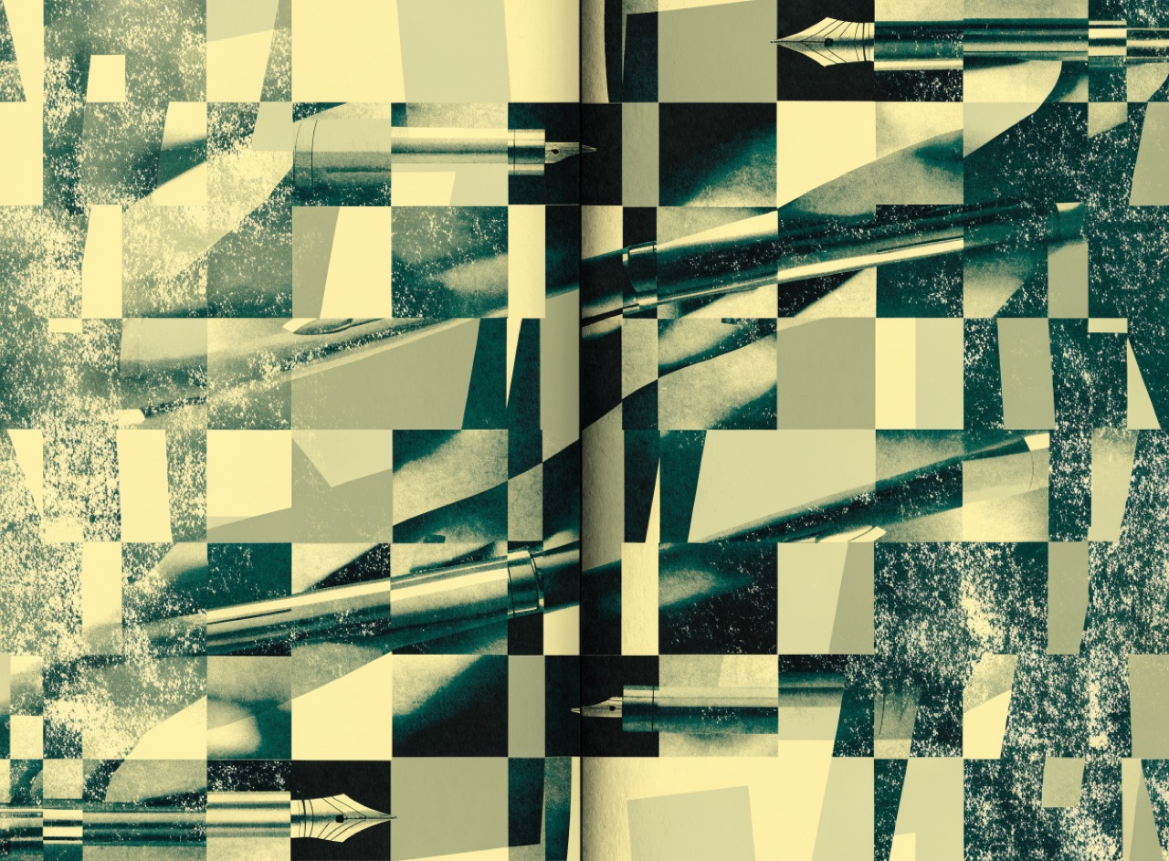
Type treated as texture rather than language, layered until reading becomes an effort.
What it does
David Carson art-directed Ray Gun from 1992 and famously set a Bryan Ferry interview entirely in Zapf Dingbats because he found it dull. Type overlaps image, columns collide, baselines drift, letterforms are cropped by the trim. The claim is that emotional register matters more than immediate legibility, which is defensible for a music magazine and indefensible for a timetable. Carson's own line, that legibility and communication are not the same thing, is the whole argument in one sentence.
The prompt
Replace [Subject] with what you are shooting. Everything else is deliberate: the gear, stock and lighting are what push a generator towards this look.
Works well in
Midjourney, FLUX
Pairs with
New Wave (Weingart)Generation Loss
The Prompt Atlas
Every prompt here is a starting point. The Prompt Atlas is the full system: hundreds of production-ready prompts organised by outcome, with the reasoning behind each one so you can adapt rather than copy.