
Complementary Colour Contrast
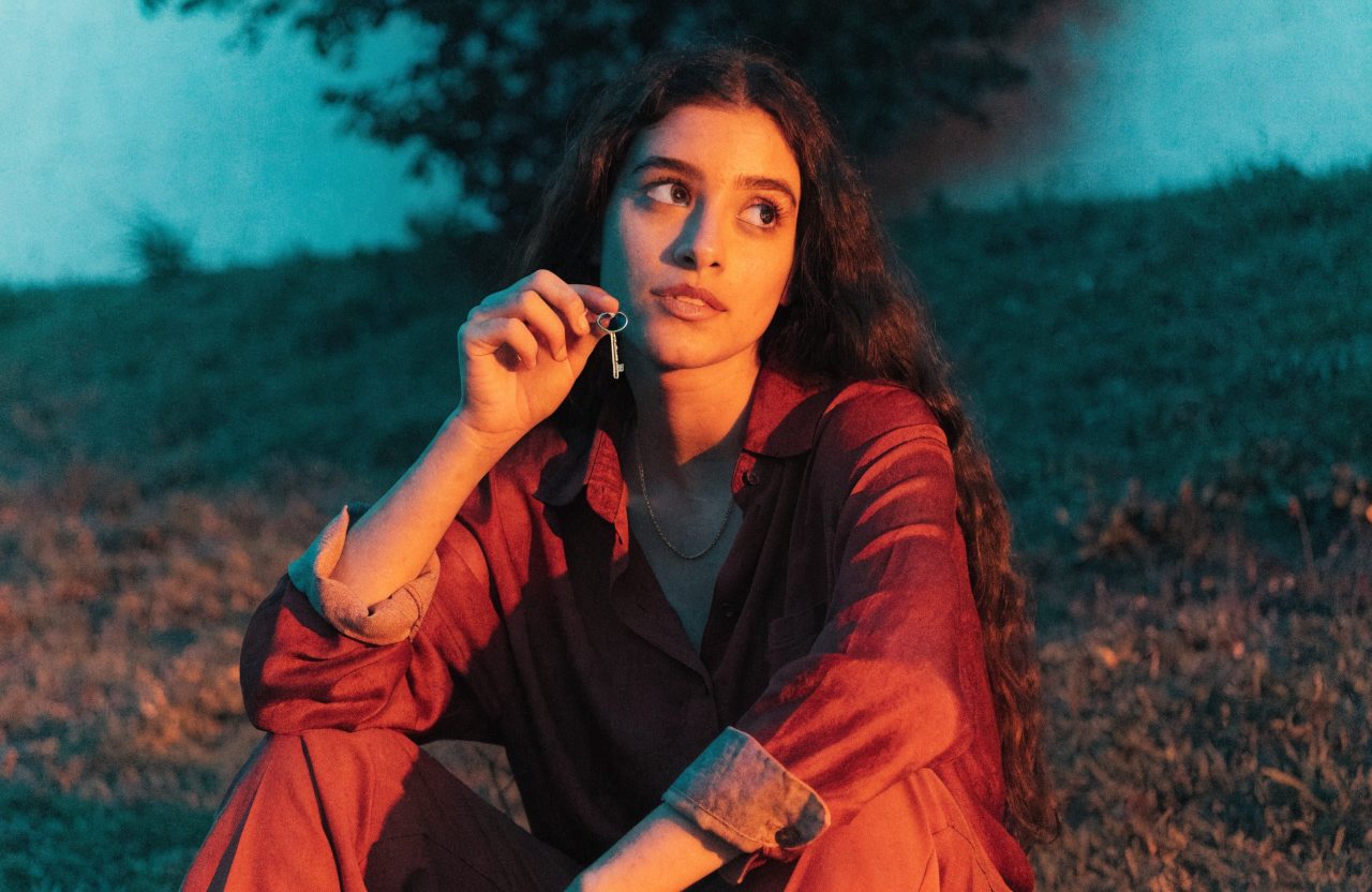
Opponent hues, often red against green or amber against teal, so figure and ground argue and desire gains a nervous system.
What it does
Complementary colour contrast places opponent hues, often red against cyan-green or amber against teal, so figure and ground argue. Done with intention it is psychology; done as a default grade it is a cliché. Emotionally it heightens desire, danger and separation: the person does not belong to the room, or the room wants something the person does not. Bruno Delbonnel's Amélie sets saturated reds against greens so whimsy has a nervous system. Christopher Doyle's In the Mood for Love pits emerald corridors against crimson cheongsams until longing becomes a palette. Bill Pope's The Matrix makes the digital world a sick green against residual human warmth. Use it when two forces occupy the frame. Do not slap a teal-and-orange LUT on a period chamber piece or a Bradford Young naturalist drama, because the complementary trick will vulgarise a film that asked for mud, dust and withheld colour.
The prompt
Replace [Subject] with what you are shooting. Everything else is deliberate: the gear, stock and lighting are what push a generator towards this look.
Works well in
Midjourney, Flux, Adobe Firefly
Pairs with
Gel LightingMonochromatic Palette
The Prompt Atlas
Every prompt here is a starting point. The Prompt Atlas is the full system: hundreds of production-ready prompts organised by outcome, with the reasoning behind each one so you can adapt rather than copy.